
Theme settings#
Theme settings apply store-wide. They sit in the theme editor's left panel under Theme settings, in twelve groups plus the Custom CSS group Shopify adds to every theme, described here in the order the editor lists them.
Favicon#
One setting: Favicon image. Upload a 32×32px PNG; it appears in browser tabs.
Typography#
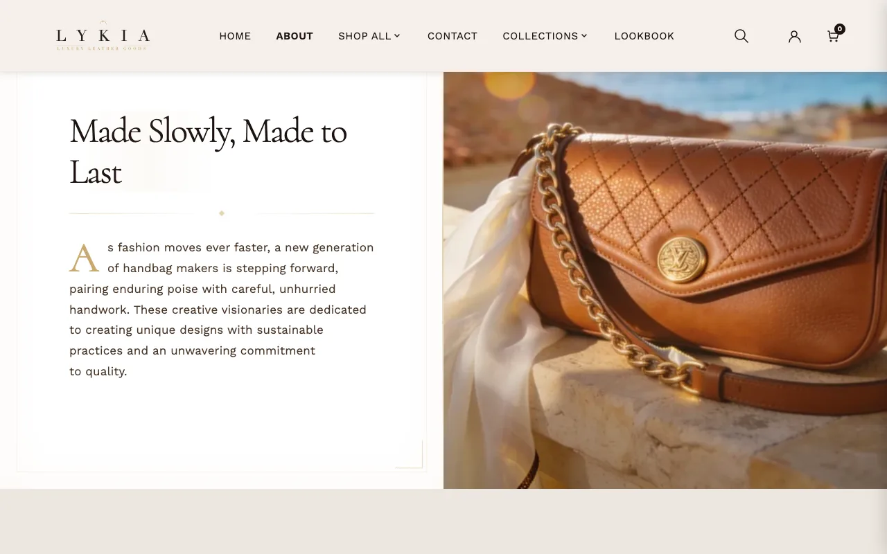
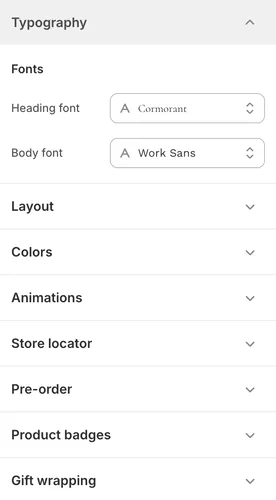
Two store-wide fonts. As installed, Heading font is Cormorant, a serif, and Body font is Work Sans, a sans-serif; both are picked from Shopify's font library. A few places use the heading font at a set weight: Add to bag and Buy it now when their Font is set to Heading font, and the store name in the pickup line and panel (at its Store name weight). If your heading font doesn't include that weight, another weight the font does include is used. Lykia never fakes bold or italic, so a heading font with no italic shows store names upright. A few sections choose type independently of these — Scrolling marquee has its own font picker, and Hero text reveal's Font family setting can mix the two.
Layout#
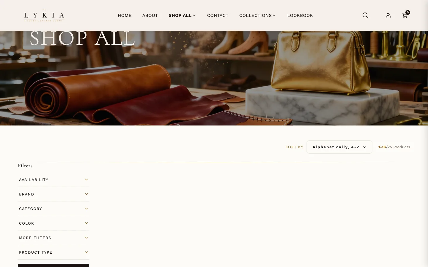
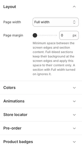
Page width sets the maximum width of page content — Narrow, Wide, or Full width (the installed choice) — and Page margin sets the minimum space between the screen edges and the content of every section; on phones the margin is one third of that value, at most 32 px. Most sections sit inside it, background included; full-bleed sections (heroes, image and video bands, Lookbook, Countdown timer, Category tabs, the header, announcement bar, footer, contact form and divider) keep their background at the screen edges and keep only their content inside it. Scrolling marquees, the cart drawer and the newsletter popup do not use it. Turning on a section's Full width option lets that section pass it (Category tabs: on desktop only, keeping a 40 px gap at each edge).
Colors#
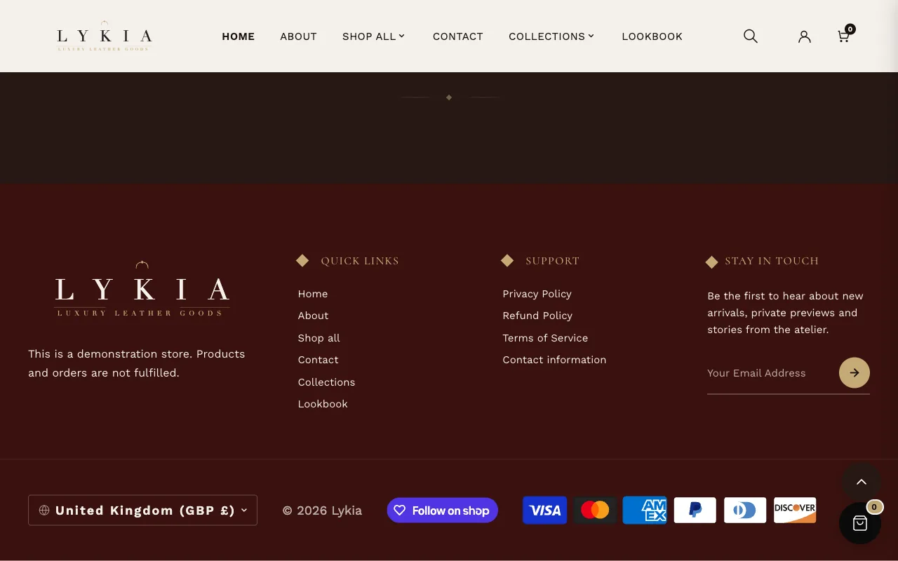
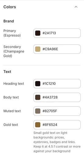
Twelve color pickers in three clusters, and one more setting under General. The Brand colors — Primary (Espresso) and Secondary (Champagne Gold) — carry the theme's identity; the gold Secondary is what most sections mean by their own "gold accent". The Text colors cover headings, body, muted text, Gold text and Text on dark backgrounds. Gold text is the darker gold for small text on light backgrounds — prices, text above headings, badges and links (#8F6524 as installed); pick a color that reads clearly against your background. Backgrounds hold the page background, foreground, card, alternate-section and dark-section colors. Under General, Input corner radius rounds form fields store-wide. Changing these repaints the whole store; individual sections' own color pickers override them locally.
Animations#
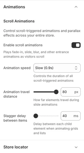
Store-wide scroll animations. Enable scroll animations is the master switch; Animation speed, Animation travel distance and Stagger delay between items tune how entrances feel — as installed, Slow (0.9s), 80px of travel, and a 40ms stagger, a deliberately unhurried pace. Visitors whose device asks for reduced motion see the content without the entrance movement. Sections with their own animation settings apply them on top of these.
Store locator#
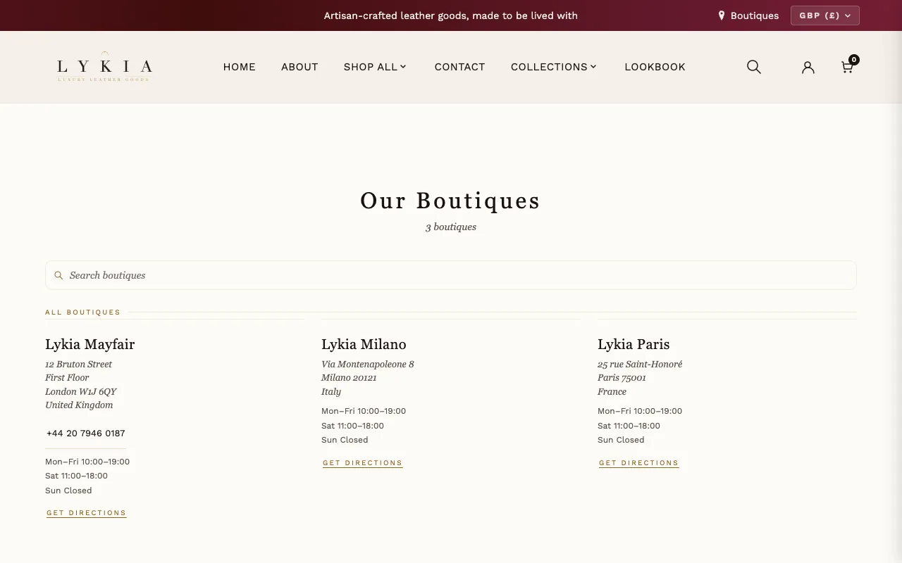
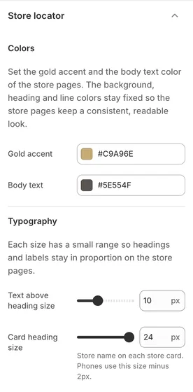
Styling for the store-locator page that the Store list section builds (see Store list, under Other templates). This group holds only appearance controls — the gold accent, a body-text color, and three type sizes; the boutiques themselves are added as blocks in the Store list section.
Pre-order#
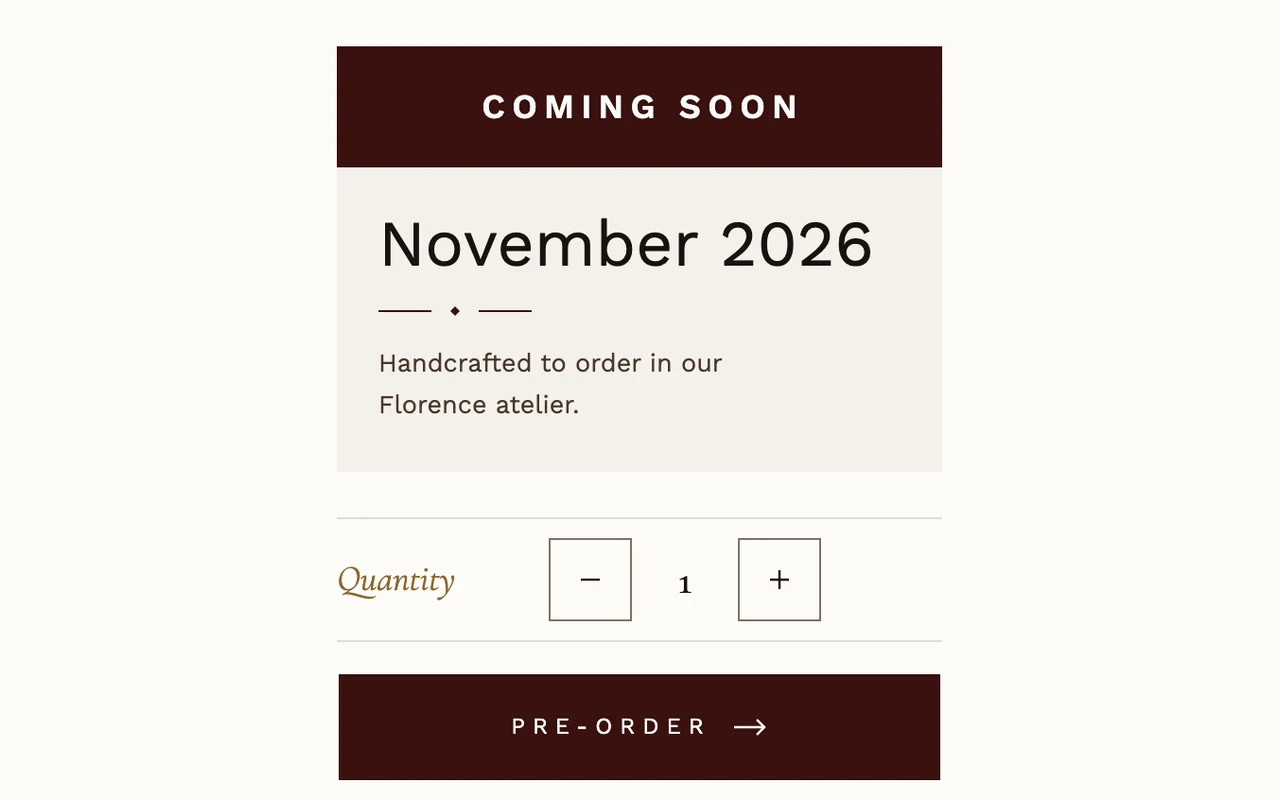
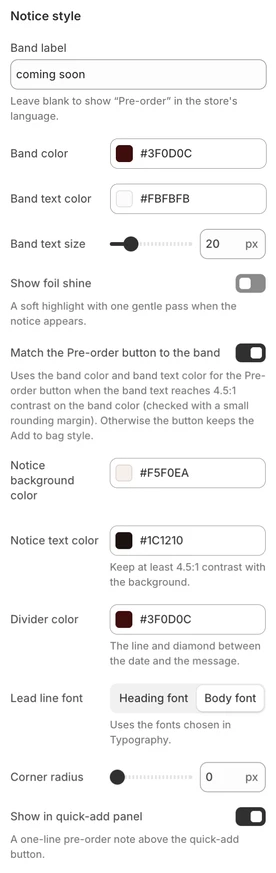
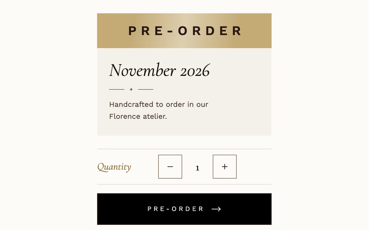
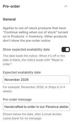
There are two ways to sell before stock arrives: the theme's own pre-order notice, and pre-order or try-before-you-buy apps that use selling plans.
The theme's pre-order notice
It applies to a variant that Shopify tracks, whose inventory is 0 or less, and that has "Continue selling when out of stock" turned on — in your Shopify admin, open the product (or the variant) under Products and check its Inventory section. For such a variant the stock line is replaced by the notice, the Add to bag button and the sticky bar button read Pre-order, and the sticky bar shows the notice's first line instead of In stock. An in-stock variant of the same product shows the normal stock line, with no empty space. Next to the price, a small Pre-order tag shows while the selected variant is on pre-order, and it hides again on an in-stock variant.
Selling-plan apps
When a product has selling plans, the product page shows a Purchase options choice: a one-time purchase plus each plan. When the product requires a plan there is no one-time option, and the first plan is preselected. Choosing a plan updates the price shown — the plan's price, its compare-at price and unit price, in the price area and the sticky bar — and choosing one-time purchase shows the variant's own price again. Quick add can't offer a plan choice, so on a product with selling plans the product card's button reads Choose options and opens the product page. The chosen plan's name is shown on the cart line in the cart drawer and on the cart page. The theme's notice appears only in the inventory case above. If an app's pre-order variant is also tracked at 0 or less with Continue selling on, both show: keep the theme's date in line with the app's plan, or leave the date blank so the notice reads Made to order.
The settings, in the order the editor lists them under Theme settings → Pre-order:
General
What the notice says.
- Show expected availability date (on as installed) — the date leads the notice. When it is off, or the date is blank, the notice leads with Made to order.
- Expected availability date (empty as installed) — free text, such as "November 2026" or "Ships in 3–4 weeks". It is printed as the notice's large first line, with no extra label.
- Pre-order message (empty as installed) — shown below the date, after a small line-and-diamond divider. Leave it blank for no message.
Notice style
How the notice looks.
- Band label — the text in the band. Left blank, it shows "Pre-order" in the store's language (German: "Vorbestellung"); text you type is used as written.
- Band color (#3F0D0C as installed) and Band text color (#FBFBFB).
- Band text size — 18 to 28 px, 20 px as installed.
- Show foil shine (off as installed) — a soft highlight with one gentle pass when the notice appears. The pass never loops; for visitors who ask for reduced motion it is skipped and the still highlight stays.
- Match the Pre-order button to the band (on as installed) — while the selected variant is on pre-order, the Pre-order button, the sticky bar's button and the quick-add button on product cards use the Band color as background and the Band text color for the label and border. Hover is a slightly darker tone of a light band, or a slightly lighter tone of a dark band. Switching to an in-stock variant brings back the normal Add to bag style at once. The buttons take the band colors only when the Band text color reads clearly on the Band color; otherwise they keep the Add to bag style.
- Notice background color (#F5F0EA as installed).
- Notice text color (#1C1210 as installed) — pick a color that reads clearly against the background. The message and the small Made to order line use softer tones of this color automatically; a softer tone that wouldn't read clearly moves closer to the text color.
- Divider color (#3F0D0C as installed) — the line and diamond between the date and the message.
- Lead line font — Heading font or Body font (as installed), using the fonts chosen in Typography.
- Corner radius — 0 to 16 px, 0 px as installed.
- Show in quick-add panel (on as installed) — a one-line note above the button in the quick-add panel of product cards: the band label ("Pre-order", or your Band label) · the date, or Made to order.
The four looks
What the notice shows depends on which text fields are filled:
- Date and message — the date, the divider, then the message.
- Date only — the date, then a small Made to order line.
- Message only — Made to order, the divider, then the message.
- Neither — Made to order alone.
A lead line longer than 22 characters is set smaller. On phones, a band label longer than 10 characters is set smaller.
Before you add a date
A new install ships with both text fields empty, so the notice reads Made to order until you type a date. Clearing a field keeps it empty — no default text comes back.
Product badges#
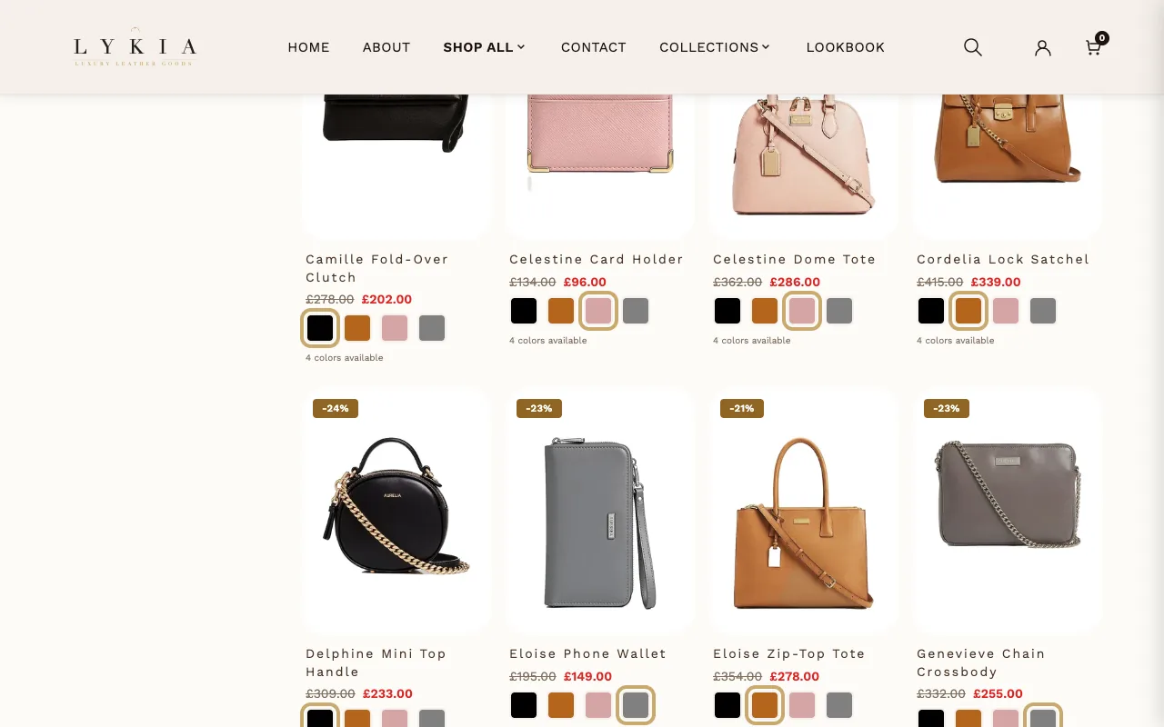
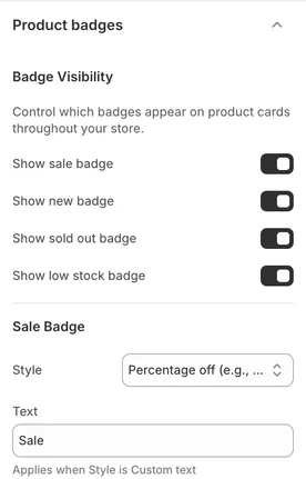
Badges on product cards across the store: Sale, New, Sold out, and Low stock, each with its own show/hide toggle, text and color, plus a Pre-order badge. The less guessable ones: under Sale Badge, Style chooses between a calculated percentage off, an amount off, or your own Text; Days to show 'New' badge defines how recently a product must have been created to count as new. Under Sold Out Badge, Pre-order badge text and Pre-order badge color style the badge a card shows instead of Sold out when its variant is on pre-order (see Pre-order above); it follows Show sold out badge. Under Low Stock Badge, Low stock threshold sets the inventory level at which the low-stock badge appears, and Show quantity in badge swaps the generic text for a live "Only X left". When a card qualifies for several badges, Sold out or Pre-order wins: a Pre-order badge hides Low stock, Sale and New, also after the shopper picks another color on the card.
Each badge color has a text color next to it: Text color under Sale Badge and New Badge, Sold out badge text color and Pre-order badge text color under Sold Out Badge, and Text color under Low Stock Badge. As installed the text is white (#FFFFFF) on Sale, New and Low stock and dark (#1A1210) on Sold out and Pre-order, and every pair reads clearly; keep it that way when you change either color. The New badge colors also style the New tag in Discover: recently viewed.
Gift wrapping#
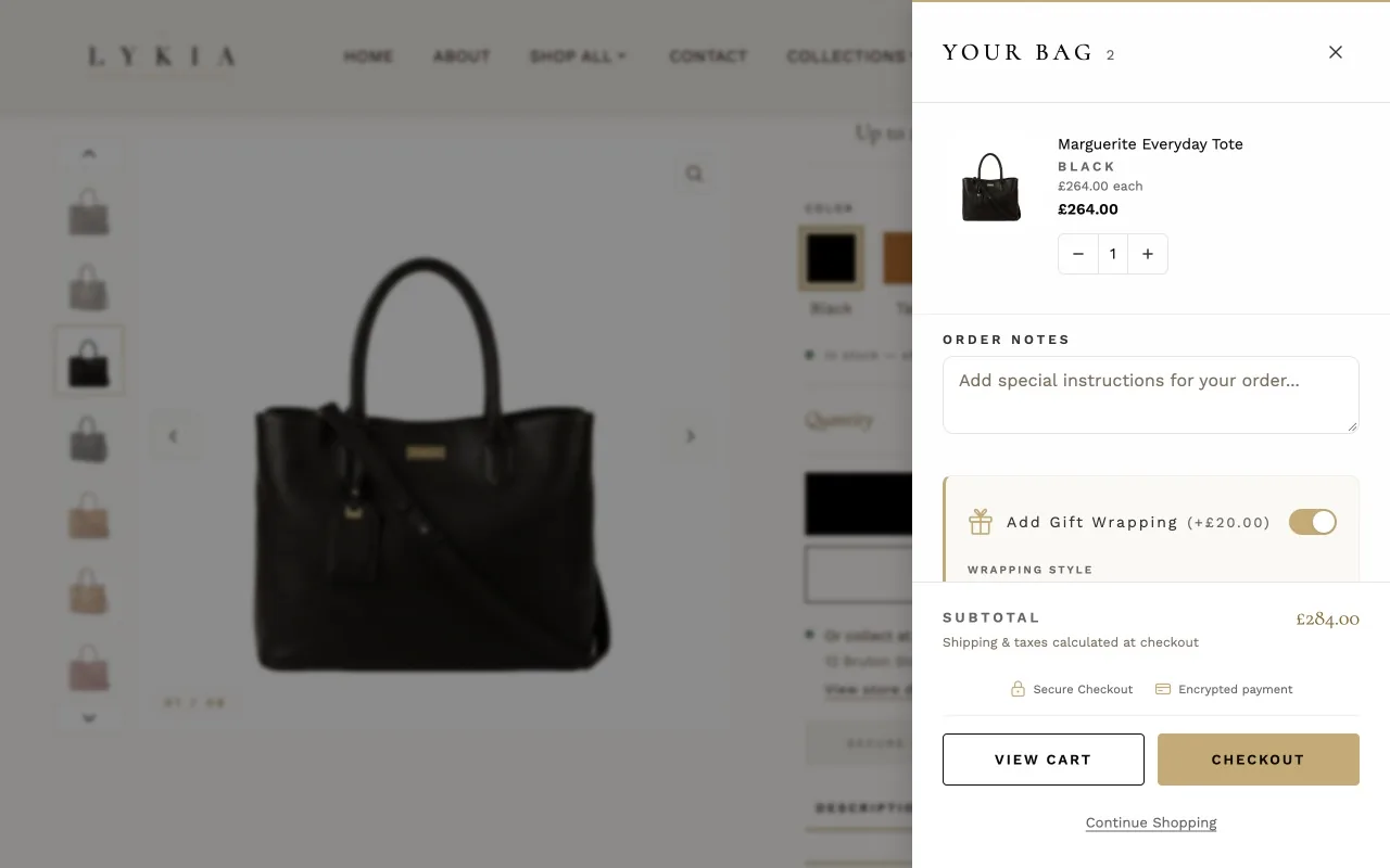
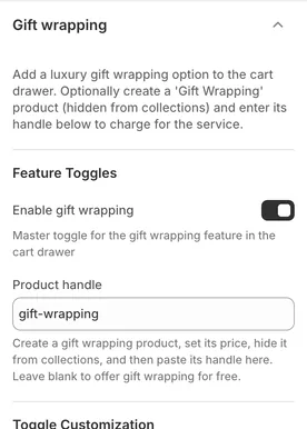
A gift-wrapping option in the cart drawer. It ships switched off — check Enable gift wrapping to turn it on. To charge for wrapping, create a product for it in your admin, hide it from collections, and paste its handle into Product handle; leave that blank for a free, cosmetic-only option. The feature includes an optional gift message (with character limit and counter), and — on by install — To/From recipient fields and a choice of wrapping styles; the styles themselves are defined as Wrapping Style blocks in the Cart drawer section, and Style selector layout (a dropdown, as installed) controls how customers pick one.
Countdown timer#
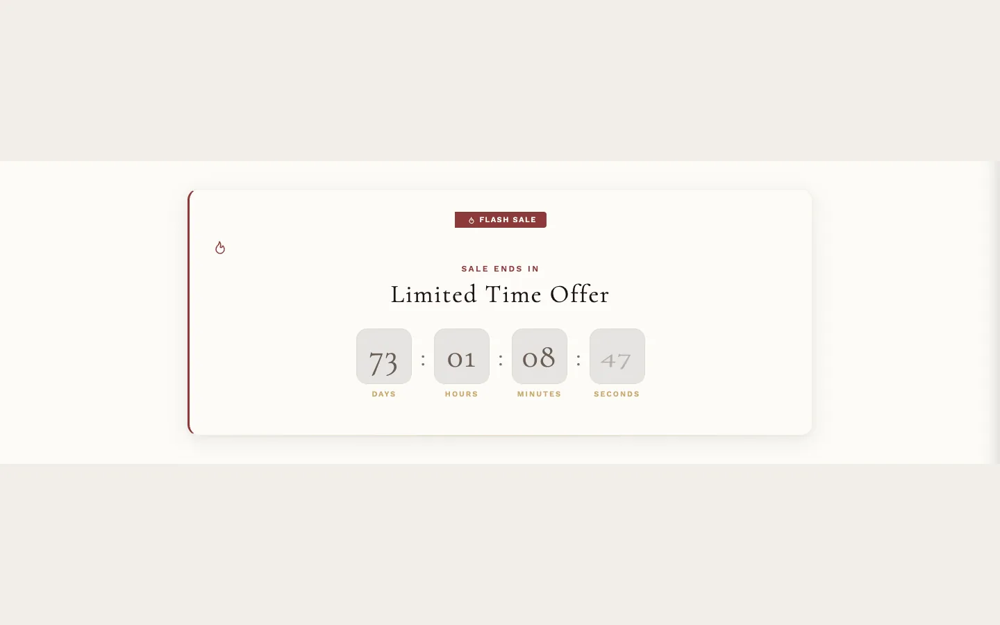
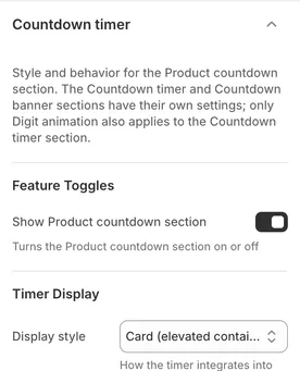
Styling and behavior for the Product countdown section. Of these settings only Digit animation also reaches the Countdown timer section; the Countdown timer and Countdown banner sections otherwise use their own settings. (The dates themselves are set elsewhere: per product via the product's countdown metafields; for a product without custom.sale_end_date, the Product countdown section's Fallback end date and Fallback end time set the end, and the product's own start metafields still set the start unless a filled Fallback start date (with Fallback start time) takes their place — or in the Countdown timer and Countdown banner sections' own settings.) Show Product countdown section switches the Product countdown section on and off. The display controls — style, digit animation, card style, colors, urgency effects, progress bar — do what they say. Help search engines show the sale (on as installed) helps search engines show the sale in their results; it is used by the Product countdown section on a product page when the sale has an end date. Unit label color is #8F6F35 as installed, readable on the light timer card. Colors the preset leaves unset start at tones that read on that card too — Progress bar color is #A8833F, clearly visible against its track. When a visitor's device is set to reduce motion, the digit animation, the urgency pulse and shake, and the striped progress bar stay still. The ones worth a pause:
- When timer expires chooses what an ended Product countdown does — hide, show its expired message, or redirect. Hide entire section when expired sits below it and, when checked, overrides that choice entirely: the section is removed from the page after expiry. It is checked on install, so out of the box an expired Product countdown disappears rather than announcing that the offer has ended. Uncheck it if you want the expired message or redirect to happen. In the theme editor the expired message always shows, so you can style it; hiding and redirecting happen only in your store. Both settings apply to Product countdown only: the Countdown timer and Countdown banner sections show their own expired message when they end.
Color swatches#
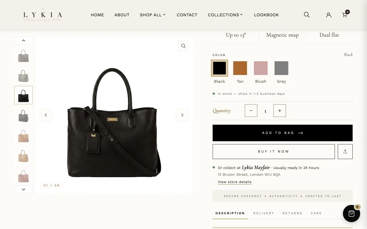
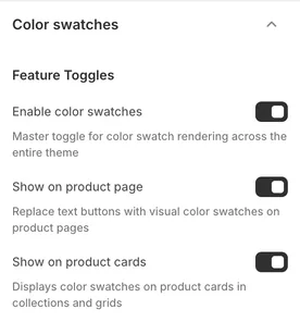
Everything about variant color swatches, store-wide. Enable color swatches is the master switch, with separate toggles for the product page, product cards, and the quick-add popup. Options named Color, Colour or Farbe always show as swatches. Color option name adds one more option name of your own (not case-sensitive). The same names count everywhere swatches appear: product cards, the product page and its sticky bar, Collection carousel tabs, Complete the look and Discover: recently viewed.
How a swatch gets its color: Display type — as installed, "Color with image fallback" — tries a color first and falls back to the variant's image. A swatch set on the option value in your Shopify admin comes first; otherwise colors come from a built-in map; for names the theme doesn't know, add your own in Custom color map (JSON) using handleized color names as keys (the setting shows an example), and Unmapped color fallback decides what unmatched names show.
Sold-out variants: Sold-out swatch style dims, crosses out, or hides them; Cross-out line color is #929292 as installed, clearly visible against the page background. Disable sold-out swatch click is checked on install, so sold-out swatches don't respond to clicks out of the box — uncheck it if you want customers to be able to select a sold-out color and see its details. On the product page itself a sold-out color always stays selectable, whatever this setting says.
The rest of the group sizes and spaces swatches per surface (product page, cards, quick add, mobile), styles the active, hover and tooltip states — Active indicator color is #A8833F as installed, so the ring around the selected swatch stands out clearly against the page background — and, under SEO, Add the product color to social link previews adds the product's color to link previews on social media. As installed: color names sit below product-page swatches, cards show a color count, and tooltips show on mobile when a swatch is tapped.
Back to top#
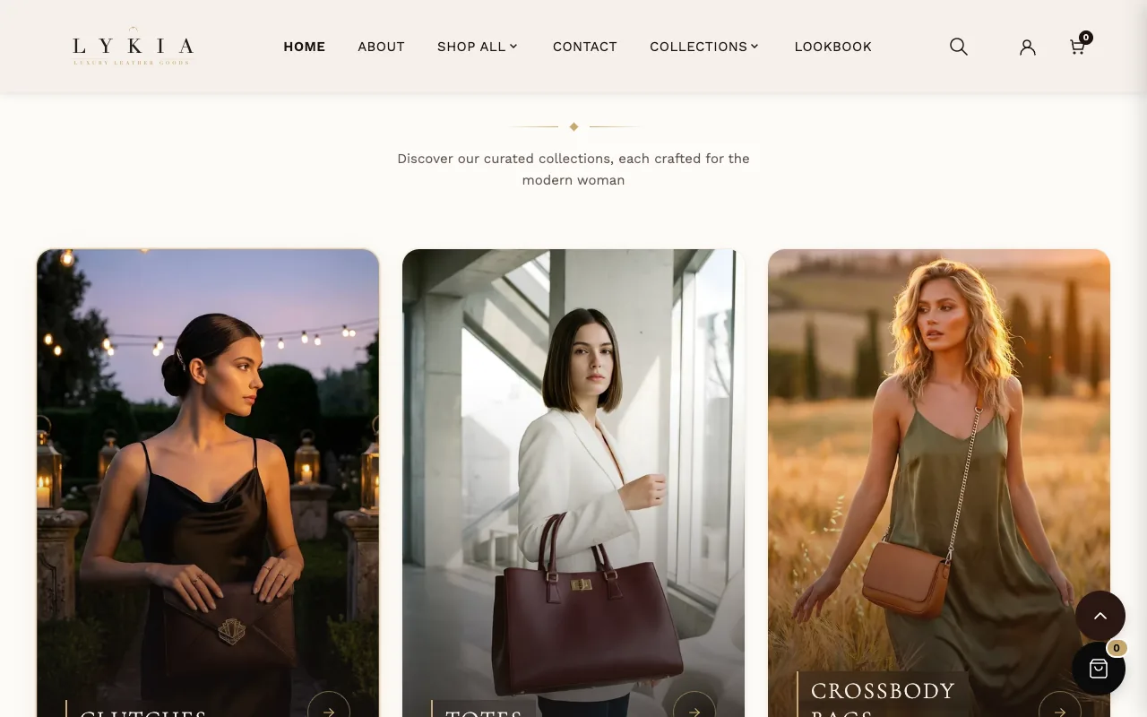
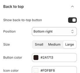
The floating back-to-top button: Show back-to-top button turns it on or off (on as installed), then position, size (Large as installed), colors, distance from the bottom edge, and Scroll threshold — how far down the page a visitor must be before it appears.
Custom CSS#
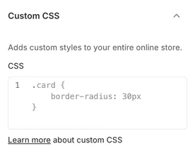
Shopify adds this group to every theme: one CSS field whose rules apply to the whole store. Shopify limits these rules to 1,500 characters (a section's own Custom CSS field takes 500), and only https://cdn.shopify.com addresses can be used inside a url(). Use a Lykia setting where one exists: a later Lykia update can rename the classes a rule targets, so check your rules after updating the theme.