
Home-page sections#
The Lykia preset arranges the home page from the fourteen sections below. All fourteen can be added to other pages too; where one has a narrower home, its entry says so.
About gallery#
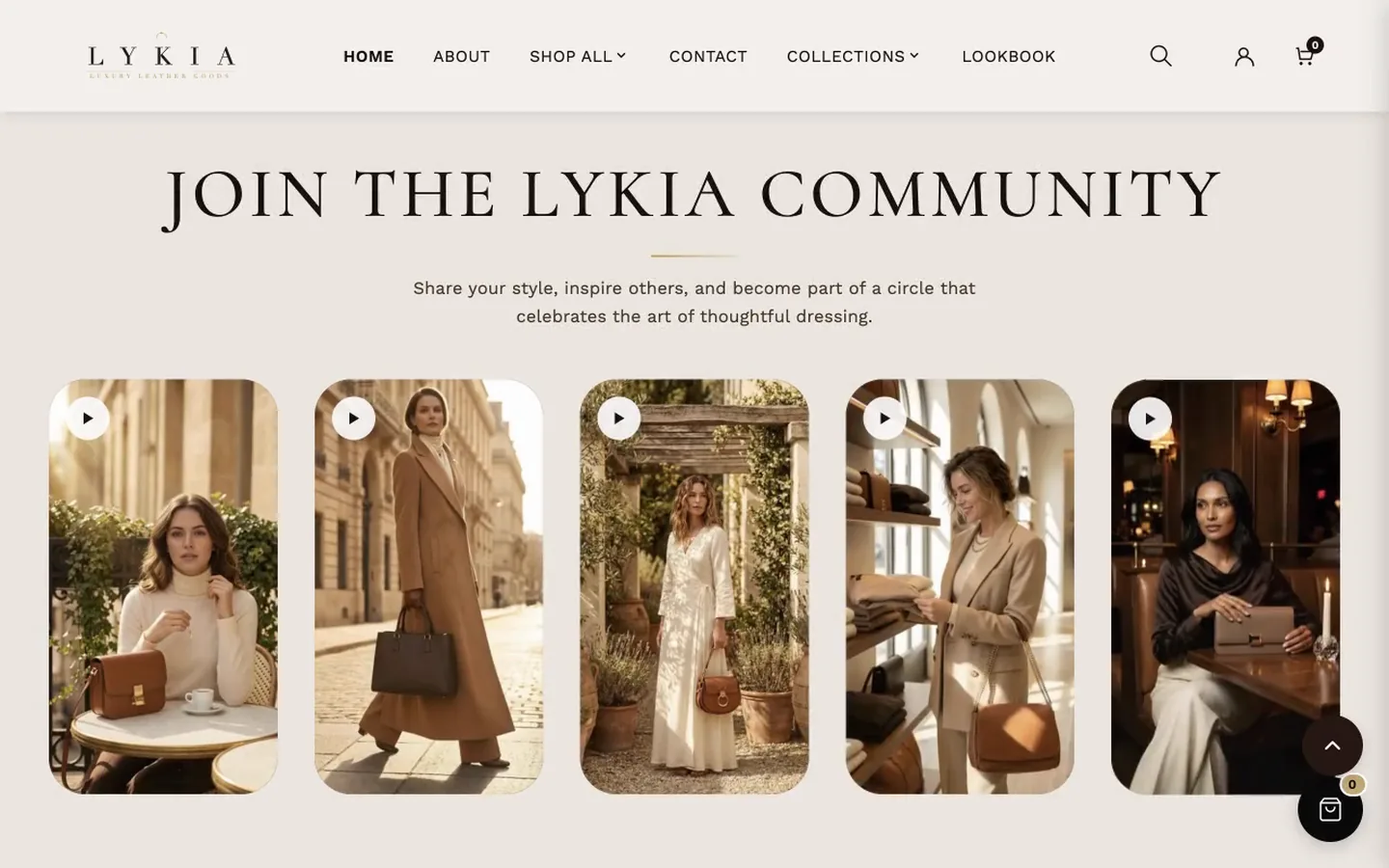
What it is for
A grid of image (or video) cards with a heading and description — a gallery of your craft, studio or products. The preset uses it twice: on the home page as Style community, and on the About page as About gallery.
What it needs
One Gallery Card block per tile. Each card takes an Image; the rest is optional: a Video URL (optional) (a direct MP4 link — the image then acts as the poster, with a play button), a Border glow color, a Heading (optional) shown below the card, a Link (optional), and a hover popup: select a Product to show its thumbnail, price and link on hover, or set Popup Heading and Popup subheading for a custom one.
Settings worth knowing
The grid runs up to ten Columns (desktop) with separate tablet and mobile counts. Card aspect ratio (desktop) sets the tile shape — Editorial (9:16) as installed on the home page. On Card aspect ratio (mobile), Same as desktop uses the desktop value. Border glow color on a card overrides the auto-cycling glow colors.
When it's empty
With no heading, description or cards, the section doesn't show. Cards without an image show one of five neutral placeholder graphics in rotation — deliberately varied so they don't read as a repeated fault. Give video cards an Image too: it is the poster shown before the video plays.
Category tabs#
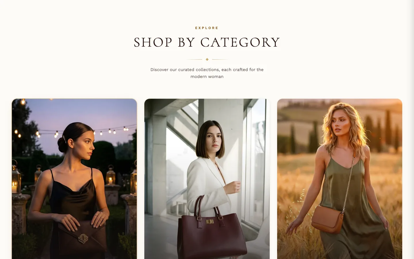
What it is for
A row of image cards, each linking to a collection or page. Use it to give shoppers a visual entry point into your main categories — the preset uses it on the home page under the heading "Shop by Category".
Where it can go
Any template that accepts sections. The Lykia preset places one on the home page.
What it needs
One Category Tab block per card, and each block has four fields: an Image, Image alt text (optional) — leave it empty when the label already names what the image shows, so screen readers don't hear the same words twice; add a short description only when the image shows something the label doesn't — a Label, and a Link. A card with no link displays but isn't clickable. The preset's three cards ship labeled Totes, Crossbodies and Clutches, with no images and no links set: you'll see a neutral placeholder graphic on each card until you add your own images, the cards won't lead anywhere until you set their links, and you can edit the labels to your own categories.
Layout
Columns (Desktop) sets how many cards sit side by side (2–4); add more blocks than columns and they wrap. Mobile layout decides what phones get: Stack (Vertical) lists the cards top to bottom, while Carousel (Swipe) — the installed choice — puts them in a swipeable row, where Mobile carousel card width (60–95% of the screen) controls how much of the screen each card takes; the lower the value, the more of the next card peeks in from the edge.
Card shape
Card aspect ratio (Desktop) sets the shape of the cards — Tall (2:3) as installed. On screens narrower than 900px, Card aspect ratio (Mobile) takes over — Portrait (3:4) as installed. So out of the box: 2:3 on desktop, 3:4 on mobile. Full width (Desktop) widens the cards on desktop, leaving a 40px gap at each screen edge; uncheck it for an 80px gap (48px on tablets), or the Page margin from Theme settings → Layout when that is larger. The section background always runs edge to edge.
Hover
Hover animation is what the card does under the pointer; Hover label style is what the label does. Both show only on devices with a pointer.
Highlighting one card
Active card (highlighted) picks one card, counted from the left, to show in its highlighted state — the installed value is 1, so the first card. Set it to 0 for no active card.
Background
Add a Background image to place the whole section on a picture; Show background overlay with Overlay opacity darkens that picture so the cards and heading stay readable. By default the section sits on its own cream Background color.
When it's empty
With nothing configured at all — no heading text, no text above the heading, no subheading, no blocks — the section doesn't leave an empty band; it simply doesn't appear on the page. With heading text but no blocks, it shows three cards carrying a neutral placeholder graphic and the label "Collection name", so the layout stays visible while you build it. A block whose image is missing shows the same placeholder with your own label.
Collection carousel tabs#
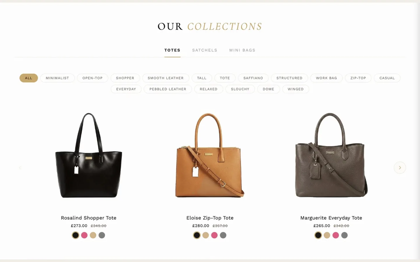
What it is for
Tabbed product carousels: each tab is one of your collections, and the active tab shows that collection's products as swipeable cards.
What it needs
Your collections. Add one Collection Tab block per tab, choose its Collection, and set its Tab label. Products to show caps how many products each tab pulls.
Settings worth knowing
The installed heading is split across Heading and Italic accent word — the accent word appears in italic gold, a device several Lykia sections share. Gold accent color colors that word, the tab underline, the tab hover and the active filter; the installed dark gold keeps the heading readable on a white background. Inactive tab text color sets the labels of the tabs that aren't selected, and Inactive filter text color the tag filter buttons that aren't selected — pick colors that read clearly against the background. Image zoom and its mobile counterpart scale product images inside their frames. Enable mobile image zoom lets shoppers tap a product image into a fullscreen pinch-to-zoom view. The section's Show color swatches turns swatches on or off for the whole section; each tab's own Show color swatches can then switch them off for that tab alone. Show tag filters (on as installed) lets shoppers filter each tab's products by their tags, with Mobile filter style choosing how those filter buttons look on phones.
Metafields it reads
A product's custom.hover_color metafield — a color name, such as one of its Color option values — picks which color's variant image its card shows on hover. It has no setting to override; without it the card picks another color's image, or the product's second image, automatically.
When it's empty
With no heading and no tabs, the section doesn't show. With a heading but no tabs, a shopper sees the heading alone. Helper messages about adding tabs or choosing collections appear only inside the theme editor, never on your published store. One case to avoid leaving in place: a tab whose Collection is not chosen shows four placeholder product cards (Shopify’s neutral product graphic, each linking to all products) beneath its tab label — on your published store too, so pick a collection for every tab, or remove the tab.
Countdown banner#
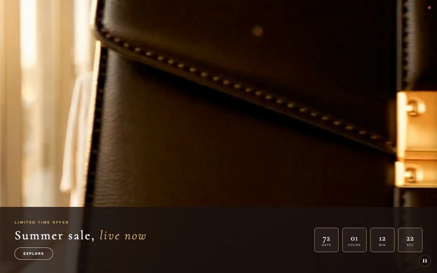
What it is for
A full-width promotional banner — image or video background, heading, description, button — with a built-in countdown timer.
What it needs
A Background image, an optional Mobile background image for phones, and a Countdown end date in the format its setting states (DD/MM/YYYY HH:MM) for the timer. Video is optional and can come three ways: a direct MP4 link, a Shopify media video, or a YouTube/Vimeo URL; the image doubles as the video's poster. A Pause/Play button on the banner stops and restarts the video; when the visitor's device asks for reduced motion, the video doesn't start by itself and the background image shows until Play is pressed. A YouTube or Vimeo video stops (showing the background image) when paused and starts again from the beginning on Play. The preset ships this section with a neutral heading and no date — the timer starts counting once you set one.
Settings worth knowing
Mobile video focus point chooses which part of a desktop video survives the portrait crop. Hide video on mobile shows only the background image on phones — it applies to this whole section, and it is off by install, so a background video plays on phones until you check it. Mobile video URL (direct link) can supply a portrait-optimized MP4 instead. Load the image only when needed should stay off when the banner sits at the top of a page. Overlay position places the frosted text panel at the bottom, center, or over the full banner. Content alignment's installed arrangement puts text left and timer right. Expired message is what shoppers see when the countdown ends.
When it's empty
With nothing configured the section doesn't show. With content but no background image, a neutral placeholder graphic stands in.
Featured products grid#
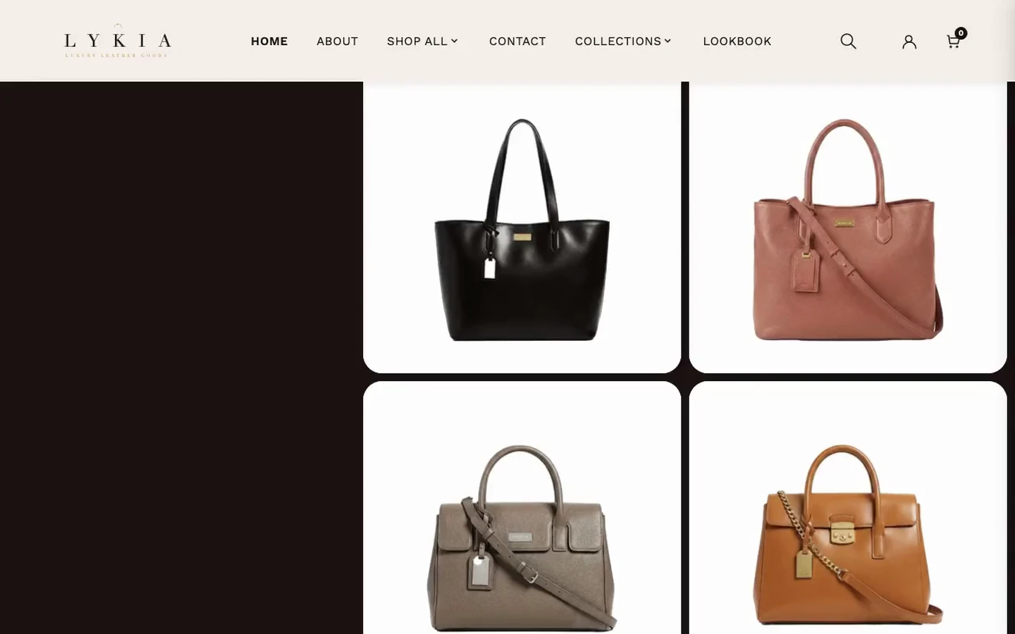
What it is for
A split layout: a text panel (three-line heading with a gradient third line, description, button) beside a grid of product cards on a contrasting background.
What it needs
One Product Card block per card — these are manual cards: each takes an Image, Heading, Price (typed as text) and Link. Nothing is pulled automatically, so keep the typed prices in step with your real ones.
Settings worth knowing
Section style has three options — Light, Dark and Transparent; the install runs it Dark with light text. The heading is built from First heading line, Second heading line and Third heading line (gradient), the third shown in a two-color gradient (Gradient Start and Gradient End); as installed it runs from gold to cream on the dark panel — pick colors that read clearly against the panel behind the heading. On hover, Hover band raises a solid band — None, Band over photo, or Photo slides up with band (as installed). Band content is Name, price and button as installed (on these cards the name and price appear only in the band), and Band content on phones switches it to Button only on screens up to 768 px as installed. Band button label, Band color, Band opacity, Band blur and Band text color style the band; the price on the band uses the accent color only when it reads clearly on the band, otherwise Band text color. Image overlay darkens the photo (0% as installed). Show border glow on hover adds the gold border, with Glow border color and Glow strength; and, extra here, Enable Magnetic Tilt, a desktop-only 3D tilt following the cursor, with Tilt Intensity capping the angle.
When it's empty
With nothing configured the section doesn't show; cards without an image show a neutral placeholder.
Hero slideshow#
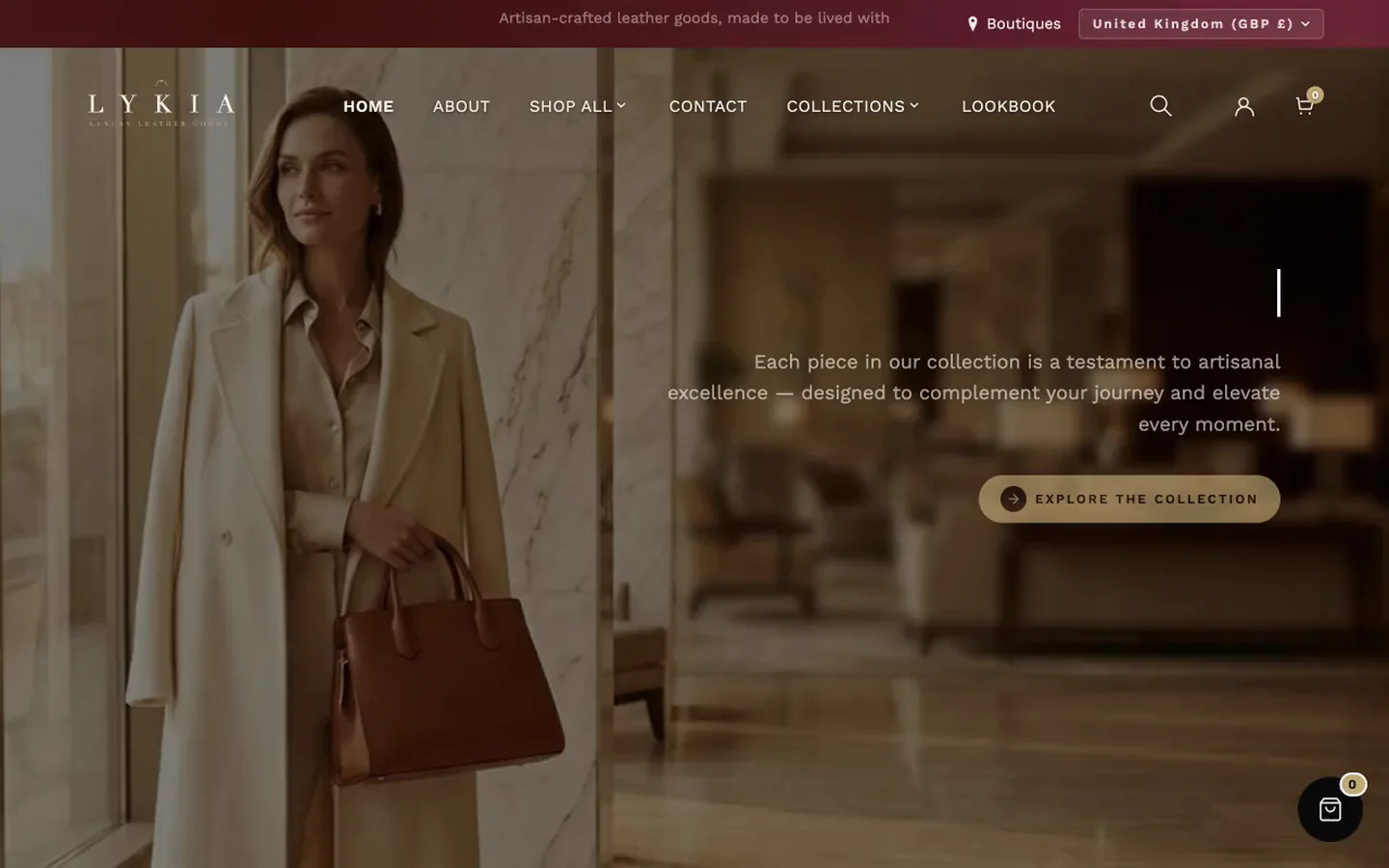
What it is for
The main home-page hero: full-screen slides with animated background images, headline, description and button per slide.
What it needs
At least one Slide block — the section does not show without one. Each slide takes a Background Image (with a portrait Mobile Image (Optional) and a mobile focal-point choice), its text, and its button.
Settings worth knowing
Content Animation (Typewriter, as installed) animates the text in. Slide Duration — Normal (6s) as installed — is how long each slide holds. Visitors can pause the slideshow with the button beside the slide dots; it also pauses while the pointer or keyboard focus is on the slides, and it starts paused when the visitor's device asks for reduced motion. Mouse Parallax makes the content follow the cursor on desktop. Overlay picks the darkening or duotone treatment laid over images (Dark, as installed). Each slide's Image Animation moves the image itself, from simple zooms and pans to cinematic reveals, with Image Filter layering a color treatment on top. Every text element has a mobile override — sizes, vertical position, button size, and optional mobile-only colors.
When it's empty
No slides, no section. A slide without an image shows a neutral placeholder graphic on its dark panel, with the slide's text over it, until you add a picture. A blank Heading or Description simply isn't printed — no stand-in text reaches your store.
Hero text reveal#
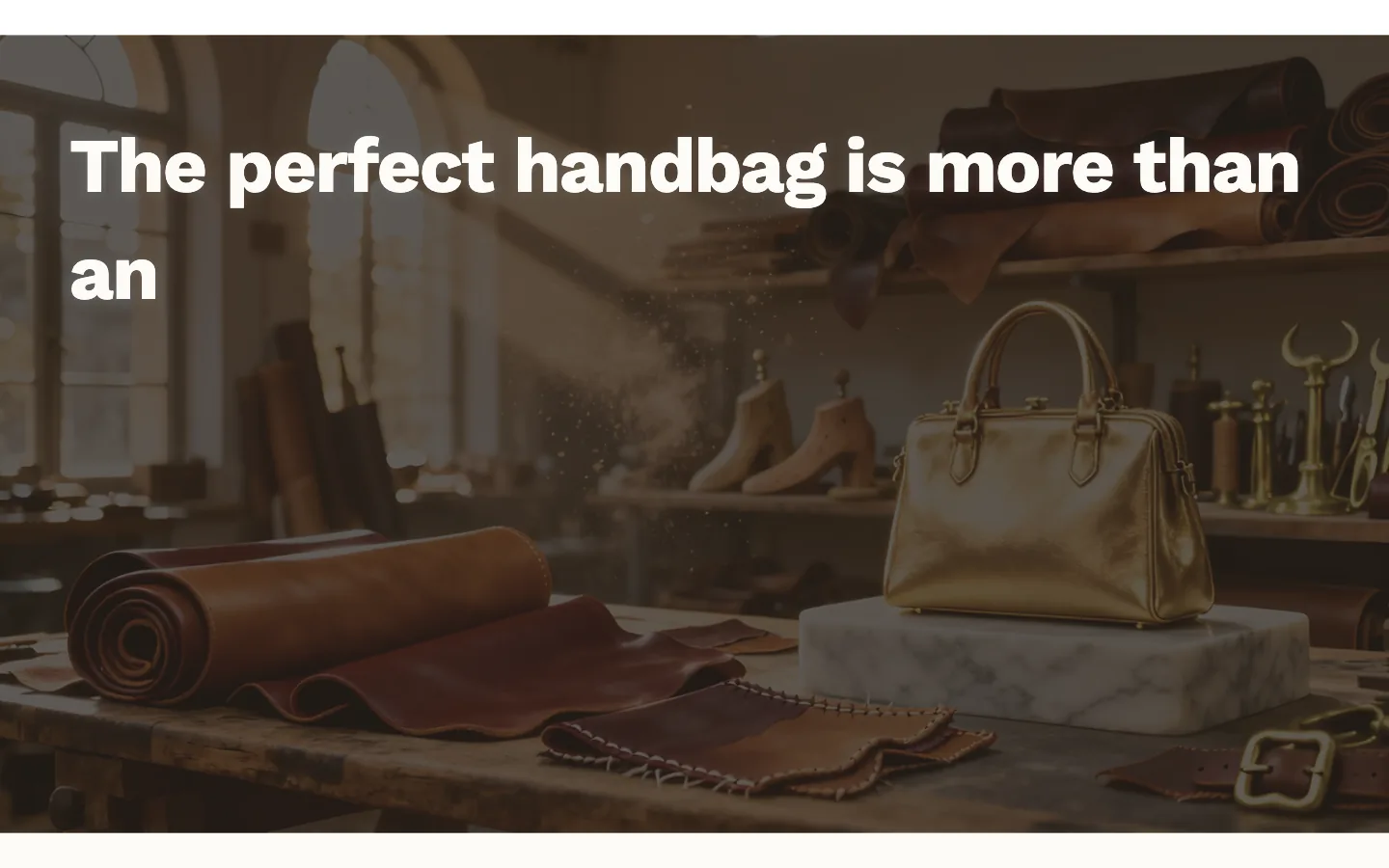
What it is for
A statement of text revealed word by word as the visitor scrolls — an editorial pause between richer sections.
What it needs
Its Text content. Everything else is optional: a background image, a subheading, a button.
Settings worth knowing
Background color shows when no image is chosen; the text and accent word colors don't switch with it, so keep them readable against it. Reveal effect chooses how words arrive (Typewriter, as installed). In the Mobile group, Same as desktop uses the desktop value. Font family's "Mixed (accent words use serif)" (the installed choice) sets accent words in the serif heading font against sans-serif body text. Accent words takes a comma-separated list of words to show in gold, italicized unless you uncheck Italicize accent words. Text color (before reveal) and Text color (after reveal) are the two ends of the reveal. As installed its Background color is gold (#C9A96E) under the dark overlay at 75%, so without a picture it reads as a warm dark brown; the text is Extra Large with "elegance." as its accent word.
When it's empty
With no statement, subheading or button text, the section doesn't show. This is also the one image-bearing section that never shows a placeholder: with no background image, its Background color simply shows through the overlay — by design, so a plain brown band here is not a bug.
Image compare#
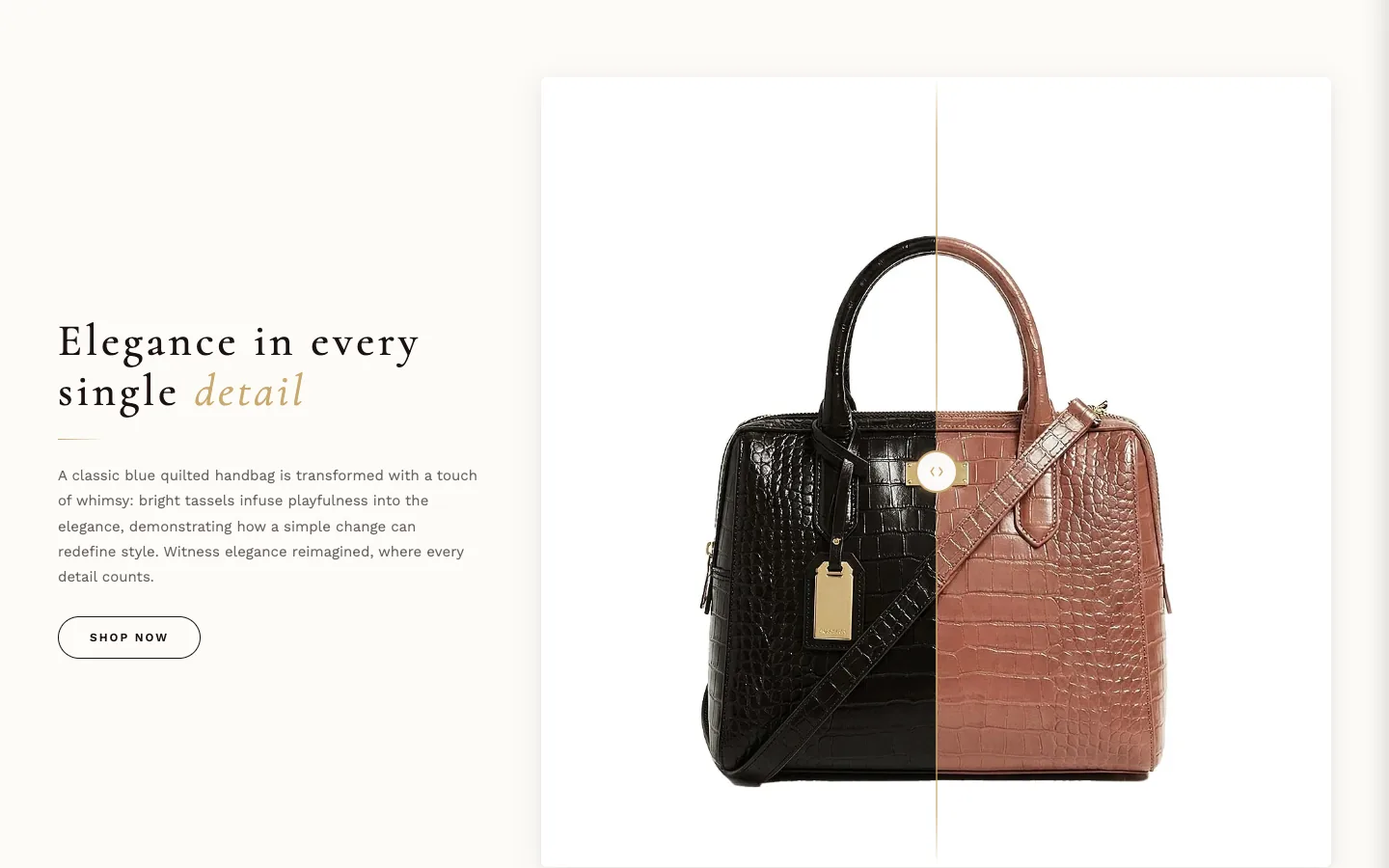
What it is for
A before/after image slider beside a text panel — for showing a detail, a process, or a transformation.
What it needs
Both images: Before image and After image. The preset ships without them, so you'll see neutral placeholders until both are set.
Settings worth knowing
Text / Image ratio splits the section between text and slider. The Text position group offers fine positioning: Horizontal alignment and Vertical alignment plus Move text left / right and Move text up / down nudges in pixels. Before label and After label caption the two halves (Show before/after labels hides them; Label color colors them, the muted text color when empty). Starting handle position sets where the divider rests before anyone drags it. Handle line color sets the divider line and the glow around the handle.
When it's empty
With nothing configured the section doesn't show; with text but missing images, placeholders stand in. The two images alone are not enough: until it has a heading, a description or a button label, the section stays hidden.
Product showcase#
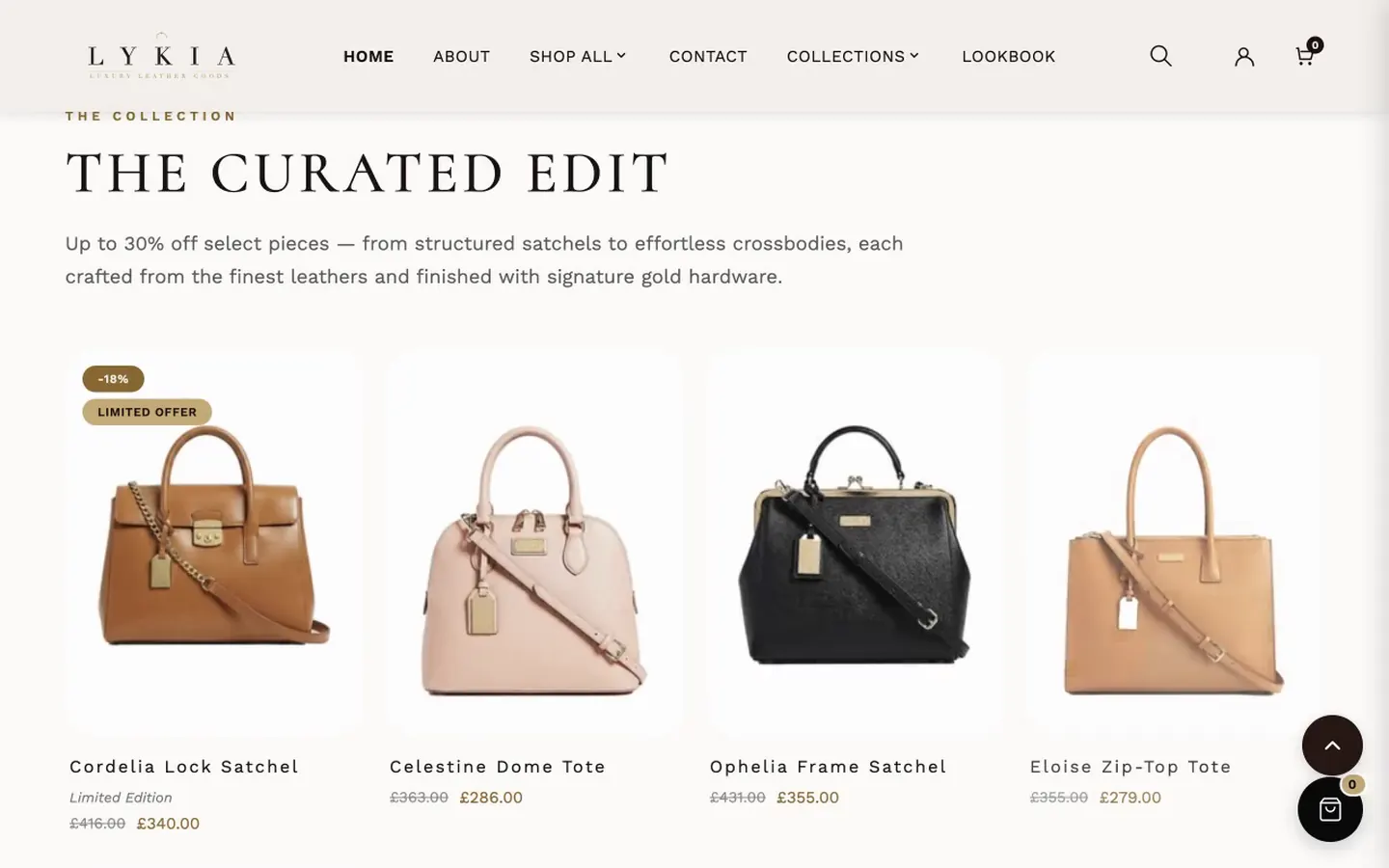
What it is for
A curated product-card grid with an editorial header — text above the heading, heading with an optional gold-italic accent word, description — and a hover band on each card.
What it needs
One Product Card block per card. Each block either picks a product in Select a product (title, price, compare price, link and image come along automatically) or uses a custom Card image and Custom link URL. The second image on hover, the image filter and badges (Show sale badge and two badge texts) are per-block; the hover band, photo effect, glow and card button are set once for the whole section.
Settings worth knowing
Section style: Dark uses a fixed dark palette; Light (colors below) and Transparent background use Heading color, Description color, Text color and Card background, which the editor shows only for those two styles; Background color shows for Light only, because Transparent lets the page background show through. Accent color colors the italic accent word, the ornament, the band price and, in the Dark style, the text above the heading — and the Add button and the small labels in the quick-add options sheet. That sheet is dark: when Accent color reads clearly on it, the sheet's small labels and the selected option use it; otherwise they switch to the light text color, and the add button's text takes whichever of dark or light reads better on the accent.
Hover
Hover band raises a solid band over the card: None, Band over photo, or Photo slides up with band (as installed — the photo rises with the band so the product stays in view). Photo hover effect — None, Zoom, 3D tilt, Shine sweep, Slide up or Blur to focus — is used when Hover band is None. Band content is Button only as installed (the name and price always sit under the card) or Name, price and button; Band content on phones is Same as desktop as installed; Button only keeps the band to the button on screens up to 768 px. Band button label, Band color, Band opacity, Band blur and Band text color style the band, and Image overlay darkens the photo on hover (0% as installed). On the band the price uses the accent color only when it reads clearly on the band, otherwise Band text color, and the compare-at price uses Band text color. Hover glow is None, Border (as installed) or Border and halo, with Glow color and Glow strength. The entrance animation follows Theme settings → Animations.
Layout
Columns (desktop) runs 2–6, with tablet and mobile counts, and Enable swipe carousel on mobile (on as installed) turns the phone grid into a swipeable row.
Card button
Show Select Options button (on as installed) adds the quick-add button to each product card; with a hover band it becomes the band's button. On a product with selling plans the button reads Choose options and opens the product page, because quick add can't offer a plan choice. Card button style is Text with arrow (as installed), Outline or Solid, colored by Button text color, Button hover text color and Button background or border color. Show view all button (on as installed, in outline style) adds a link to a collection of your choice below the grid.
When it's empty
With no heading, description, text above the heading or blocks, the section doesn't show. With a header but no blocks, it shows eight preview cards, each a neutral placeholder named "Product name" with no price and no add-to-cart — the shape of the section and nothing invented. A block with no image and no product shows the same placeholder.
Scrolling marquee#
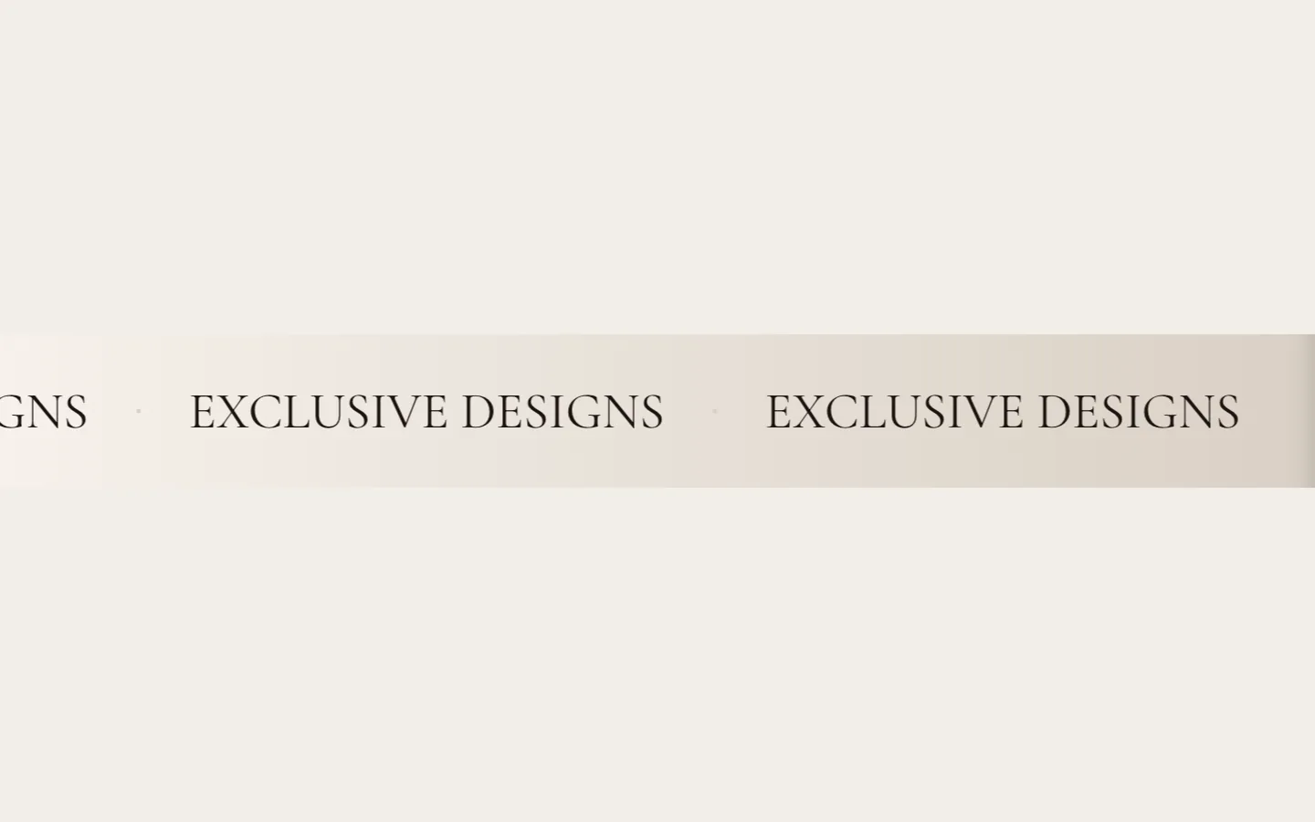
What it is for
One or two rows of horizontally scrolling text and small images — a strip of phrases, values or icons in continuous motion.
What it needs
Content blocks: First row text and First row icon / image blocks for the first row, Second row text blocks for the second (in Dual mode). With no blocks, each row falls back to its own fallback text setting (First row fallback text or Second row fallback text).
Settings worth knowing
Mode switches between one row and two, each row with its own direction, speed, background (solid or gradient) and text color. This section has its own Font Family picker, independent of the theme's fonts — Cormorant by default. Separator styles the mark between items. Enable Scroll Animation off turns the marquee into static text; Pause on Hover / Touch pauses it under the pointer or a held tap, and First row mobile speed and Second row mobile speed slow or quicken it on phones. It also pauses while one of its links has keyboard focus, and it stays still when the visitor's device asks for reduced motion. First row icon / image blocks carry their own shape, ratio, border, opacity and filter controls.
When it's empty
With nothing configured the section doesn't show.
Scrolling marquee dual#
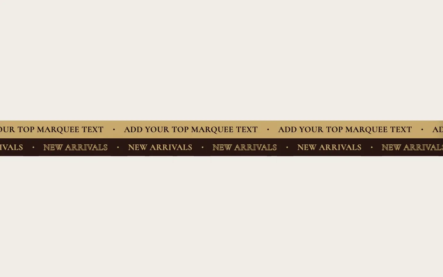
What it is for
A simpler, fixed two-row marquee: one text per row, two background colors, one speed. Use it when you want the double-strip look without Scrolling marquee's block system.
What it needs
Its two texts: Top Text and Bottom Text.
Settings worth knowing
Colors per row, Scroll Speed (seconds) (lower is faster), Pause on Hover, and shared Font Size (px) and Font Weight. It stays still when the visitor's device asks for reduced motion.
When it's empty
With neither row's text filled in, the section doesn't show; a row left blank is simply left out — no stand-in words reach your store.
Typography statement#
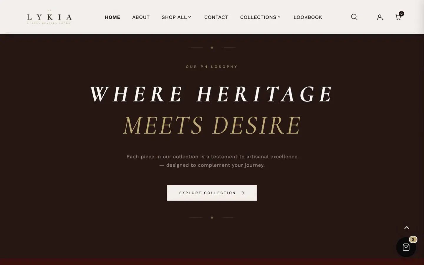
What it is for
A centerpiece of stacked text lines — each line its own block with its own style — over a dark background, with an optional button. The most flexible of Lykia's typographic sections.
What it needs
Text Line blocks: each takes its text, a Style (Solid, Gold accent, Outline, Muted), italic/bold toggles, a per-line font size (0 = automatic), letter spacing and an optional Custom color for that line. Spacer blocks add vertical gaps between lines.
Settings worth knowing
On Mobile text alignment, Same as desktop uses the desktop value. A Background image can replace the flat color, dimmed by Overlay opacity. Heading HTML tag sets the SEO heading level for the whole statement — or "Paragraph (no SEO heading)" to keep it out of the heading structure. Show button with its text, link and style closes the section.
When it's empty
With nothing configured the section doesn't show.
Video section#
What it is for
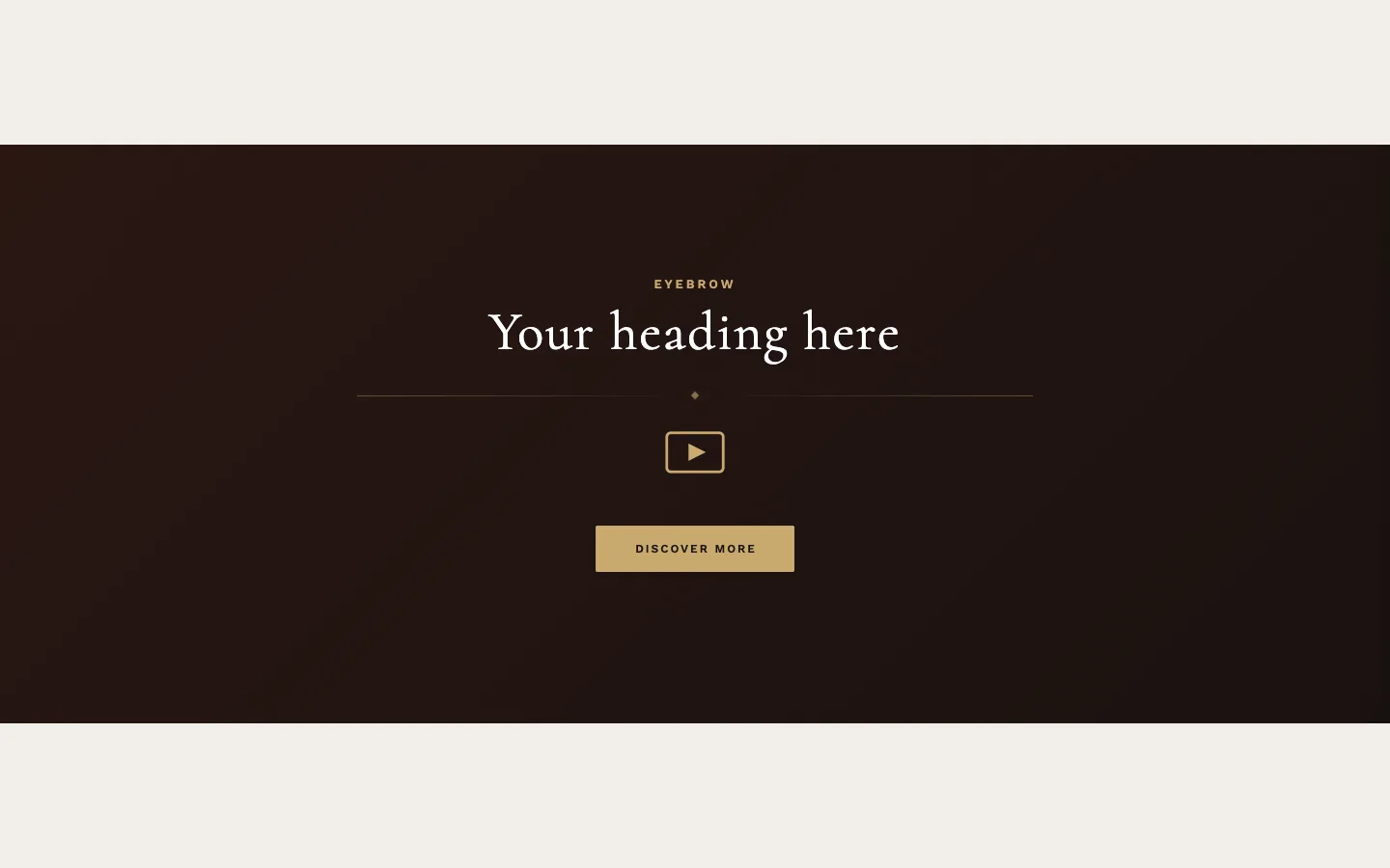
Video, three ways — chosen by Layout: Hero — Full-width background video (text sits over the video), Split — Video + text side by side, or Embed — Centered video player.
What it needs
A video, from any one of three sources: Shopify-hosted video, YouTube or Vimeo URL, or Direct MP4 URL. Add a Poster / fallback image — it shows before the video loads, and on phones whenever the video is hidden.
Settings worth knowing
In Split layout, Position picks the side and Show first on mobile the stacking order on phones. In Embed layout, Aspect ratio frames the player — the preset ships 21:9. In Hero layout, Section height, Overlay darkness and Overlay color shape the banner (the preset runs it tall with no overlay). A Pause/Play button on the banner stops and restarts the background video; when the visitor's device asks for reduced motion, the video doesn't start by itself and the poster image shows until Play is pressed. A YouTube or Vimeo background stops (showing the poster) when paused and starts again from the beginning on Play.
About phones: Hide on mobile (Hero) does exactly what its label says — when checked, the Hero layout shows the poster image instead of playing the video on screens narrower than 768px, saving data. It affects the Hero layout only; Split and Embed layouts play their video on phones regardless. It ships unchecked, so out of the box the video plays on phones in every layout — if your video isn't showing on mobile, this checkbox (in Hero layout) is the first thing to check, and a missing poster image the second. (The similarly named checkbox in Countdown banner covers that whole section; the two labels differ because the two behaviors differ.)
When it's empty
With nothing configured the section doesn't show.
Word and image collage#
What it is for
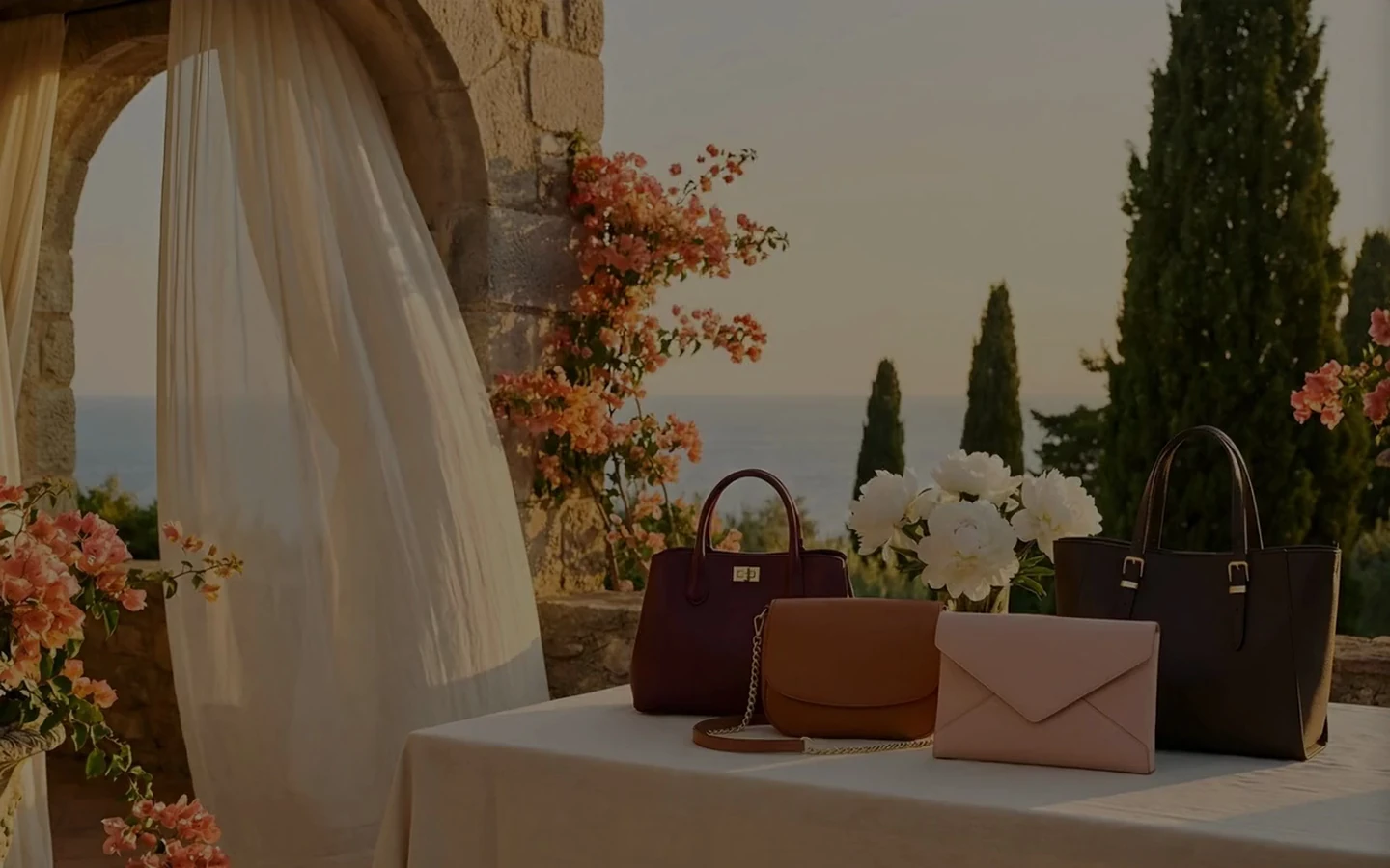
A typographic statement piece: three short lines of large words, small oval "pill" images set between them, and one very large Main word at the bottom, over a full-bleed background image.
What it needs
A Background image, then your words — each line is built from individual word settings (Line 1 first word, Line 1 second word and so on, with Make third word muted/faded on the first line and Make second word muted/faded on the second) — and up to four pill images: one per line (Line 1 pill image, Line 2 pill image, Line 3 pill image), and an optional End-of-line pill image (small) on the third.
Settings worth knowing
Overlay darkness (60% as installed) keeps the text readable over the background. Word size (desktop) and Main word size (desktop) scale the two tiers of type; Muted text opacity (65%) dims the de-emphasized words — if you lower it or Overlay darkness, check that the muted words still stand out from your photo. Animation style offers a wide range of entrances; the install runs "Bounce In" at Slow speed; when the visitor's device asks for reduced motion, the words appear at once without the entrance.
When it's empty
With every word and the Main word left empty, the section doesn't show. With words but no images, placeholders fill every slot — one behind the section and four different ones in the pills, deliberately varied.