
Header#
The header area holds two sections, grouped together in the theme editor.
Announcement bar#
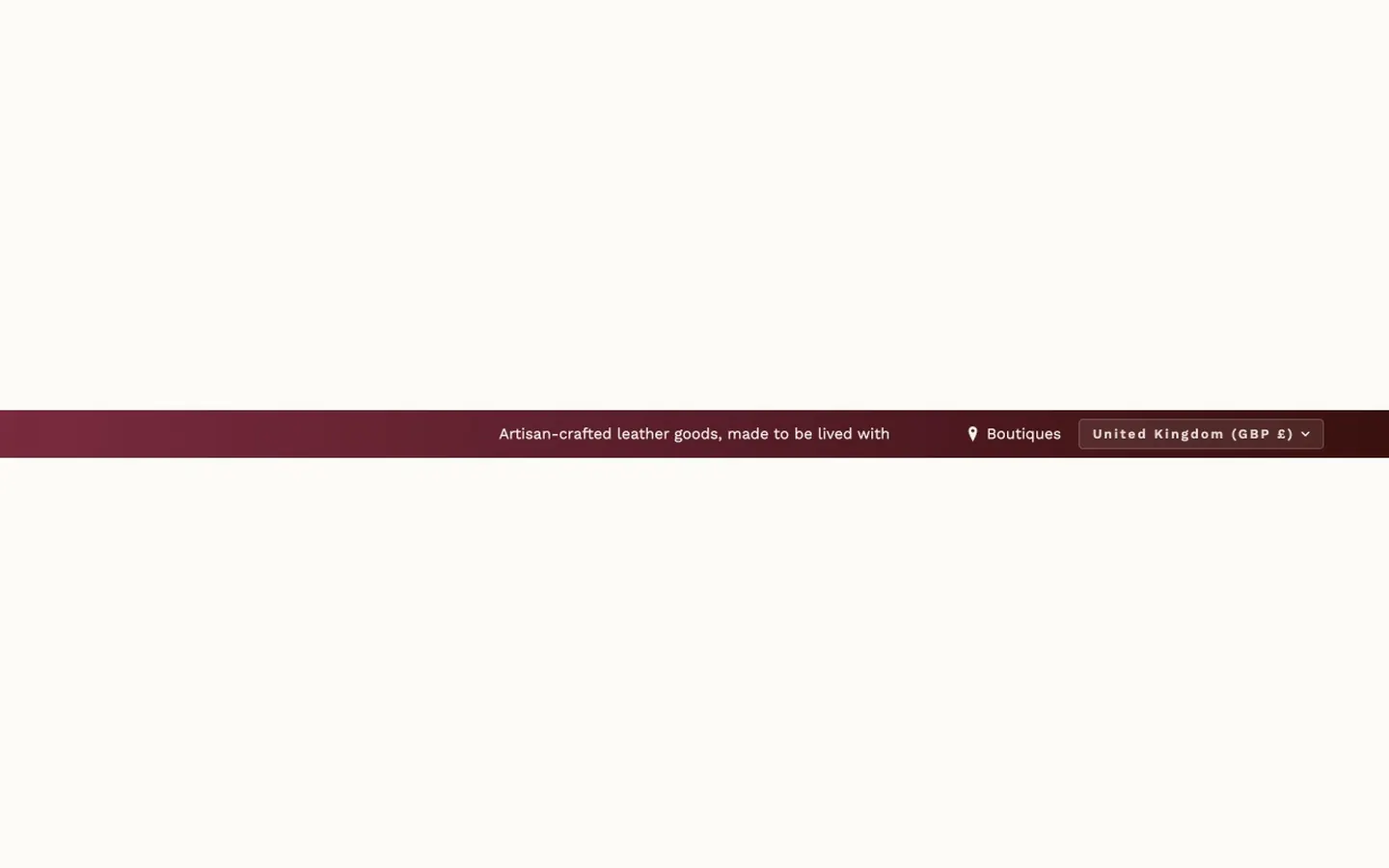
What it is for
The thin bar above the header: an announcement in the middle, optional social icons and a phone number on the left, an optional store-locator link and country/region selector on the right.
Where it can go
It ships in the header area and can only be placed there — it is not one of the sections you add to templates.
What it needs
Only its own settings. Turn on Show social media icons and fill in the URLs you want; the icons appear for those. Under Announcement Text, Text is the message and Link (optional) makes it clickable.
Settings worth knowing
Under Mobile Settings, Mobile layout decides what phones show — Show all elements, Text only or Compact spacing. With Show all elements or Compact spacing, Show social media and phone number on mobile and Show store link, country/region and language selectors on mobile decide whether the left and right sides show on phones; Text only always hides both. Screen reader label names the bar for assistive technology. The background can be a flat color or a two- or three-color gradient (Enable gradient background, with direction and an optional moving effect). Animation type offers a long list of entrance and attention effects for the announcement text, with Loop animation controlling whether the moving ones repeat (it applies to Pulse, Bounce, Typewriter, Glow, Shake, Wave, Flash, Swing and Rubber band; Marquee and Rainbow gradient always loop, and the other effects play once). Looping effects (such as Marquee and Rainbow gradient) run continuously. When a visitor's device is set to reduce motion, the bar's animations and its moving gradient stay still. Gradient animation speed and Animation speed run from 1 (slowest) to 10 (fastest), and every step is a different speed. Show country/region selector shows a country/region selector with each country's currency, e.g. "United Kingdom (GBP £)", when the store sells to more than one country/region; Show language selector adds a language selector, which appears when the store has more than one published language.
When it's empty
Uncheck Show announcement bar to remove the bar entirely.
Header#
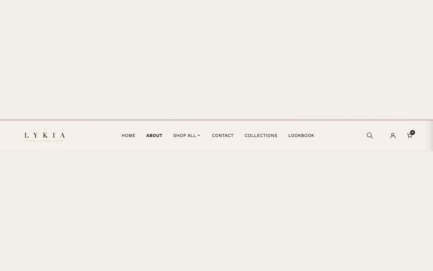
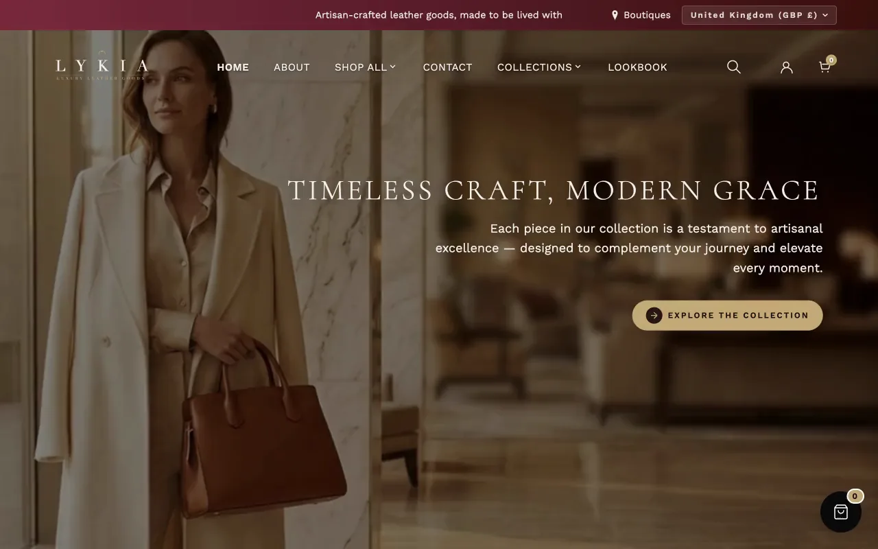
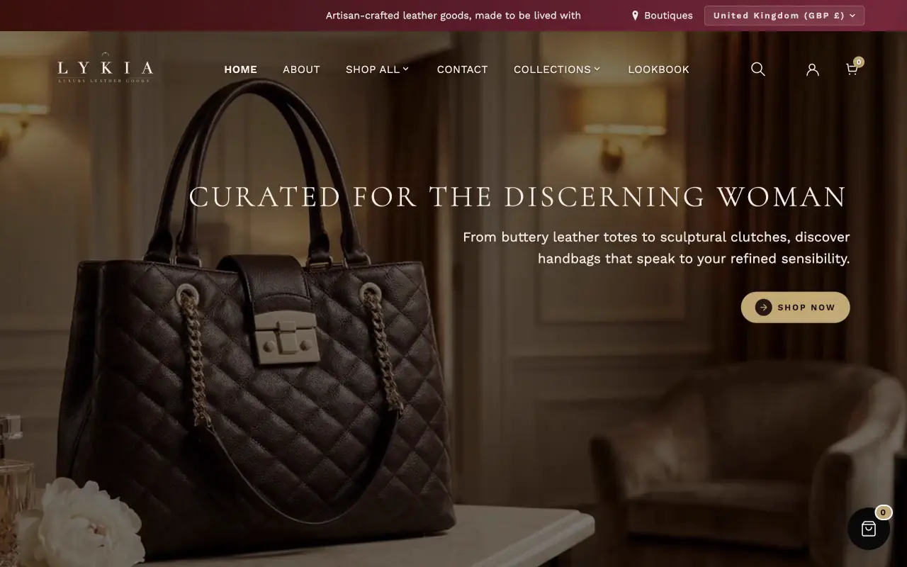
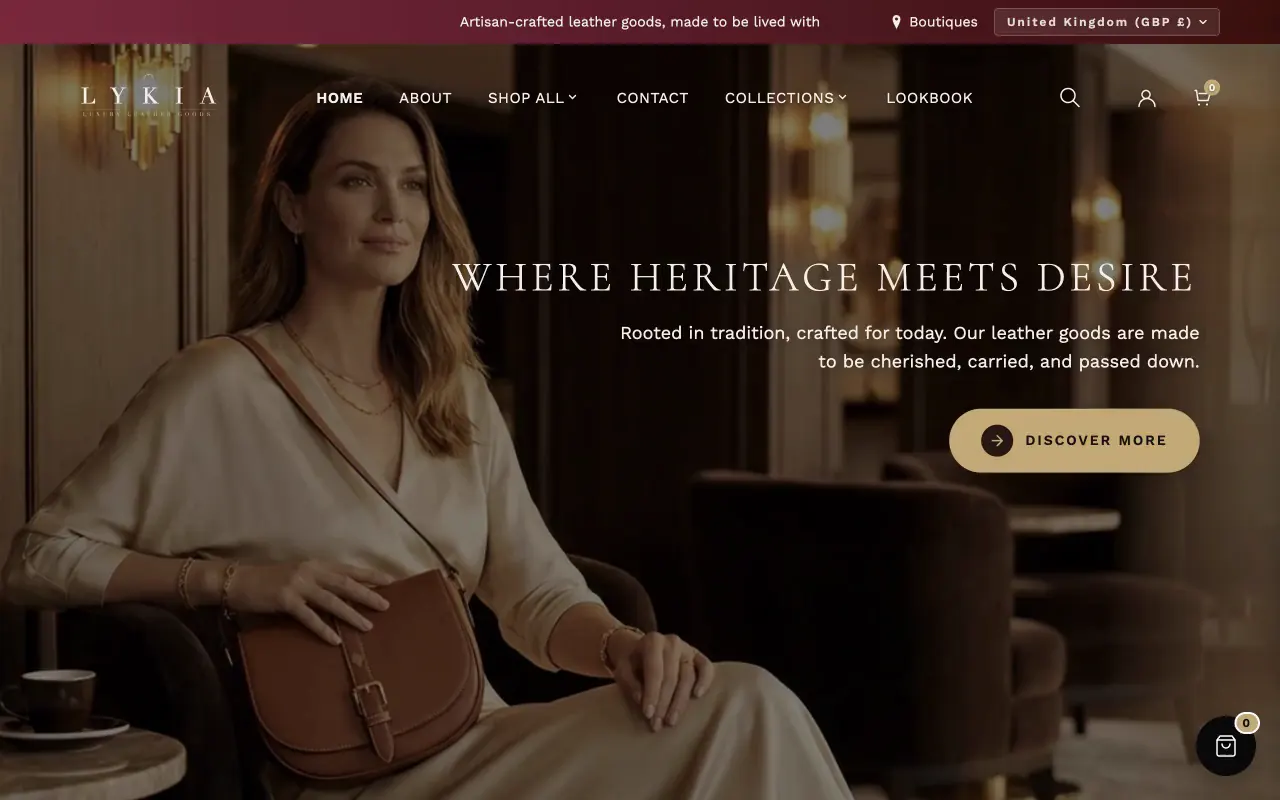
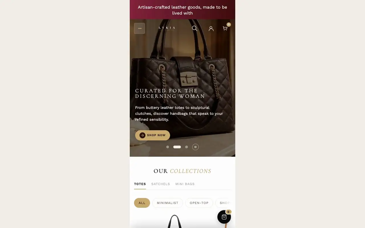
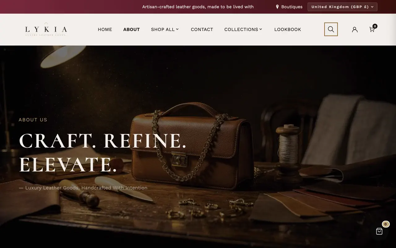
The header is part of the theme rather than a section you add, and it is configured here. Its pieces:
- Logo. Two slots: Logo (light — for hero overlay) shows over transparent hero backgrounds; Logo (dark — for solid header) shows once the header has a light background (on every page except the home page, and on the home page after scrolling). Upload both so the logo stays visible in both states; Logo height sizes them. Without a logo image the store name is the logo: Long store name on phones wraps a name that is still too long to two lines or shortens it with an ellipsis once it has shrunk as far as Store name minimum size on phones, so the header icons always fit (these appear when no logo image is set).
- Navigation. Main menu points at a menu from Online Store → Navigation — the main menu by default.
- Mega Menu. On screens wider than 1200 px, a menu item with three or more sub-items opens the mega menu. Background color, Mega menu text color, Accent color and Muted text color color it, Vertical padding and Category name font size set its spacing and type, and Show gold corner ornaments on images frames its images with gold corners.
- Features. Show search toggles the search icon; Customer account menu picks the menu shown to logged-in customers.
- Mobile Settings. A generous set of controls for the slide-out phone menu: panel colors and width, its own logo height, a greeting (Text above greeting, Greeting text, Brand subheading), an optional featured product card (Show featured product card, with Text above featured product above it) drawn from a collection you choose in Featured product from collection, a country/region selector, a language selector (Show language selector; it appears when the store has more than one published language), the gold bar at the top, and the hamburger button's colors. Show icon borders draws the same thin frame around the menu, search, account and cart icons on tablets and phones; turn it off for plain icons.
- Colors. Solid background color and Solid text color set the header on every page except the home page, and on the home page once it scrolls (it starts transparent there). Set to exactly #FDFBF8 (background) or #1C1210 (text), they follow Theme settings → Colors → Background and Heading text instead; as installed the background is #F5F0EA and the text color follows Heading text.