
Collection and collection list#
The collection template is the Collection section plus optional companions; the collection-list template pairs Collections hero with Collections grid.
Collection#
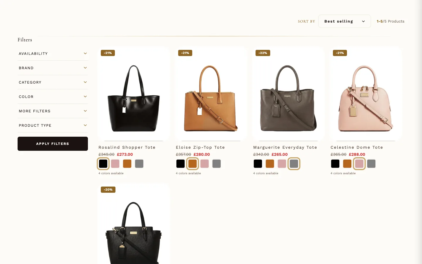
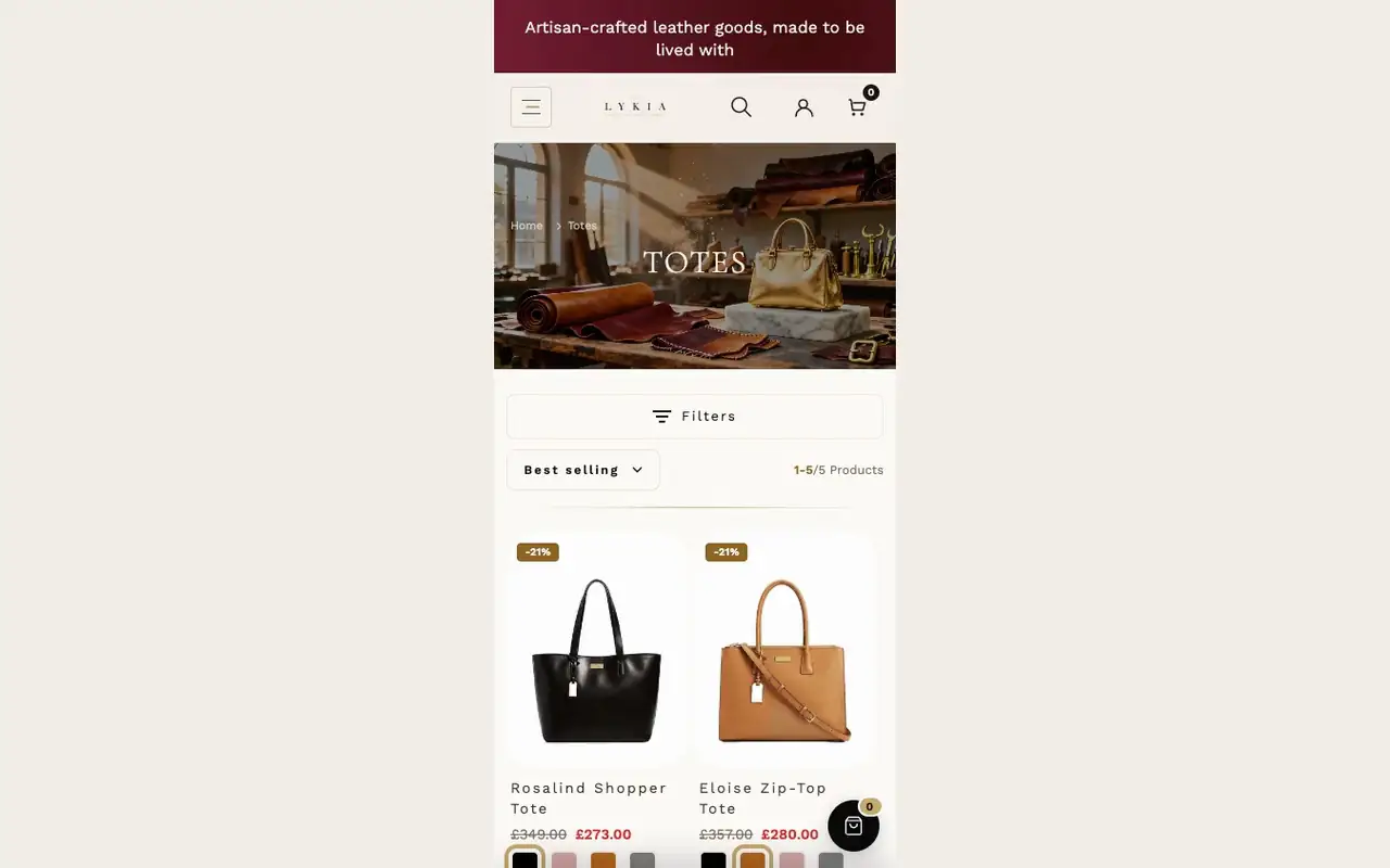
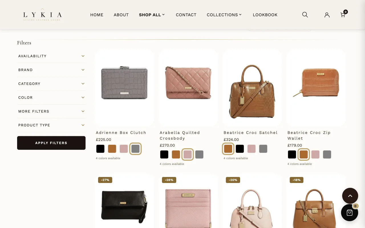
The collection page itself — the product grid with Lykia's card treatment. Part of the collection template; configure rather than add.
Settings worth knowing
The Hover and Glass Panel group sets this grid's own card hover: Hover style picks Slide-up glass panel (with its Glass panel button label), Gold glow only (no panel) or Image zoom only. Glass panel opacity is 65% as installed; lower values show more of the photo, so check that the text still reads clearly over light photos. On the glass panel the product name and compare-at price use Glass panel text color; the price uses Glass panel price color only when it reads clearly on the panel over light and dark photos, otherwise Glass panel text color. Products per page sets the grid size, and Enable infinite scroll swaps pagination for automatic loading as the shopper scrolls.
When it's empty
A collection with no products shows the page's own "no products" message — the section is the page, so it never disappears.
Category carousel#
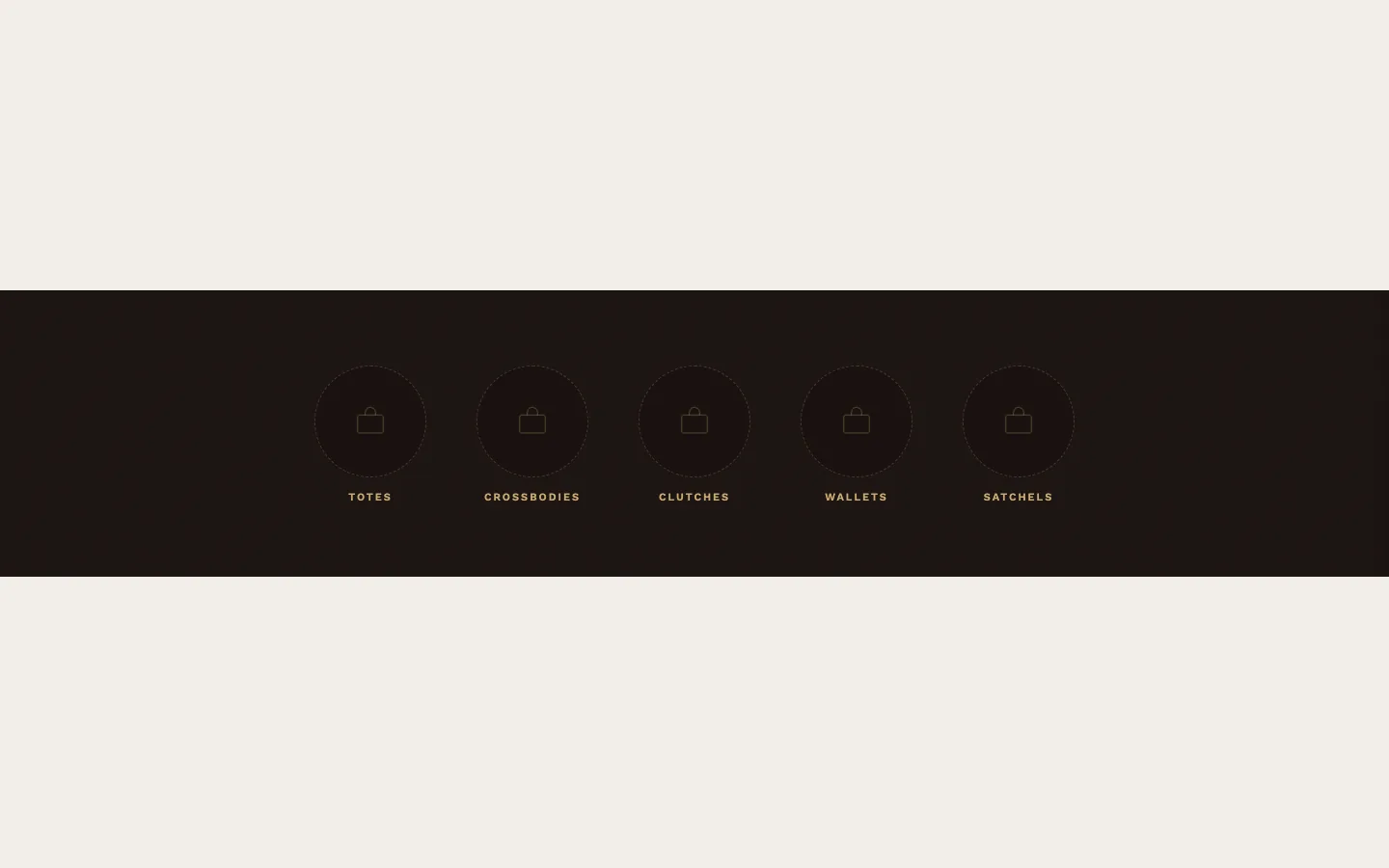
What it is for
A horizontal strip of small round category thumbnails with labels — quick navigation across collections, placed above a collection's grid in the preset. As installed it has no Category blocks, so it stays hidden until you add some or fill the metafield below.
What it needs
One Category block per item: a Thumbnail image, an optional Label (blank uses the collection's title), and a Collection.
Metafields it reads
On a collection page, the collection's custom.carousel_heading metafield, when filled, overrides the section's Heading, and a filled custom.carousel_categories list replaces the Category blocks for that collection.
Settings worth knowing
An optional heading with its own type and entrance-animation controls, Thumbnail size (80/120/160px) and Item gap. Show film grain texture lays a faint texture over the strip, and Show navigation arrows adds the arrows.
When it's empty
With nothing configured the section doesn't show.
Collection hero banner#

What it is for
The banner over a collection page: heading, description, breadcrumbs, optional background image, and an optional row of category links.
What it needs
Nothing beyond the collection it sits on: leave Heading blank to use the collection's title, and Description blank to use the collection's description — the recommended arrangement, since the banner then follows each collection automatically. The preset ships it that way on the collection template. Category link blocks add a thumbnail row, each pointing at a collection.
Metafields it reads
A collection's custom.hero_heading, custom.hero_description and custom.hero_image metafields, when filled, override Heading, Description and Background image for that collection (a blank Background image with no metafield uses the collection's own image). When custom.carousel_categories is filled, the Category link row is hidden here; the Category carousel section, where it is placed, shows those categories instead.
Settings worth knowing
Background color (fallback) shows when no image is set. Minimum height (600px as installed), Text alignment (left as installed), and per-element animation controls shape the banner; the Luxury Treatment group adds grain and an optional gold ornament (off as installed).
When it's empty
With nothing configured at all it doesn't show — but on a collection page it inherits the collection's own title, so in practice it shows. Placed outside a collection page, for example on the home page, it has no collection title to fall back on, so only its category cards show, with no banner or heading above them: give it a Heading there, or keep it on collection pages.
Collections grid#
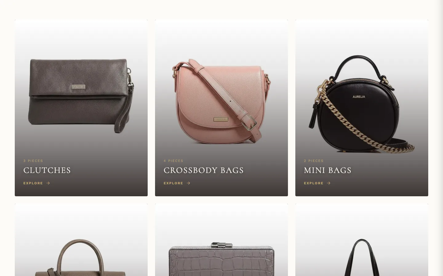
What it is for
The collection-list page's grid: one card per collection.
What it needs
Your collections. Show empty collections decides whether collections with no products appear — it is checked as installed, so empty collections show until you uncheck it.
Settings worth knowing
Columns on desktop, Gap between cards, Card image ratio, and card content toggles: product count, description, and the Explore link (text editable).
When it's empty
A store with no collections sees the section's own empty message (an icon, a title and a line of text) — like Collection, this section is the page.
Collections hero#
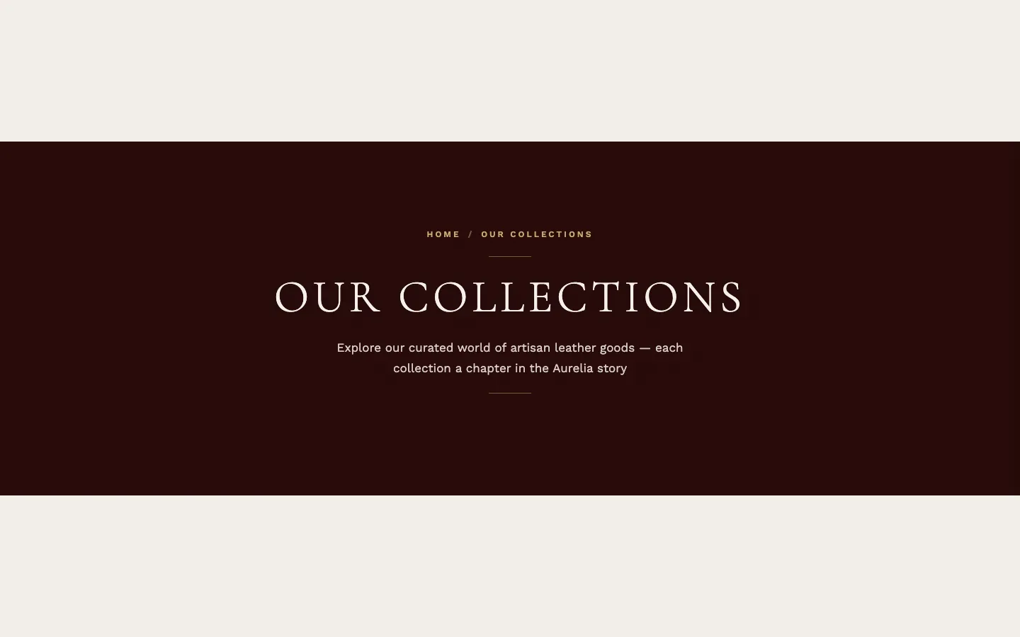
What it is for
The banner over the collection-list page — heading, description, breadcrumb.
What it needs
Nothing beyond its text.
Settings worth knowing
As installed it runs a written description, a deep red-brown background, and 500px minimum height. Text colors, alignment, grain and ornament round it out.
When it's empty
With no Heading and no Description it doesn't show.
Promo banner cards#
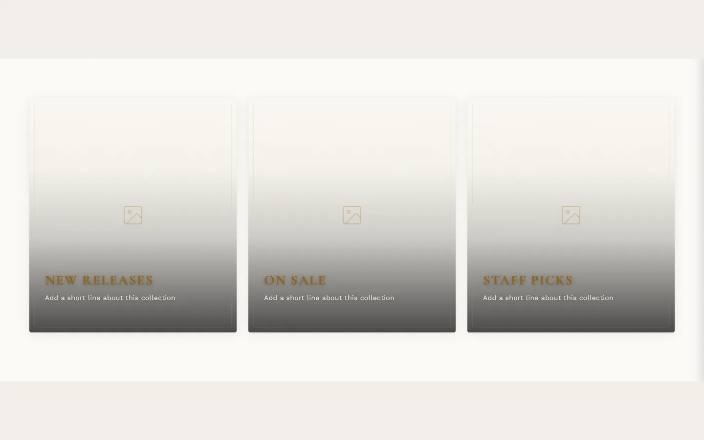
What it is for
A row of tall promotional image cards — heading, subtitle and link per card — for cross-promoting collections or campaigns from a collection page.
What it needs
One Banner card block per card: Background image, Heading, optional Subtitle and Link. As installed it has no Banner card blocks, so it stays hidden until you add some or fill the metafield below. A card without a Link is not a link: it shows its image, heading and subtitle but isn't clickable and has no Explore cue — set a Link to make the card open your collection or page.
Metafields it reads
On a collection page, the collection's custom.promo_heading metafield, when filled, overrides Section heading, and a filled custom.promo_banners list replaces the Banner card blocks for that collection.
Settings worth knowing
An optional Section heading with its own typography sits above the row; the two overlay opacities run a gradient from the top of each card to the bottom so the text stays readable; Card height, Card gap and Card border radius shape the cards.
When it's empty
With nothing configured the section doesn't show.