
Product page#
The product template is built from the Product section plus the optional sections below it. Product, listed first, is what you see when you open the template.
Product#
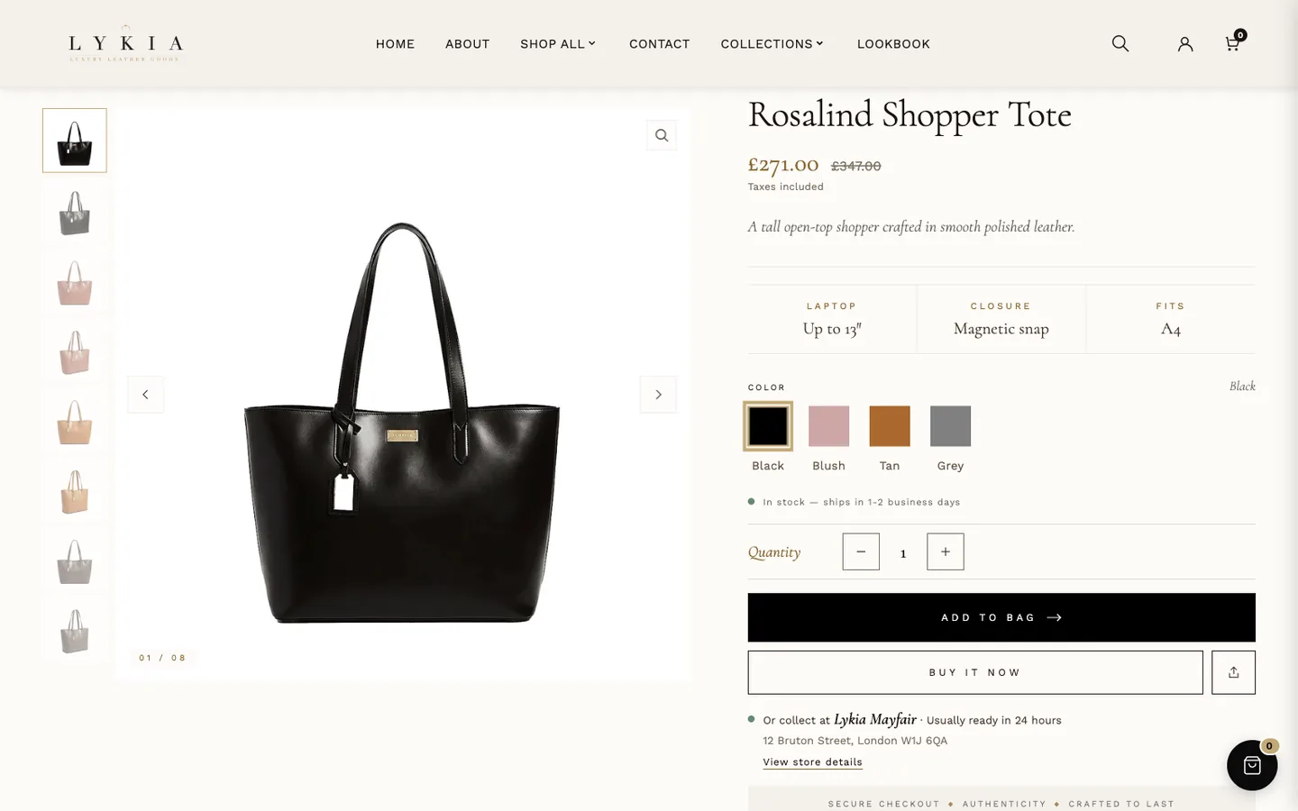
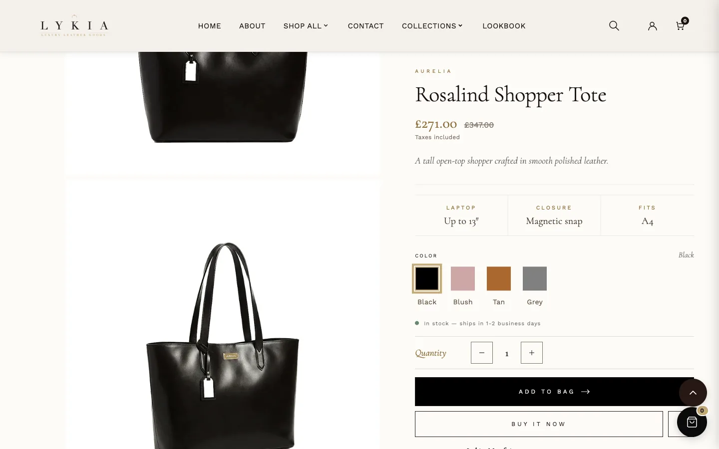
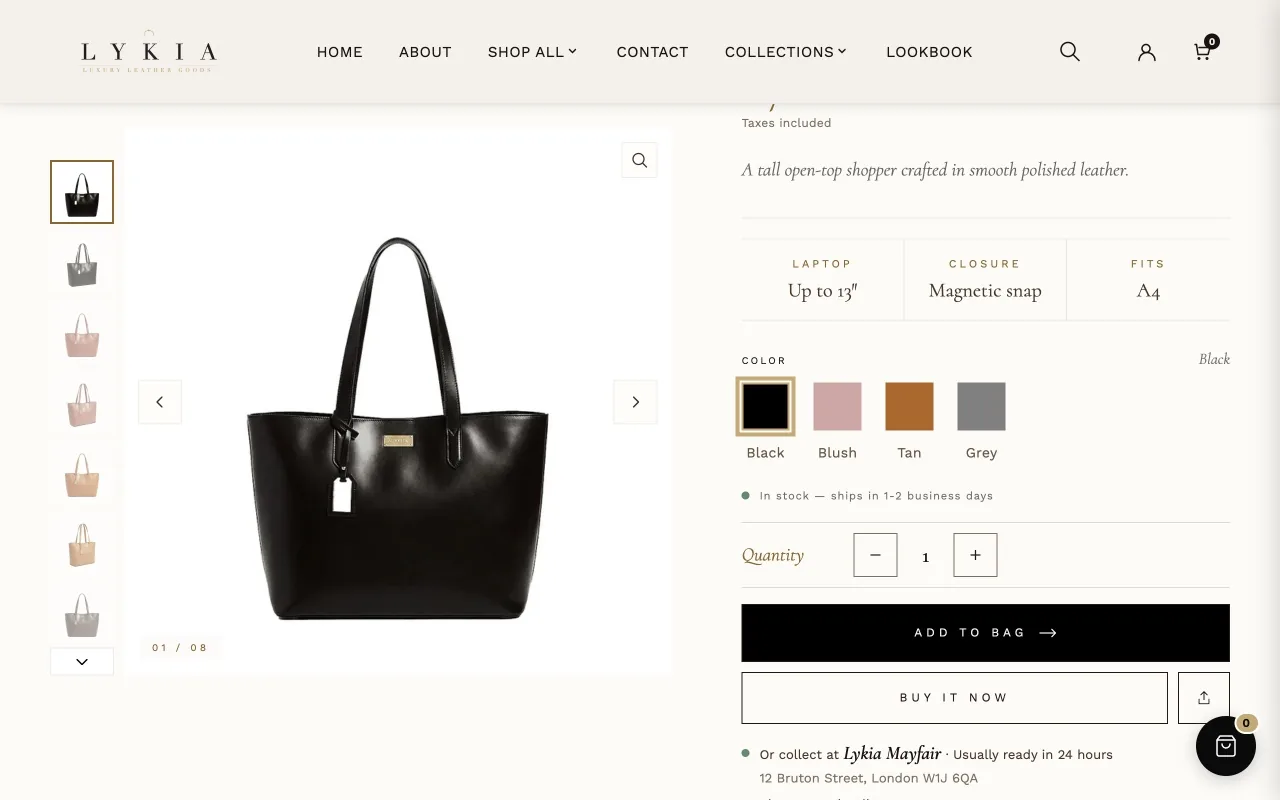
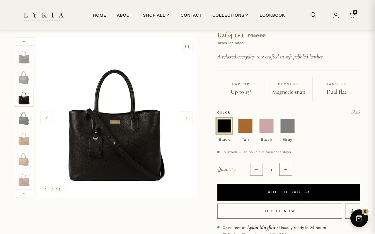
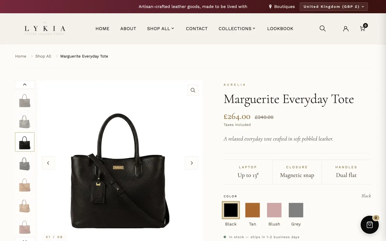
The product page itself — gallery on one side, buy box on the other. It is part of the product template; you configure it rather than add it, and the editor offers it on product templates only. Everything in the buy box is a block you can reorder or remove: Vendor, Title (with an underline toggle), Price (with an optional ornament divider), Variant picker, Buy buttons, Trust badges and share, Description, Delivery, Returns and Care, plus Custom Liquid blocks and an app block slot. A fresh install lists the first ten in that order.
Description, Delivery, Returns and Care share one row of tabs. The row sits where the first of those blocks sits, and its tabs follow the order of the blocks. A tab appears only when its block has something to show — Delivery needs a cost or a time on a row, Returns some text, Care at least one item or the product's lykia.care_instructions metafield — and removing a block removes its tab.
The settings, by what they feed:
- Media gallery. Desktop media layout is Carousel with thumbnails (photo stays) as installed, or Stacked photos (details stay): every photo in one column that scrolls while the product details stay in view — on screens 960 px and wider; smaller screens show the carousel. Sticky media on desktop (on as installed) keeps the media in place while the details scroll beside it; phones scroll normally. Fit media to screen height (on as installed) sizes the image and its thumbnails to the browser window below the header. Image fit is Fill the frame as installed; Show the whole image fits each image in the frame without cropping. Desktop thumbnail position puts the thumbnails Beside the image (as installed, on screens wider than 1024 px) or Below the image.
- Buy Box. Add to cart button text is "Add to Bag" as shipped. When your prices include tax, the price carries a "Taxes included" note on its own. The buttons themselves are styled in the Buy buttons block (see The Buy buttons block, below).
- Sale. Sale badge label adds a badge beside the price when the selected variant is on sale; leave it blank to hide the badge.
- Spec Strip. Show spec strip (on as installed) shows three label/value cells — left, middle and right, labeled Dimensions, Cards and Phone as shipped — at the top of the Variant picker block: they sit under the price in the shipped block order, move when you move that block, and disappear if you remove it. Each label and value has a setting here, but a product's own metafields win:
lykia.spec_1_labeltolykia.spec_3_labeloverride the labels andlykia.spec_1_valuetolykia.spec_3_valueoverride the values, per product. Rename the labels to suit what you sell. - Luxury Styling. Accent color sets the gold of the selected option buttons, the zoom lens, the low-stock dot and the buy box's highlights. Accent hover color is used on hover: the option buttons' border and light tint, the selected option's fill (on devices with a mouse or trackpad; its text uses your heading color when it reads clearly, otherwise your background color, or black or white) and the breadcrumb links. Small gold text (badges, text above headings and labels) uses Theme settings → Colors → Gold text. The button settings are in the Buy buttons block, not here.
- Gallery. Maximum width, Background, Active thumbnail border, and the hover zoom: Hover zoom level is the magnification and Magnifier circle size the lens.
- Pickup. Show pickup availability surfaces Shopify's local pickup for any variant a location has pickup enabled for (Settings → Shipping and delivery → Local pickup); uncheck it and the pickup line under the buttons goes.
- Stock Counter. Low stock threshold decides when the low-stock message appears; Low stock message uses
[count]for the live number. In stock message and Out of stock message have their own fields. - Vendor. Show vendor, and an optional Text color — leave it blank to keep the theme's gold.
- Price. Sale price color (in the Price block) colors the price when the selected variant is on sale; leave it blank to keep the theme's gold.
- Trust badges and share. Show trust badges switches the cream band of up to three short reassurance lines (First badge to Third badge) on or off; Show share button switches the Share button on or off — it sits beside Buy it now, or beneath the badges when the Buy buttons block is removed.
- Description, Delivery, Returns and Care. Each has a Tab label. Delivery holds a top, middle and bottom row of name, cost and time; Returns an opening and a closing paragraph; Care up to five short items, all of which a product's
lykia.care_instructionsmetafield replaces for that product. A Care block you add yourself starts empty.
Thumbnail rail and keyboard. The thumbnails are one Tab stop. The arrow keys move between them — Up and Down when the thumbnails sit beside the image, Left and Right when they sit below — and Home and End jump to the first and last; the page stays still while the highlight and the image counter move. When there are more thumbnails than fit, the rail's page arrows scroll it for mouse users and stay out of the Tab order.
The Buy buttons block
Template › Product › Buy buttons holds every button style setting: Show dynamic checkout buttons first, then the Add to bag, Buy it now, Quantity and Pickup panel groups. As shipped:
- Show dynamic checkout buttons (on) shows Buy it now, or one wallet button such as Shop Pay when the store offers it — on a product page Shopify picks a single button. Wallet buttons appear once you activate accelerated checkout for Shop Pay or another provider such as Apple Pay, Google Pay, Amazon Pay or PayPal. Branded wallet buttons keep Shopify's own colors and logo; only the Buy it now group's Height, Height on mobile and Corner radius reach them. In the words of the Shopify Help Center: "You can customize the color and fonts of your unbranded accelerated checkout buttons, but you can't customize the branded versions of the buttons."
- Add to bag. Style is Custom as installed: black (#000000) with light text (#F5F0EA), a bronze hover (#846A39) and the inner line off. Dark classic is a darker ink fill (Theme settings → Colors → Heading text) without the line, and Gold accent is an espresso fill with a champagne inner line. Custom shows your own colors: Background color, Text color, Hover background color, Hover text color, Border color and Show inner line, with Inner line color while the line is on; pick text and background colors that read clearly together. The sticky bar button follows this whole group.
- Font (Body font, or Heading font), Text size (11–16 px, 12), Letter spacing (0–6 px in half steps, 4), Text case (Uppercase, or As typed) and Show arrow icon (on, the arrow on Add to bag) set the Add to bag lettering. Heading font uses the heading font at weight 500; if your heading font doesn't include that weight, another weight the font does include is used. Height (44–60 px, 58) applies to screens wider than 749 px and Height on mobile (44–60 px, 58) to screens up to 749 px wide; Corner radius (0–30 px, 0) rounds the corners.
- Buy it now. This group shows only while Show dynamic checkout buttons is on, under the line "Applies to the Buy it now button. Wallet buttons such as Shop Pay keep their own colors; only height and corner radius apply to them." Style is Custom as installed: off-white (#FDFBF8) with dark text and border (#2A1713) and a light cream hover (#F5F0EA). Outline is transparent, with the theme's primary color for the text and border, Filled is a light warm fill of the primary color, and Custom shows your own colors: Background color, Text color, Hover background color, Hover text color and Border color, with the same note on readable colors. Font, Text size (11–16 px, 12), Letter spacing (0–6 px, 4) and Text case work as they do for Add to bag. Height (44–55 px, 52), Height on mobile (44–55 px, 52) and Corner radius (0–30 px, 0) size Buy it now and the wallet button.
- The share button takes Buy it now's height, corner radius and border color. When Buy it now is hidden — Show dynamic checkout buttons is off, or the variant is sold out — the share button sits beside Add to bag and takes Add to bag's height, corner radius and border color.
- Quantity. Quantity buttons are Round or Square; Square corners follow the Add to bag Corner radius, up to 22 px.
- Pickup panel. Pickup panel background color (white) and Pickup panel text color (dark gray, #333333) match the cart drawer; the text color covers the title, store names, status and address, so keep it readable against the background. Store name weight (Regular, Semibold or Bold; Semibold as shipped) sets how heavy the store name looks, under the buttons and in the panel. It loads your heading font's real italic at that weight, or the nearest heavier weight the font has (a lighter one only if there is none heavier), and never a fake bold. If the heading font has no italic, store names show upright.
The buttons on the page
Top to bottom: a Quantity line — the label with − and + buttons, round or square; Add to bag at full width, with the optional arrow; Buy it now with the share button beside it (the share button shows while Trust badges and share › Show share button is on); and, under the buttons, the pickup line. A sold-out variant turns Add to bag into a disabled Sold out button and hides Buy it now, so the share button moves beside Add to bag; a pre-order variant's button reads Pre-order.
What you can switch off
Uncheck Show dynamic checkout buttons and only Add to bag remains, the Buy it now group leaves the editor, and the share button sits beside Add to bag while share is on. Switch the share button off and Buy it now takes the full width. Uncheck the Product section's Show pickup availability and there is no pickup line.
The pickup line and panel
The line reads "Or collect at" the store and its ready time, with the store's address on one line beneath (street, city and postal code; the country only when the store is in a different country from your shop), and a text link under it: "Check other stores" when several stores stock the variant, "View store details" when one does. The link always opens the pickup panel — from the right on desktop, as a bottom sheet on phones — listing each store with a green dot when the variant is available there or a hollow dot when it isn't, the store name, the ready time or "Pickup currently unavailable", and the address. Selected marks the store the page is showing. Choosing a store only changes what the product page shows; the customer chooses the pickup location at checkout.
Metafields it reads
lykia.spec_1_label to lykia.spec_3_label and lykia.spec_1_value to lykia.spec_3_value override the Spec Strip settings; lykia.care_instructions replaces the Care items; lykia.lead_description, when filled, adds a short lead line beneath the price, and has no setting of its own.
When it's empty
The Product section always shows on a product page — it is the page itself. Remove a block and that part of the buy box goes; a tab whose block has nothing to show leaves no tab; with the Buy buttons block removed, the sticky add-to-bag bar still works and uses the Gold accent defaults.
Complete the look#
What it is for
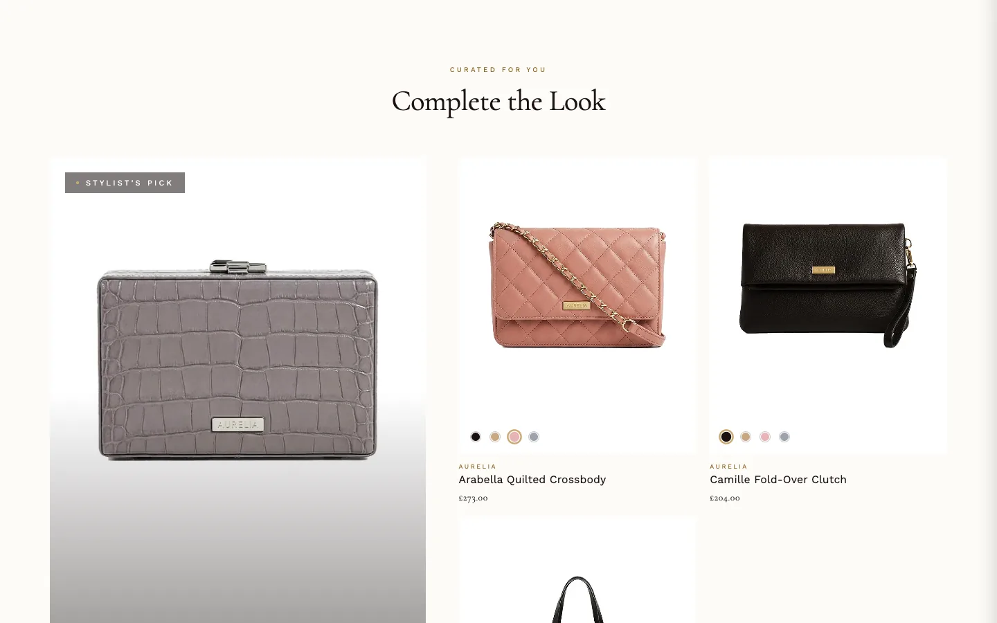
A styled companions row: a featured product on the left with an editorial quote, up to three companion products, and a "view all" card.
Where it can go
The preset places it on the product template; it can be added elsewhere, where choosing a Featured product matters more (on a product page, leaving it unset uses the current product).
What it needs
Companion products, one of two ways: add up to three Companion product blocks and pick a product in each — or set the product's own Complete the look metafield (lykia.complete_look_products), which, when filled, replaces the blocks for that product. The View all card block (or the View all URL setting when no block is added, or the block has no collection) closes the row with a link to a collection.
Settings worth knowing
Text above featured product name heads the featured product; Show Stylist's Pick badge and Badge label add the badge; Editorial quote and Attribution dress it. Discover link label words the link to the featured product ("Discover" as installed); View all label ("Discover the full collection") and Count text (shown exactly as typed, nothing when blank) word the closing card; a View all card block's own Label, and its Count text when filled, take their place.
When it's empty
It shows only once it has companion products. A fresh install picks none — the theme carries no demo product handles — so Complete the look stays hidden until you pick products in its Companion product blocks or fill a product's lykia.complete_look_products metafield. Only the Add section preview shows a sample row; in the theme editor and on your store it stays hidden until then.
Discover: recently viewed#
What it is for
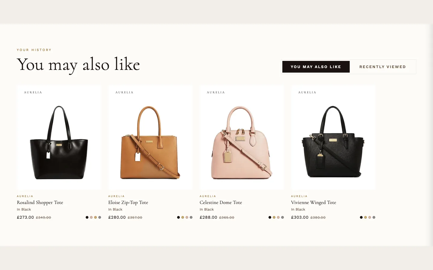
A two-tab product rail: "You may also like" (Shopify's recommendations, falling back to the product's first collection, or to the whole store when the product is in no collection) and "Recently viewed" (the visitor's own browsing history).
Where it can go
Anywhere; the "You may also like" tab appears only on product pages.
What it needs
Nothing to configure beyond preferences — recommendations and history fill it by themselves as the store is browsed.
Settings worth knowing
Maximum products per tab caps each rail. Show badge on card image labels cards: "Limited" on either tab when the product has the tag limited, Limited or limited-edition; otherwise recently-viewed cards say when ("Viewed today" or "Viewed yesterday") and recommendation cards show "New" for the tag new or New, with the vendor name when nothing else applies. The two Empty state messages are yours to word: what shows when there are no recommendations, and what a first-time visitor sees in place of history.
When it's empty
This section deliberately stays on the page rather than hiding: a visitor with no history sees your No recently viewed message ("Browse our collection to see recently viewed items here.", as shipped) once the section has confirmed there is nothing to show.
Pairs well with#
What it is for
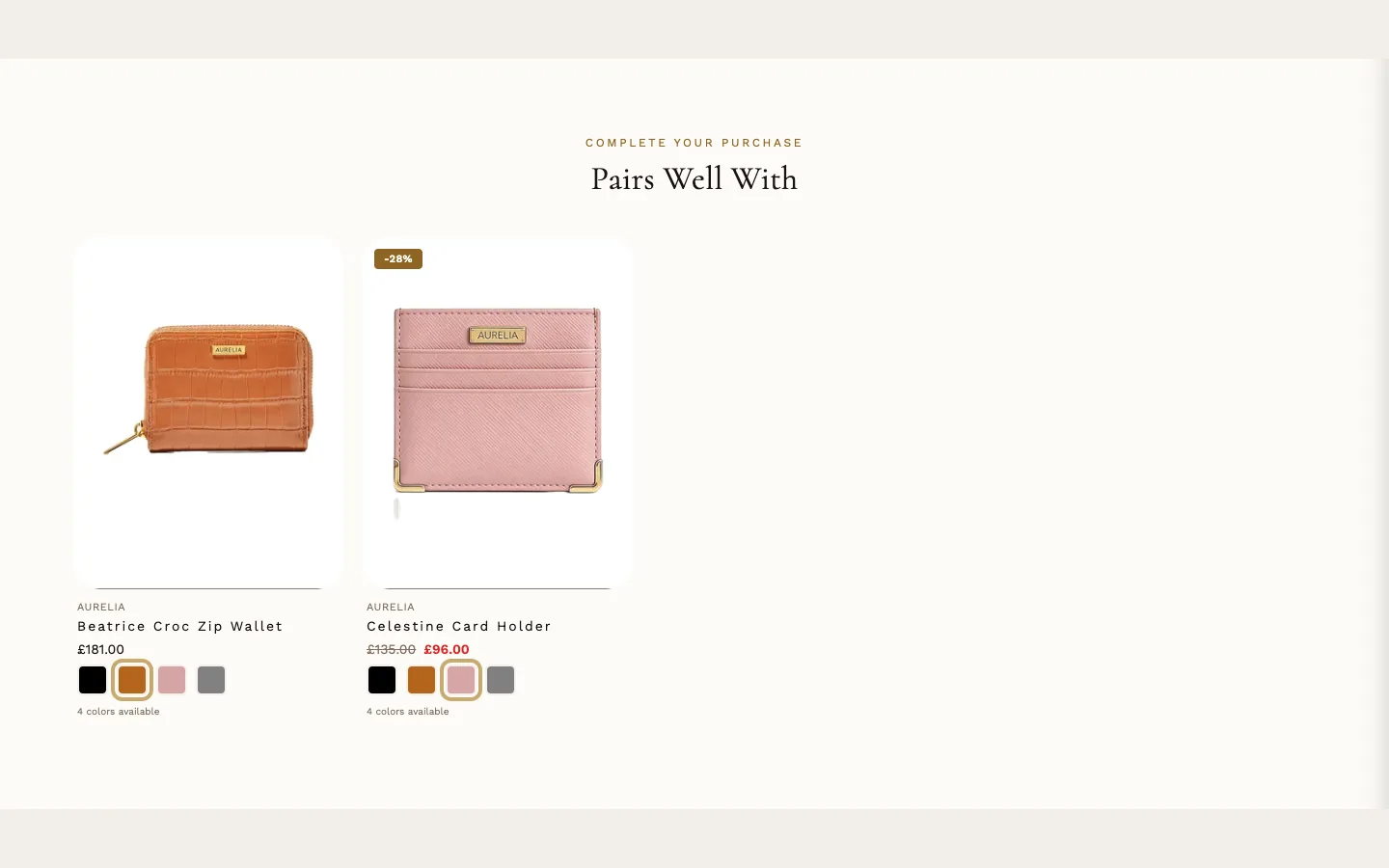
Complementary-product recommendations ("pairs well with"), driven by Shopify's recommendations.
Where it can go
Product template only — the editor offers it nowhere else.
What it needs
For its default Recommendation type, Complementary (pairs well with): products linked as complementary in the Shopify Search and Discovery app. The section hides automatically until complementary products are configured there. Switching the type to Related (similar products) uses Shopify's similarity instead, with no app setup.
When it's empty
Nothing — the section collapses to nothing on the page until recommendations exist.
Pickup availability#
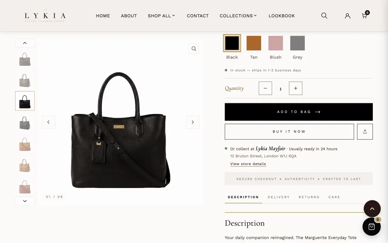
Part of the theme rather than an addable section: it shows Shopify's local-pickup availability as the pickup line under the buy buttons and the pickup panel that the link under it opens (see The pickup line and panel, under Product). The panel's settings are in the Buy buttons block: Pickup panel background color, Pickup panel text color and Store name weight. On the product page it is controlled by the Product section's Show pickup availability setting, and it shows for any variant a location has pickup enabled for in Settings → Shipping and delivery → Local pickup.
Product countdown#
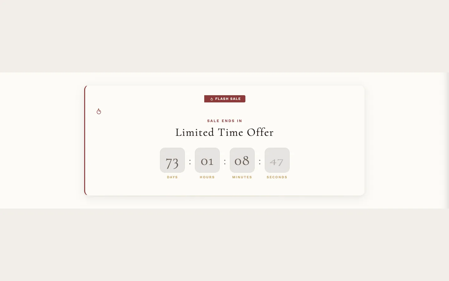
What it is for
A per-product sale countdown strip — heading, timer, button — shown on products that have a sale end date.
Where it can go
Product template only.
What it needs
The product's custom.sale_end_date metafield: only products carrying it show the timer. Write the date as YYYY-MM-DD or DD-MM-YYYY with a four-digit year, with - or / between the parts (2026-12-31 or 31/12/2026); a date that doesn't exist, such as 31-02-2027, can't be read. The Fallback end date and time settings exist for testing — they apply only when the metafield is empty, and their formats are stated beside them (DD-MM-YYYY, 24-hour HH:MM).
Metafields it reads
custom.sale_end_date, plus the optional custom.sale_end_time (23:59 when empty), custom.sale_start_date and custom.sale_start_time (00:00 when empty). When custom.sale_end_date is filled, these metafields set the dates and the four Fallback settings are ignored for that product.
Settings worth knowing
Italic accent word sets one word of the heading in italic, in Theme settings → Countdown timer → Accent color. A start date (the product's custom.sale_start_date; when the fallback end date is in use, a filled Fallback start date takes its place) shows "Coming Soon" in place of the timer and button until it arrives, and lets Show progress bar in Theme settings → Countdown timer fill a bar from the start to the end date. A start date that can't be read counts as no start date; an end date that can't be read hides the timer and shows the expired message. Expired button text and Expired button link let an ended offer point somewhere useful instead of a dead button. Timer styling comes from Theme settings → Countdown timer, including the installed behavior that an expired countdown section removes itself. Full-width section takes the section past the Page margin from Theme settings → Layout to both screen edges, with its content still inside Max content width; with Theme settings → Countdown timer → Display style set to Card (elevated container), as installed, the card itself becomes the edge-to-edge band. With Page width set to Narrow or Wide, it stops at that width. Uncheck it and the section keeps the page margin (on phones a third of Page margin, at most 32 px).
When it's empty
Without an end date the section doesn't show in your store. In the theme editor a sample countdown stands in (three and a half days, with a note that it is a sample) until you add the metafield or a Fallback end date.