
Cart#
Cart#
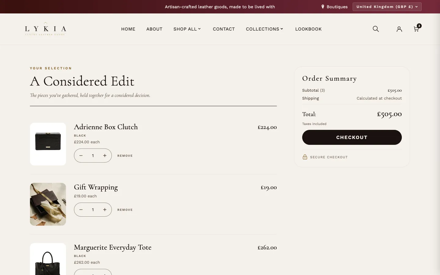
What it is for
The cart page: the customer’s bag line by line, an order summary and the way to checkout. It is part of the cart template — configure it rather than add it.
What it needs
Nothing to show the bag. Show cross-sell products shows products only when the Search & Discovery app has complementary products for an item in the cart. The accelerated checkout buttons appear only when your store offers them (for example Shop Pay, Apple Pay or PayPal). Gift wrapping appears here when Theme settings → Gift wrapping is on and has a wrap product.
Settings worth knowing
- Header — Text above heading (“Your selection” as installed), Heading (“A Considered Edit”), Subheading (the italic line under it) and Order summary heading (“Order Summary”). Each is blank as installed and shows the theme’s translated wording; type your own words to replace it, or clear the field to go back.
- Content — Show order notes adds a notes field, worded by Order notes label and Order notes placeholder. Show dynamic checkout buttons (on as installed) adds the accelerated checkout buttons your store offers, in their own branded colors, under the Express checkout label (“Or express checkout”). The labels are blank as installed, like the Header texts.
- Cross-sell Products — Show cross-sell products adds a row of recommended products under the cart. Text above heading (“Complete your purchase”) and Heading (“Pairs Well With”) are blank as installed like the Header texts. Product alignment (Center as installed) puts the products in the middle of the row, or at the left, when there are fewer than fill one row. Space above cross-sell on phones and tablets sets its distance from the order summary when the row stacks below it (up to 1100 px wide).
- Trust Badges — Show trust badges and up to three badges under the Checkout button, each with an icon (None, Secure lock, Shield, Shipping truck, Returns or Credit card) and a text. A badge shows only when its text is filled; with the icon set to None it shows the text alone. As installed only the first badge shows: Secure lock with “Secure checkout”.
- Empty cart — Page heading (“Your bag”), Empty cart message (“Your bag is empty”), Text below the message and Empty cart button text (“Continue Shopping”), blank as installed like the Header texts.
The page follows Theme settings → Colors and Typography: names and prices use Heading text, small labels use Muted text (a touch deeper so they read clearly on the page), the order summary sits on Card background, and the page background is the light color in Text on dark backgrounds. Other cart wording — Subtotal, Shipping, Total, Checkout, Remove — comes from the theme’s translations; change it under Online Store → Themes → ⋯ → Edit default theme content.
What the page shows
- Each line: the product image and name (both link to the product), the variant (for example Black), the price for one (“£224.00 each” in the image above, with the regular price struck through when it is on sale), a unit price where the product has one, any details the customer entered on the product page (such as gift card recipient details), and the line total with any line discount named under it.
- A subscription or other purchase option shows its plan name next to the variant.
- Gift wrapping, once the customer adds it, is its own line at its price — “Gift Wrapping £19.00” in the image above.
- The order summary: automatic discounts on the whole order, Subtotal with the number of items, Shipping “Calculated at checkout”, Total, and “Taxes included” when your prices include tax. Discount codes are entered at checkout; the cart has no code field.
- Quantity: − and + or type a number; Remove takes the line out. Every line and the totals update after each change. When fewer are in stock, the line is set to what is available and a short note under it says so.
- On phones and tablets (up to 1100 px wide) a bar with Total and Checkout stays at the bottom of the screen until the order summary’s own Checkout button comes into view.
- Under the cart, once the Search & Discovery app has complementary products for the first item: your heading and up to six products on the same cards as your collection pages — image, name, price (a sale price in Gold text, the regular price struck through), color swatches and badges. Desktops show four cards in a row, three up to 1200 px wide, two on tablets and phones. When there are more products, arrows on desktop or a swipe on tablets and phones show the rest; on tablets and phones the next card peeks in at the edge.
Keyboard and screen readers
- Tab moves through the page in reading order: each line’s name, −, the quantity, + and Remove, then the order notes, gift wrapping, Checkout and the recommended products.
- − , + and Remove work with Enter or Space; in the quantity field type a number or use the arrow keys. After each change the page reloads, focus comes back to the control you used and a screen reader announces the new quantity. The focus ring shows only when you were using the keyboard — not after a mouse click or a tap.
- In the recommended products, Tab reaches each product name, color swatch and arrow, and brings a card that is out of view into the row. Each product has one link, its name.
When it’s empty
An empty cart shows the Page heading, the Empty cart message, the Text below the message and a button to all your products (Empty cart button text).
Cart drawer#
What it is for
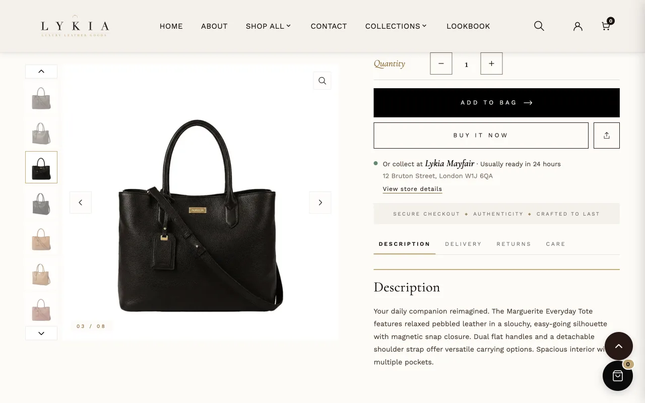
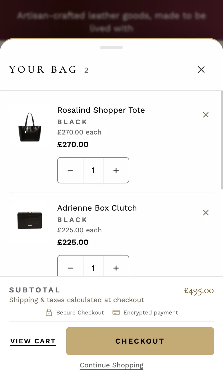
The sliding cart panel, part of the theme on every page: it opens when a customer adds a product or presses the cart icon, and shows the bag without leaving the page. On phones it rises from the bottom as a sheet.
What it needs
Nothing — it arrives configured. Gift wrapping lives in Theme settings → Gift wrapping, which ships switched off; the Wrapping Style blocks below are the styles customers choose from once it is on.
Settings worth knowing
- Cart Text — Cart heading (“Your Bag” as installed), Empty cart message, Empty cart button text, Order notes label, Order notes placeholder, Subtotal label, Shipping note text, View cart button text, Checkout button text and Continue shopping link text. They arrive filled with English wording; clear a field and the drawer uses the theme’s translated wording instead, which follows your store’s language.
- Cart Features — Show order notes adds a notes field; Show sticky cart button (on as installed) shows a round cart button with the number of items in the bottom corner of every page except the cart page.
- Trust Badges — Show trust badges and First badge text, Second badge text and Third badge text, shown above the buttons with a lock, a card and a truck icon. A blank text hides that badge; as installed the first two show (“Secure Checkout”, “Encrypted payment”).
- Short phones — Compact footer on short phones (on as installed): on phones up to 740 px tall the footer gets slimmer so at least two items and the Checkout button stay in view; View cart becomes a text link beside Checkout and the footer ornament is hidden. Trust badges on short phones keeps the badges to One row (as installed) or hides them.
- Luxury Treatment — Gold accent color (#C9A96E as installed) for the border, glows and highlights; Show grain texture overlay; Show header ornamental divider and Show footer ornamental divider (both off as installed); Checkout button gold glow; Trust badge gold tint, a deeper shade of the gold so the icons read clearly; and Show gold accent border.
- Luxury Fine-tuning — Texture intensity, Ornament line opacity, Ornament diamond size and Checkout glow strength (Strong as installed).
- Wrapping Style blocks — up to eight Wrapping Style blocks, one per style: Style name, Style swatch image (optional) — shown in the Pills and Cards layouts, not Dropdown; 80 × 80 px recommended — and Style color swatch, used when no image is added (not in Dropdown). Three arrive installed: Classic Gold, Midnight Blue and Rose Pink.
The panel itself is white with dark text; its gold comes from Gold accent color, and its fonts follow Theme settings → Typography.
What the drawer shows
- Each line: image, name, variant, plan name for a subscription, any details the customer entered on the product page, the price for one, the line total with any discount, − and + for the quantity, and × to remove the line (on computers it appears when you point at the line or reach it with the keyboard; on phones it is always there). When fewer are in stock, a short note under the line says so.
- Gift wrapping, when it is on: a switch under the notes, “Add Gift Wrapping” with the wrap’s price on the demo store. Turning it on adds the wrap to the bag and the subtotal and opens the message, recipient and style choices set in Theme settings; the wrap itself shows as a line on the cart page, not in the drawer.
- The footer: automatic discounts on the order, Subtotal, the shipping note, the trust badges, View cart, Checkout and Continue shopping.
Keyboard and screen readers
The drawer opens as a dialog: focus moves into it, Tab and Shift+Tab stay inside it, and Escape — or × or a click outside — closes it and returns focus to the button that opened it. Quantity changes, removals and gift wrapping are announced to screen readers.
When it’s empty
An empty drawer shows the Empty cart message and its button to all your products, and hides the footer.