
More sections you can add#
These sections ship with the theme but are not placed on any page by the preset — add them wherever they fit. The About set (CTA, Team, Values) pairs naturally with the About page's preset sections; the Product set (FAQ + image, Features, Testimonial) with the product template.
About call to action#
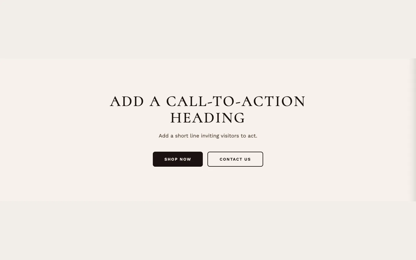
A call-to-action band: label, heading, description, and two buttons (primary and secondary), over a color or image. As added it shows a placeholder heading, line and buttons; with the label, heading, description, button text and background image all empty it doesn't show.
About team#
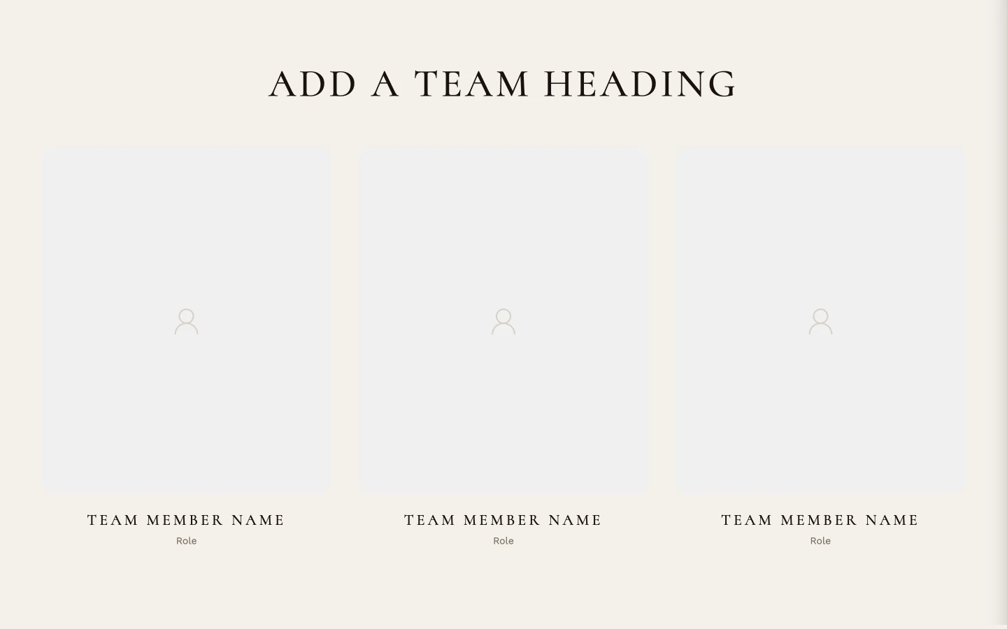
A team grid: heading, description, 2–4 columns of Team Member blocks — photo, name, role, bio, and LinkedIn/Instagram links per member. Doesn't show until it has a label, heading, description or Team Member block; the label and description show without a heading, and the heading line appears only once Heading is filled.
About values#
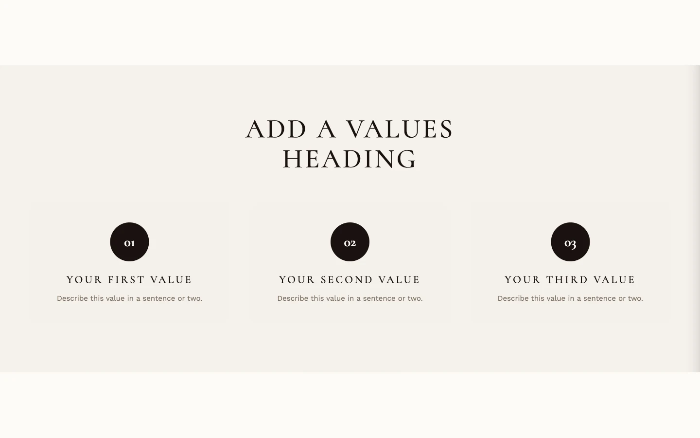
A values grid: heading, subheading, 2–4 columns of Value blocks — heading, description, and an Icon SVG field that takes pasted SVG code. Doesn't show until it has a label, heading, subheading or Value block; as added, it comes with a heading and three Value blocks.
Collection story + FAQ#
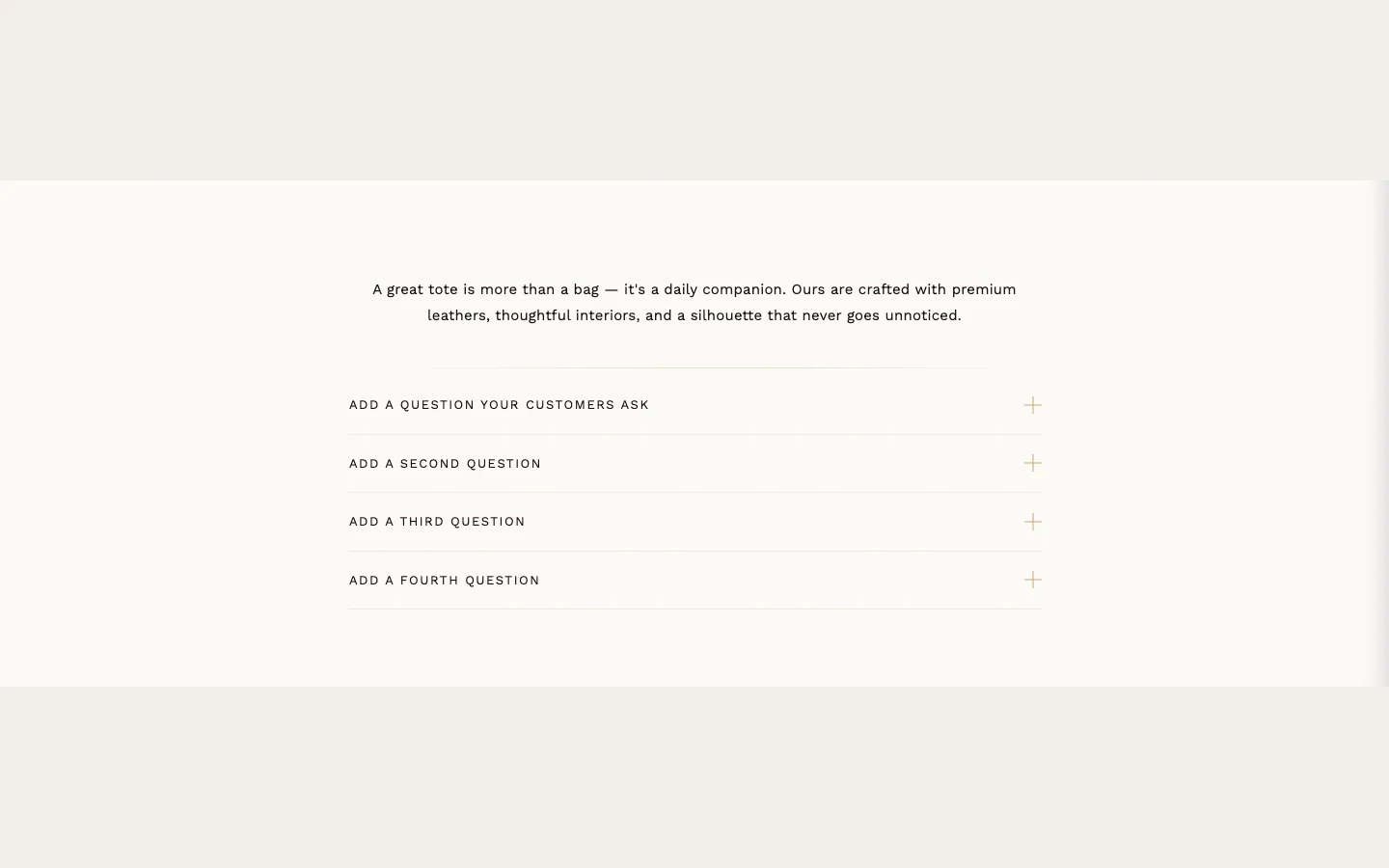
A rich-text story with an image on one side and an FAQ accordion beneath — suited to a collection or landing page. Needs its Heading, Description, an optional Image, and FAQ item blocks (question + rich-text answer). Only one FAQ open at a time controls the accordion. Metafields it reads: on a collection page, the collection's custom.story_heading, custom.story_description and custom.story_image metafields, when filled, override Heading, Description and Image, and a filled custom.faq_items list replaces the FAQ item blocks. As added it comes with placeholder FAQ items, so it shows at once; with no heading, description or image and no FAQ items (blocks or metafield) it doesn't show.
Countdown timer#
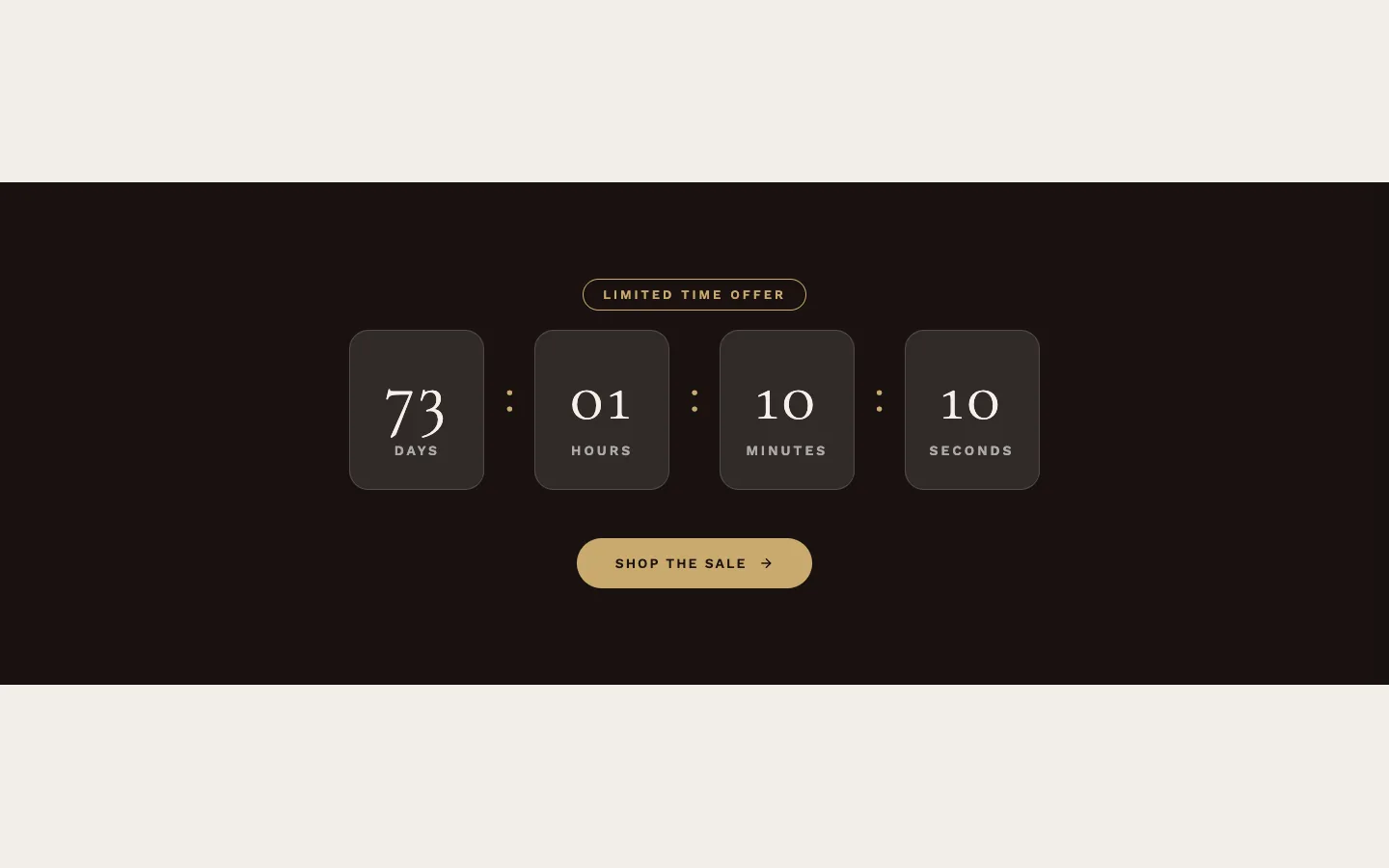
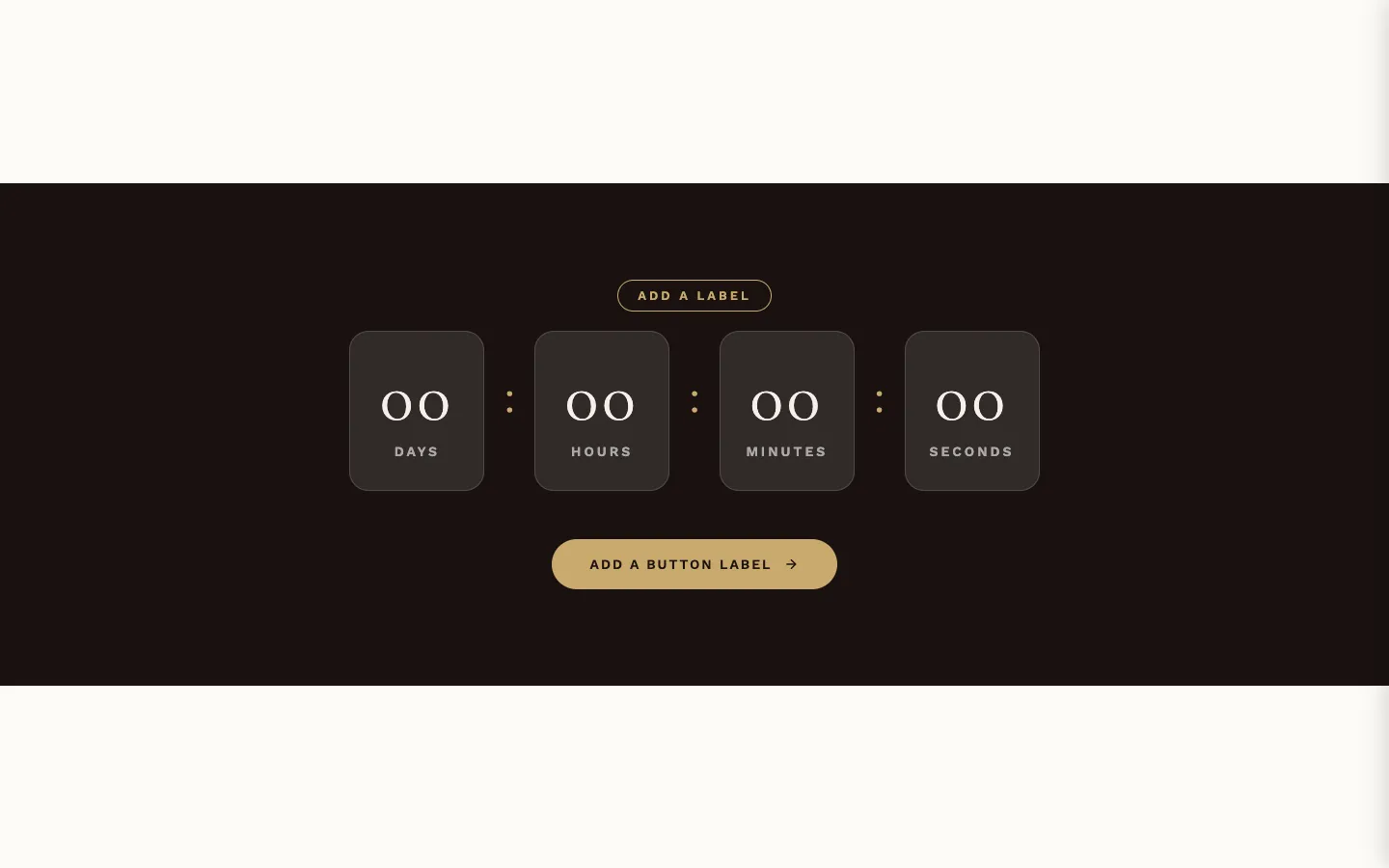
A standalone countdown band — distinct from the Countdown timer group in Theme settings (which styles the Product countdown section; only its Digit animation applies here) and from Countdown banner (the image-led version). Needs an End Date and End Time, in the formats stated beside them (DD-MM-YYYY, 24-hour HH:MM); a Start Date (optional) delays the start and shows the Not Started Message until then (as added it reads "Add a message before the timer starts"; cleared, it falls back to "Coming Soon"). The expired message, time-unit labels, button, and background (video or image, with Overlay Opacity; otherwise the theme's dark background color) are all settable. It shows as soon as it is added, with its placeholder label and button text; the timer needs the End Date and End Time.
Custom Liquid#
A container for your own code: the Liquid setting accepts Liquid, HTML and CSS up to 50KB (app embed snippets work too). It can use Liquid's global objects and, on a product or collection template, that page's product or collection. Section Layout settings control background, width, alignment and padding. Empty, it collapses to nothing on the page. What you paste here is your own code, outside theme support.
Custom section#
A minimal shell — one Background setting (an image) — that exists to hold theme blocks (see Theme blocks, below). Build freeform arrangements inside it from theme blocks: Group (added as Row or Column), Text and Custom Liquid. Empty, it collapses to nothing.
Featured product#
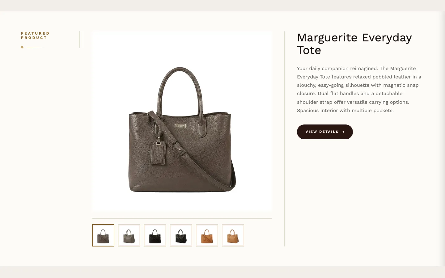
One product, presented large: its images, video and 3D media, with a heading beside them. Choose the Product; Media aspect ratio applies one shape to every media type so the frame doesn't jump when the shopper switches. Accepts an app block. Doesn't show until configured.
Gold accent divider#
A decorative divider in five styles — Diamond ornament, Subtle line, Double line, Solid bar, or Scrolling marquee, built from Marquee Text blocks. Each setting states which styles it applies to. The four line and ornament styles show as soon as the section is added; the scrolling marquee shows nothing until it has at least one Marquee Text block.
Hero banner#
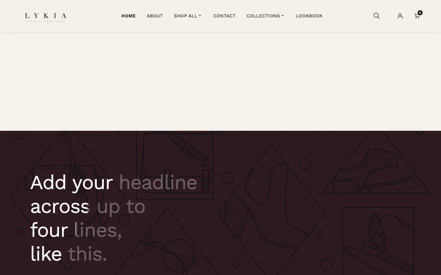
A simple hero: a background image behind up to four lines of headline text. Lighter-weight than Hero slideshow — no slides, no buttons. As added it shows four placeholder lines over a placeholder image; it shows nothing only when all four text lines and the Background image are empty.
Hero promo#
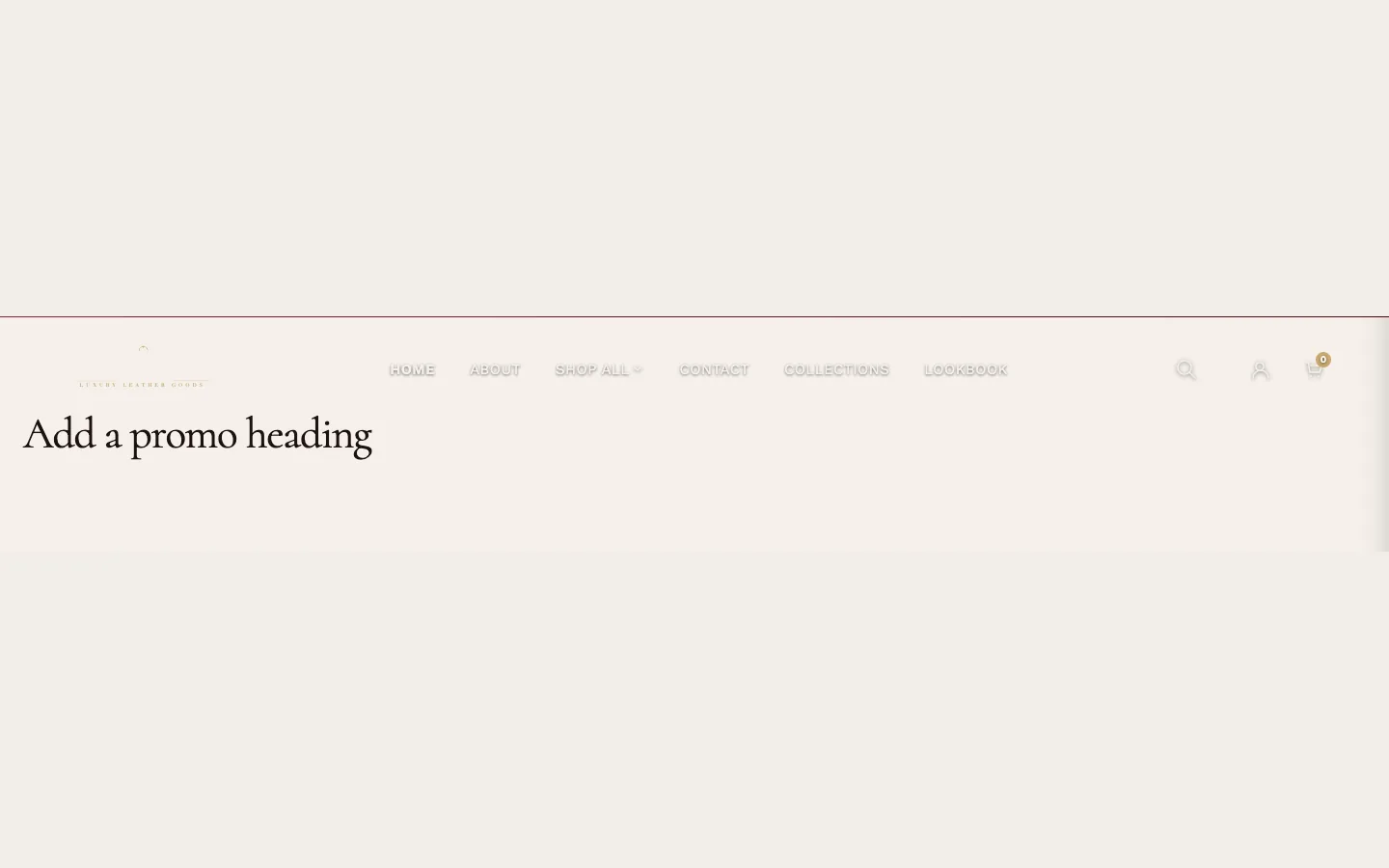
A minimal promo block: heading, description, and an image used as the button (Button Image (SVG or .png) plus Button Link). It shows once it has a Heading or Description, or a Button Image (SVG or .png): as added it shows its placeholder heading. Add the Button Image (SVG or .png) and Button Link to give it its button.
Hero with products#
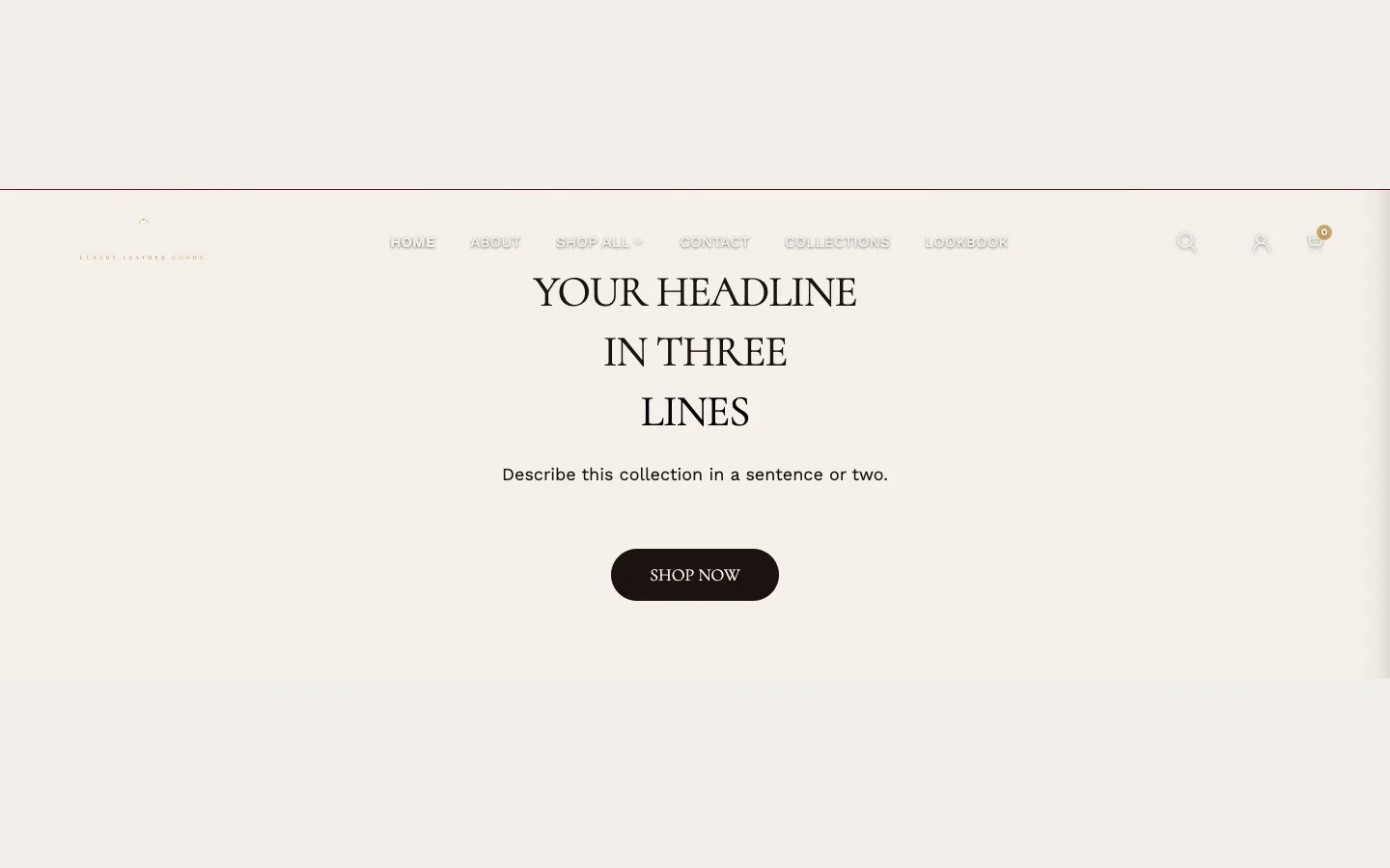
A three-line gradient headline (the same style as Featured products grid) with Product blocks — each a product image and label — arranged around it. Doesn't show until configured; a Product block without an image shows Shopify's placeholder graphic in its card.
Newsletter popup#
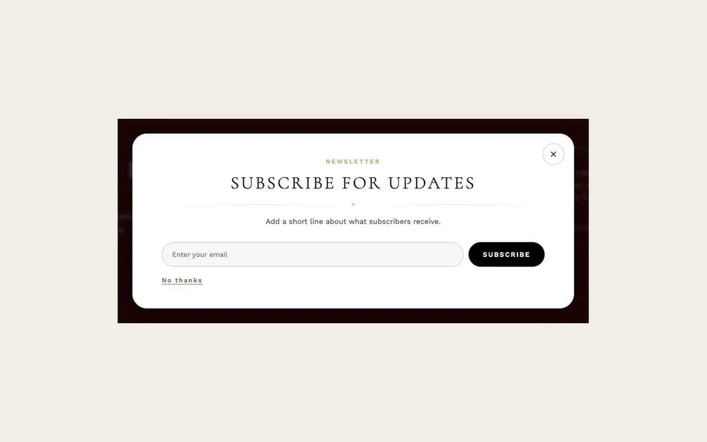
The signup popup. It is part of the theme rather than an addable section: the theme places it on every page, and you can't add it from Add section — open its settings by selecting it in the theme editor. Show popup is off as shipped — the popup never shows until you check it. Delay before showing (seconds) and Days before showing again control when it appears and how long a dismissal lasts. It can carry an image, and — via Show promo code — display a discount code you've created in your Shopify admin. The signup itself feeds Shopify's customer list.
Newsletter signup#
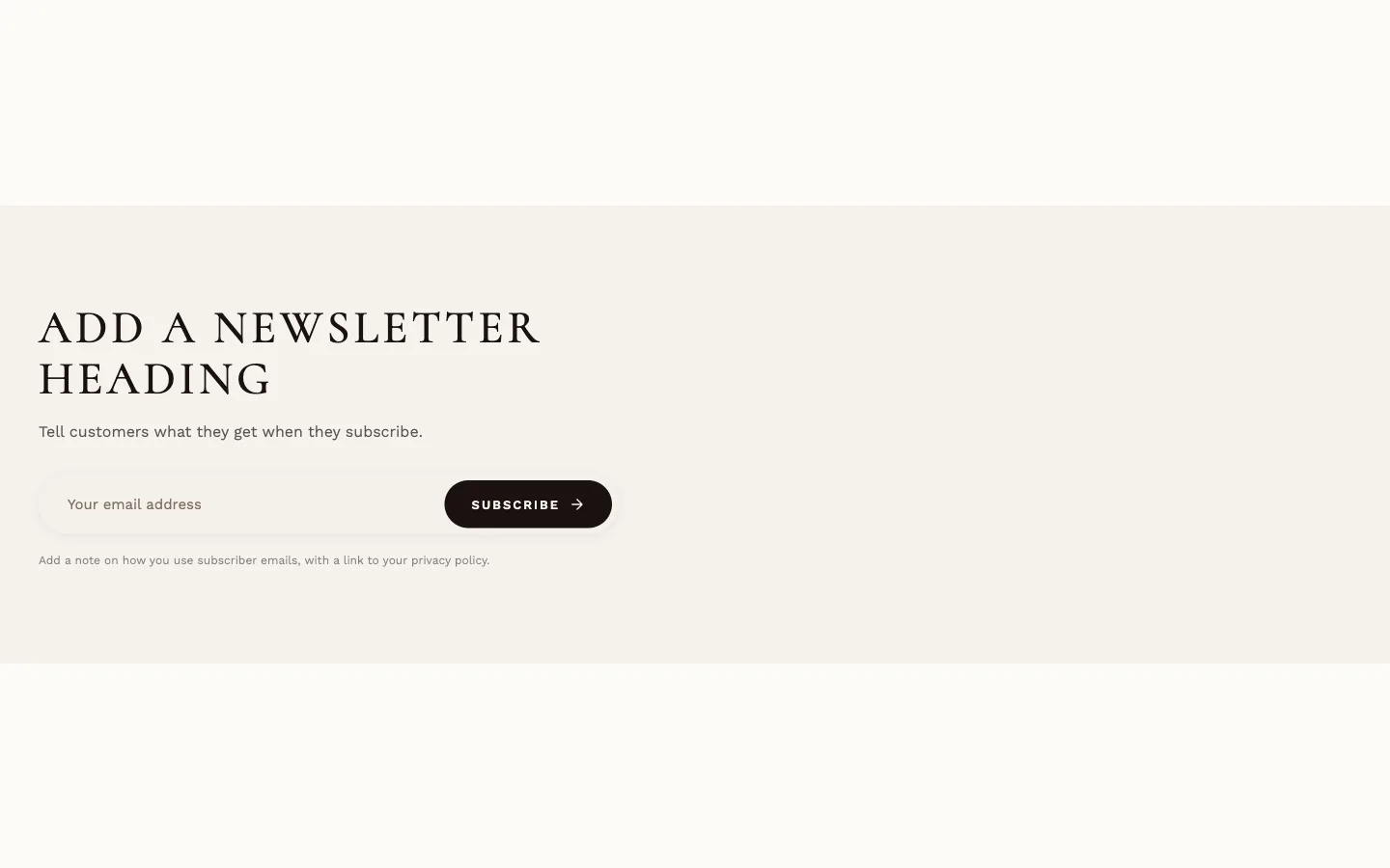
An in-page signup band: heading, description, email field, button, success message and privacy line, with an optional image. Add it to any page where you want signups without the popup. With content but no image (when Show Image is on), a neutral placeholder stands in.
Product FAQ + image#
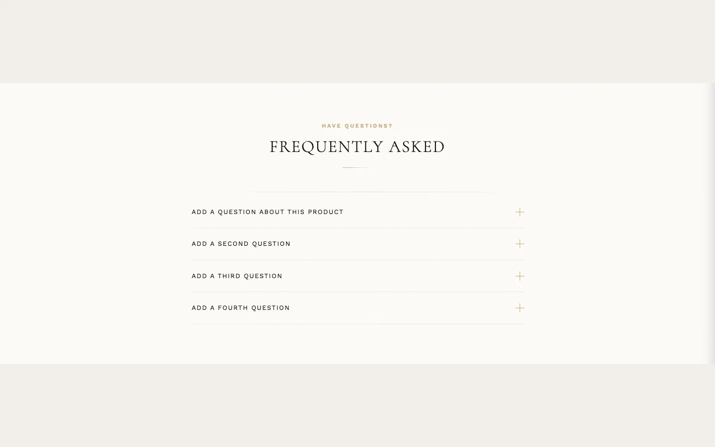
An FAQ accordion with an image panel, built for product pages. It reads a product's FAQ metaobjects (custom.faq) first and falls back to its own FAQ Item blocks; the image comes from the product's custom.faq_image metafield or the section's Fallback image. A contact CTA ("Still have questions?") closes it. As added it comes with placeholder FAQ Item blocks, so it shows at once; with no FAQ items (blocks or the product's custom.faq) it doesn't show.
Product features#
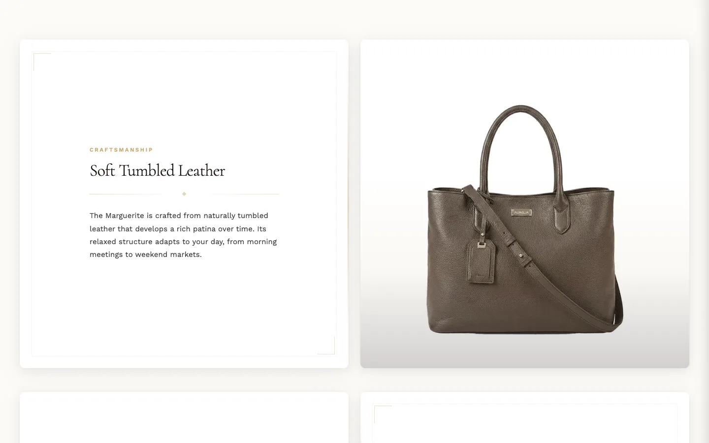
A 50/50 feature showcase: each feature a full-height image beside framed text with gold accents. Reads a product's Feature metaobjects (custom.features) first and falls back to Feature blocks (image, label, heading, description, button). Doesn't show until it has features — Feature blocks or the product's custom.features metafield; a heading on its own shows nothing.
Product testimonial#
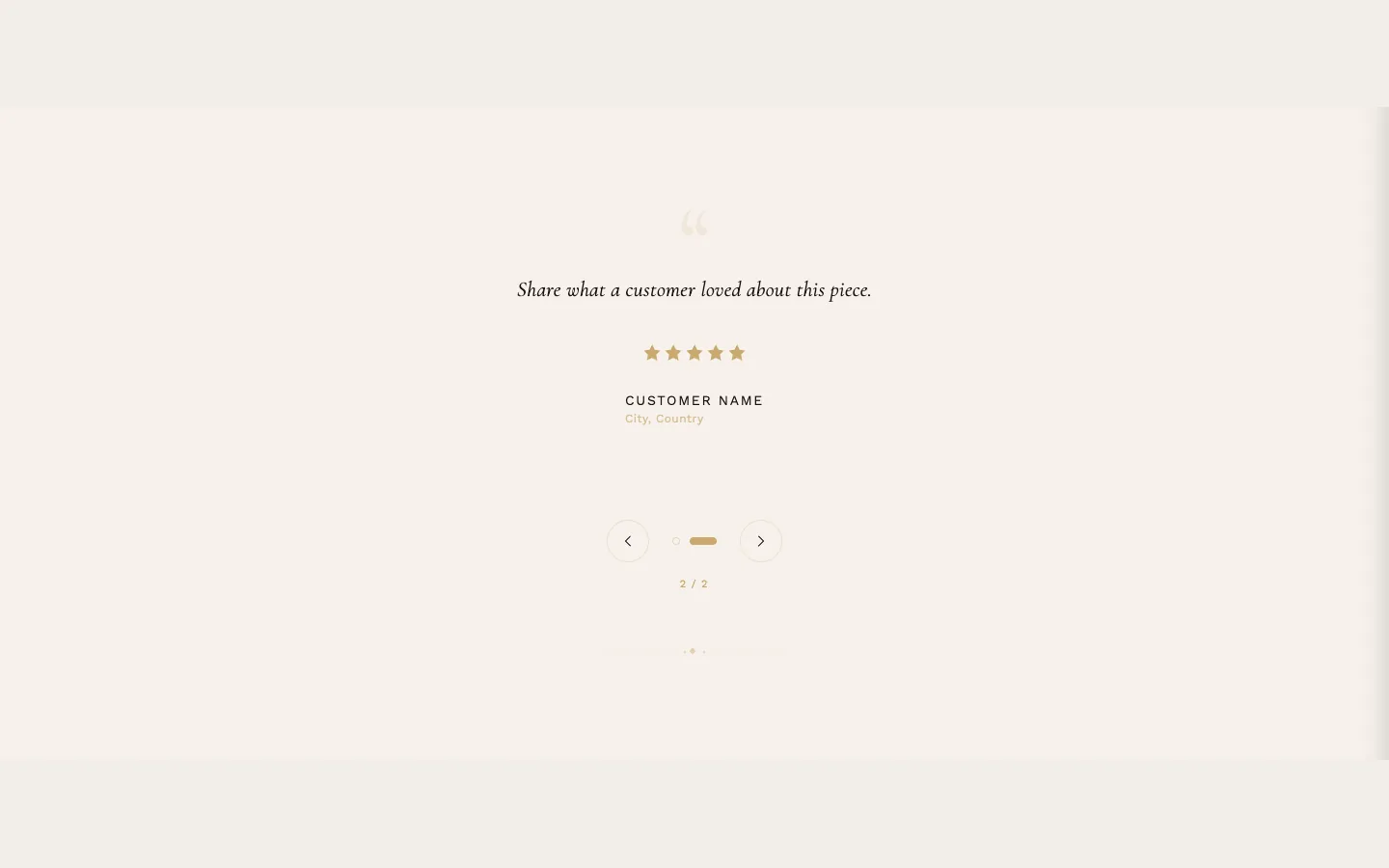
A rotating testimonial: Testimonial blocks each hold a quote, author, location, optional photo and a star rating. Auto-rotate with Rotation speed cycles them. Doesn't show until a block exists.