
Other templates#
404 page#
The not-found page. Two settings: Show popular collections and Max collections to show — the page offers shoppers a way back into the store.
About hero#
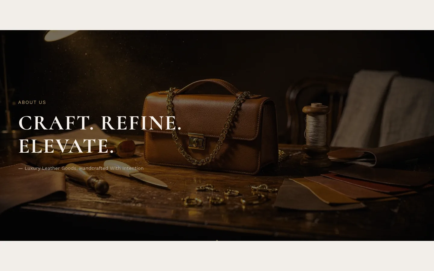
What it is for
A tall opening banner for an About page: small label, large heading, attribution line, over an image or dark color.
What it needs
Its text; a Background image is optional, with Background color (fallback) behind it.
Settings worth knowing
Overlay darkness, heading and label sizes, grain and the bottom ornament.
When it's empty
With nothing configured the section doesn't show. A background image alone isn't enough: it appears once it has a label, a heading or an attribution.
About timeline#
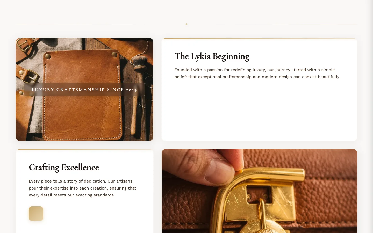
What it is for
A brand-story timeline: up to three Story Card blocks interleaved with two images and one large media slot (image or video).
What it needs
Story Card blocks — each a heading and rich-text content, plus an optional bottom element: avatar photos with names, an icon box, or an animated counter (number, suffix, label). The image slots take their own alt texts; Video URL accepts YouTube, Vimeo or a direct MP4 link, with Poster image as its cover.
When it's empty
With nothing configured the section doesn't show.
Article#
The blog-post page. Part of the article template. Six toggles: featured image, publish date, author, tags, share buttons, and the comments section (comments also need enabling per blog in your Shopify admin).
Blog articles#
The blog's post grid. Part of the blog template. One setting: Articles per page.
Blog hero#
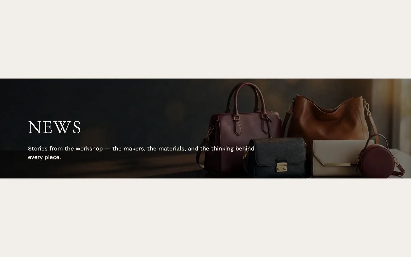
What it is for
The banner over the blog: heading and description over an image.
What it needs
Nothing beyond the blog it sits on: leave Heading blank to use the blog's own title — the preset ships it that way, with a written introduction in Description. Background Image is optional.
When it's empty
On a blog page a blank heading falls back to the blog's title, so in practice it always shows; with no image, a neutral placeholder graphic sits behind the overlay.
Brand statement#
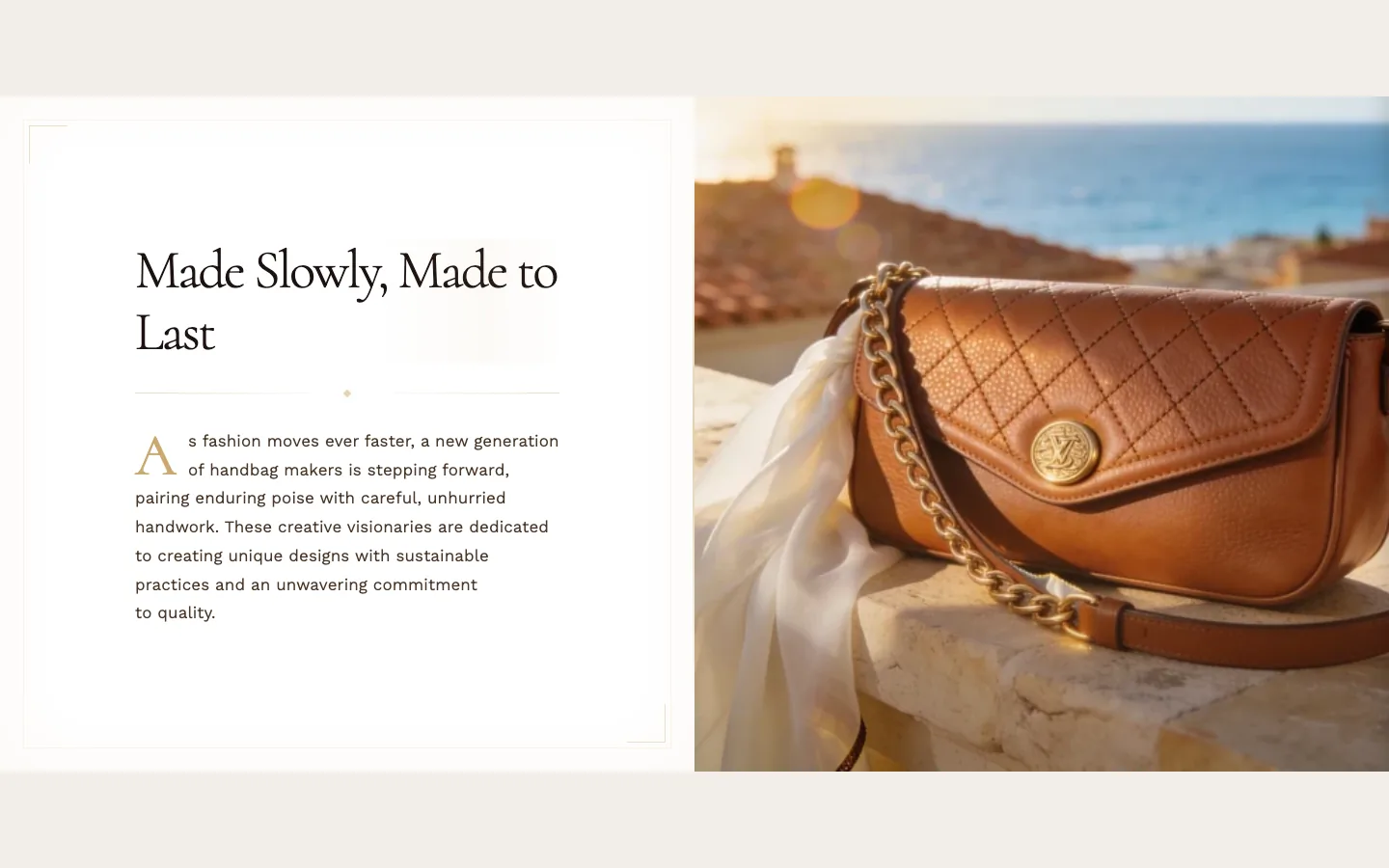
What it is for
A story split: rich text beside an image, with an optional signature image below the text.
What it needs
Its Heading and Body text; the Signature / logo image with its alt text, and the Image, are optional. Image position on mobile decides whether the image stacks above or below the text on phones.
When it's empty
With nothing configured the section doesn't show.
Contact form#
What it is for
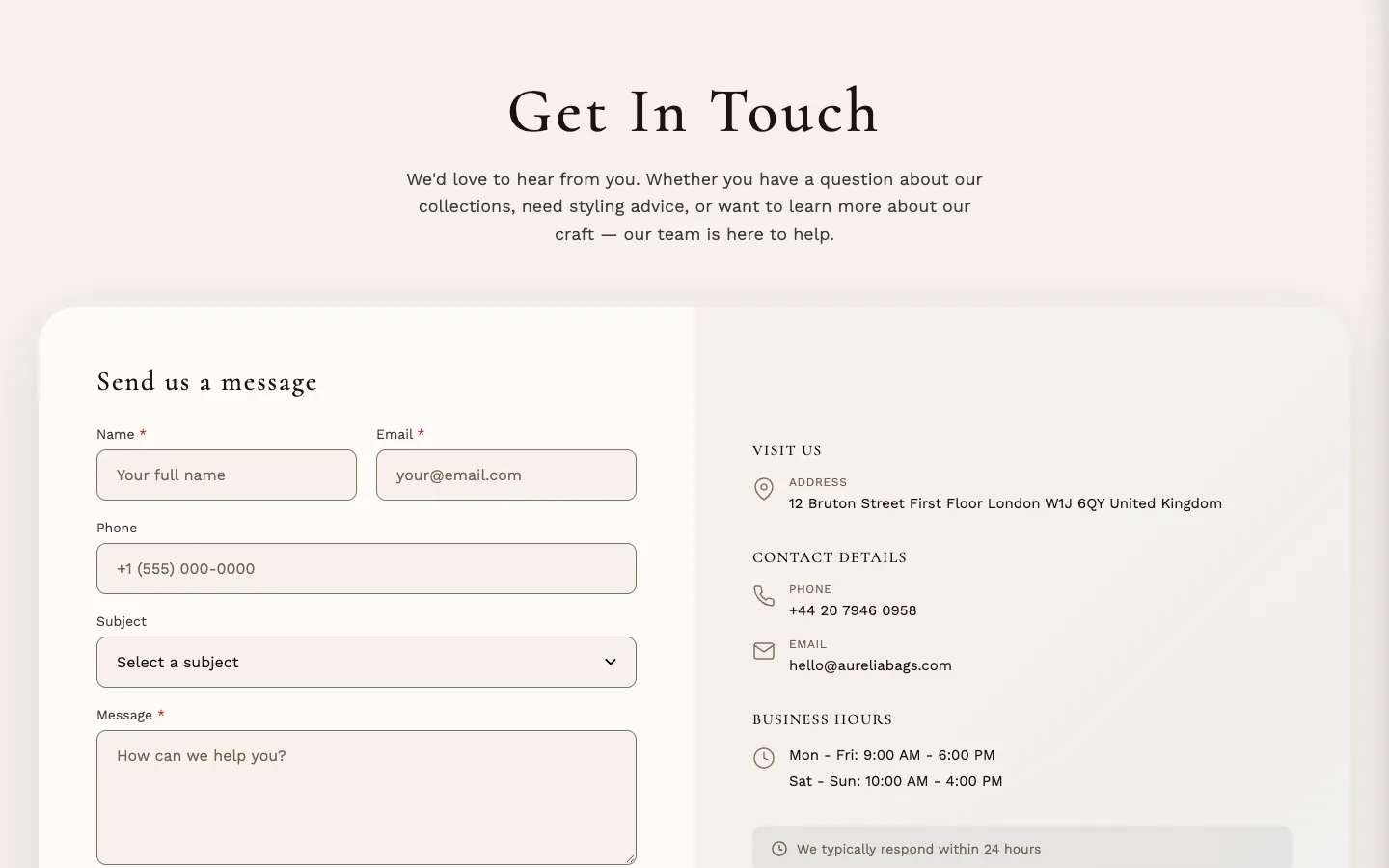
A working contact page: the form on one side, your store information on the other.
What it needs
Nothing — it shows a working form from the moment it's placed, delivered through Shopify's built-in contact form. Fill in the information panel to taste: Store address, Phone number, Email address (leave it blank to show the store email from Settings → Store details), the two hours fields, and Response time note — a short line telling visitors when to expect a reply.
Replace the shipped hours and response time note with your own before publishing — the preset's contact page carries example opening hours and a sample reply time; Store address and Phone number ship blank, and a blank Email address shows the store email.
When it's empty
Never empty by design: the form is the content, so this section always shows it.
Lookbook#
What it is for
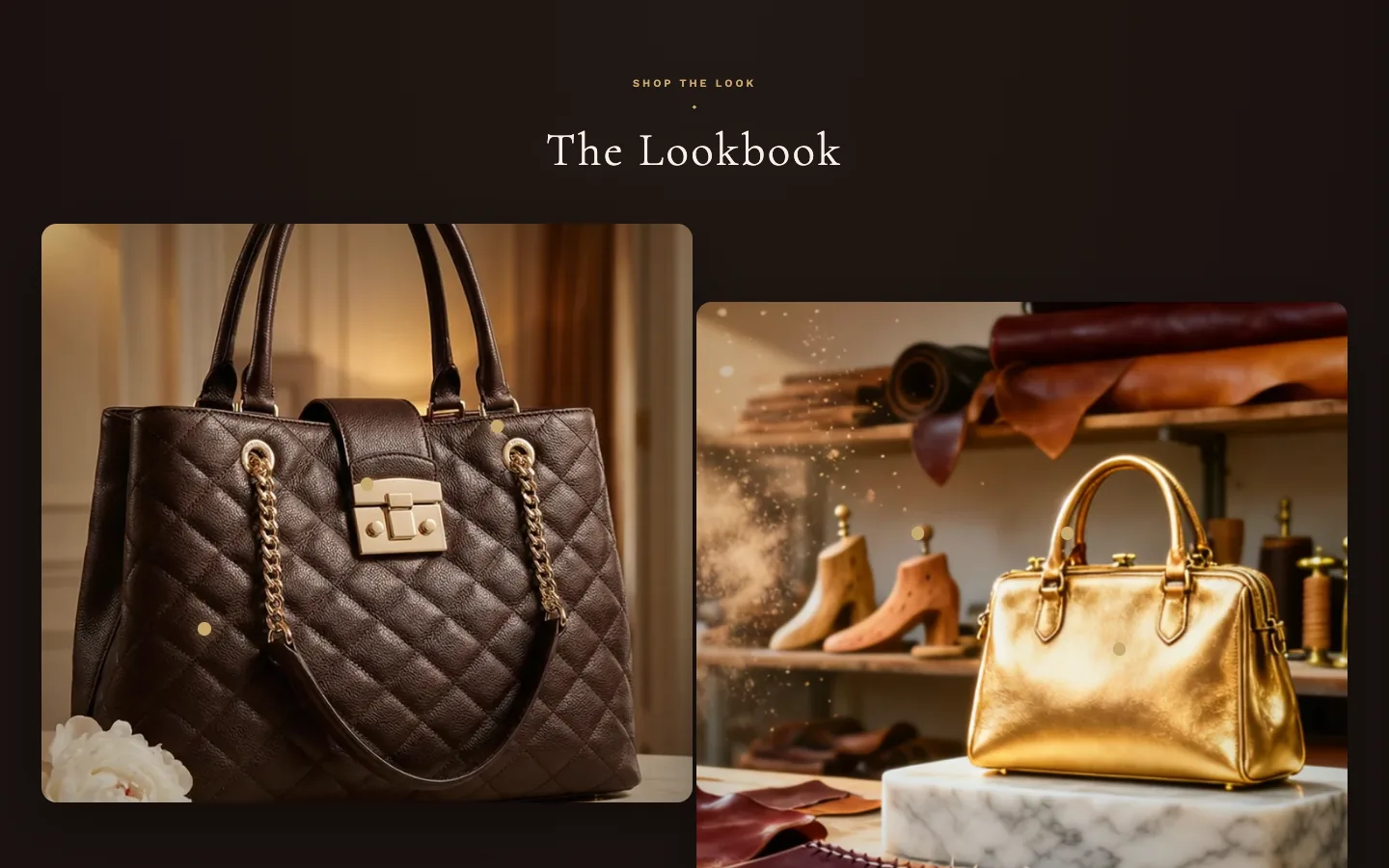
Full-width lifestyle imagery with shoppable hotspots — markers on the photos that open a product tooltip.
What it needs
Image blocks (up to four) for the photos, and Hotspot blocks (up to twelve), each assigned a Product and positioned by its two percentage sliders. Placement rule, stated in the editor too: a hotspot belongs to whichever Image block sits directly above it in the block list — order the blocks image-first, hotspots beneath, and drag to rearrange.
Settings worth knowing
Image layout offers six arrangements from a single full-bleed photo to staggered floating cards — the preset ships Staggered. Full width (edge to edge) trades side padding and rounding for a full-bleed look (Staggered keeps its floating-card spacing and corners); uncheck it to keep the images within Max content width and at least the Page margin from Theme settings → Layout away from the screen edges. At 768px wide or less (900px or less for Staggered) only the Page margin remains as side padding, so with Page margin 0 the images run edge to edge. Hotspot style, size, glow and pulse are all adjustable, with a separate mobile marker style (numbered circles by default) and a Bottom sheet style for the phone tooltip. Image blocks carry their own alt text and focal-point sliders.
When it's empty
With nothing configured the section doesn't show.
Page#
The plain page template. No settings — it shows the page's own content from your Shopify admin.
Password#
The password page shown while your store is locked. No settings.
Search results#
The search results page. No settings.
Store list#
What it is for
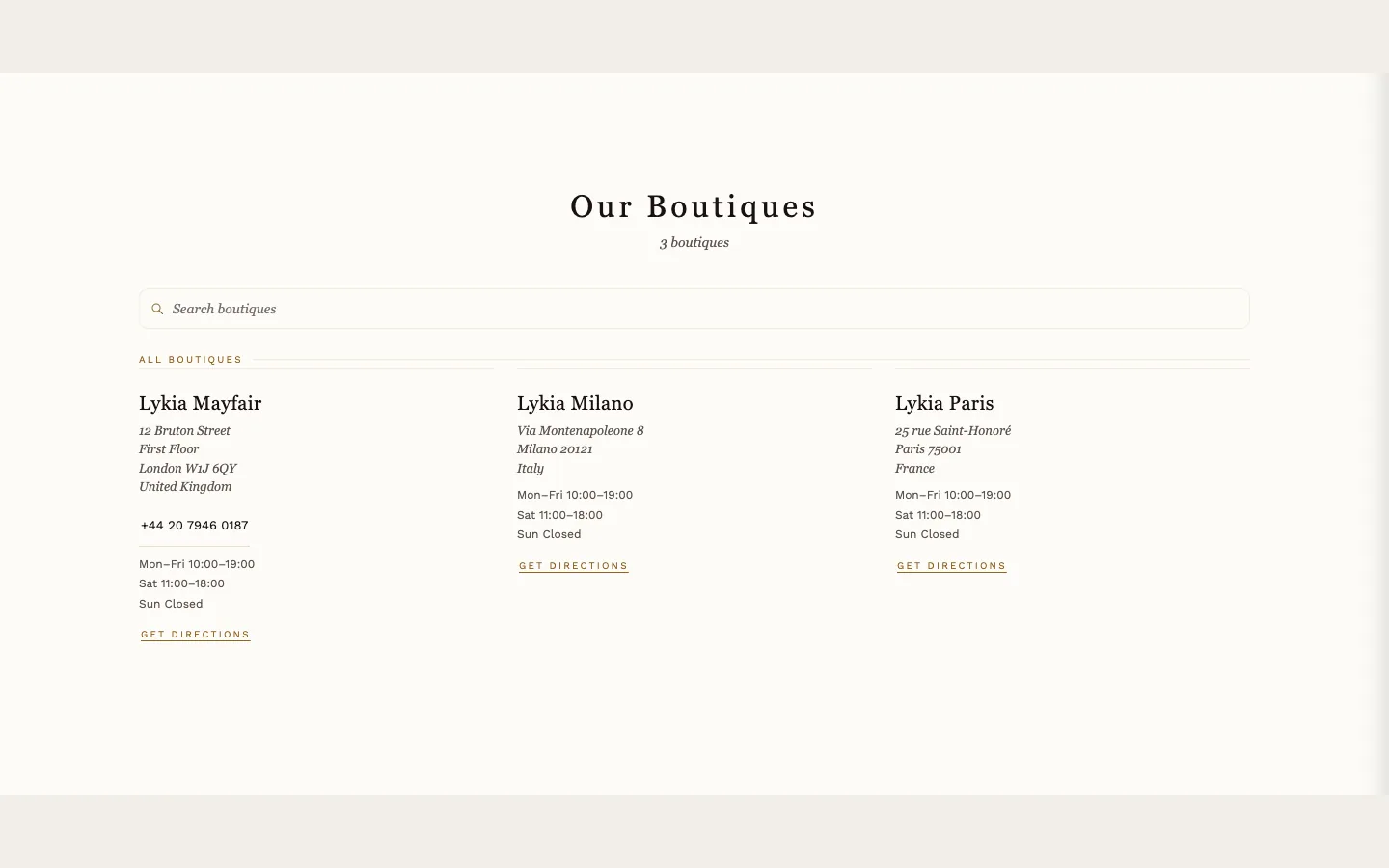
A boutique directory page — the section behind the store-locator link in the Announcement bar. Its visual styling lives in Theme settings → Store locator.
What it needs
One Boutique block per location: name and address line 1 are required; address line 2, city, postal code, country, phone and free-text Store hours (shown as written, one line per day) are optional. Directions link (optional) left blank auto-builds a Google Maps link from the address.
Settings worth knowing
Text above heading prints nothing when blank, and the Heading falls back to a translated default when left blank. Show boutique count totals the list. A search box appears automatically once there are eight or more boutiques; Always show search box forces it on sooner. Search placeholder and List label fall back to translated defaults when left blank. The section also accepts app blocks and a Custom Liquid block.
When it's empty
With no Boutique blocks the section is hidden on the storefront; inside the theme editor a sample boutique stands in so you can see and style the layout.