
Footer#
Footer#
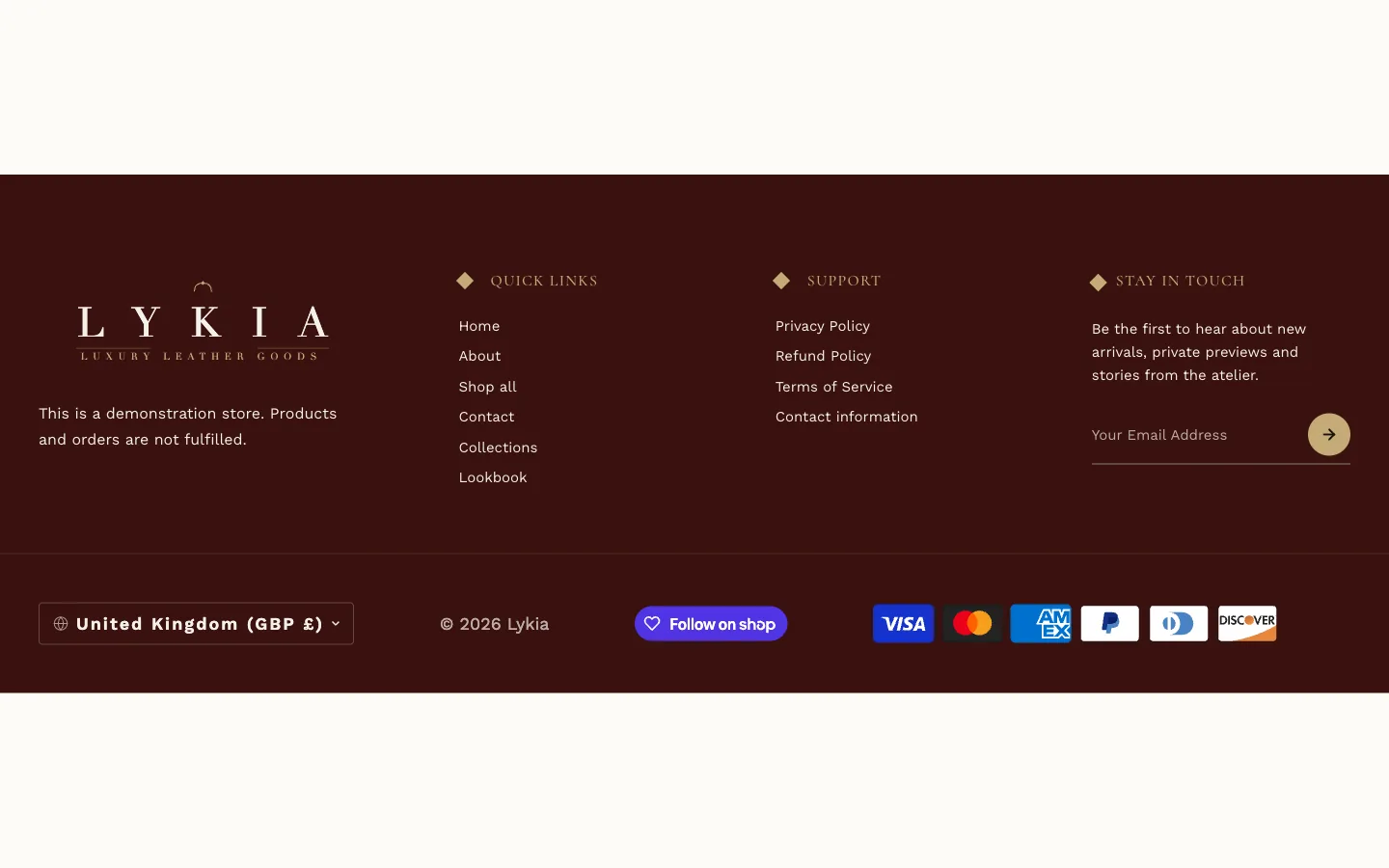
What it is for
The store's footer: brand column, up to four link columns, up to two text columns, a newsletter signup (at most six of these blocks together), social icons, payment icons and the bottom bar.
Where it can go
It ships in the footer area on every page and can only be placed there — it is not one of the sections you add to templates.
What it needs
Menus for its link columns — each Link Column block points at a menu from Online Store → Navigation and shows that menu under its Heading. The Text Column block holds free text; the Newsletter block wires to Shopify's customer signup. Fill in whichever Social Media URLs you use; icons appear only for filled-in links.
Settings worth knowing
Logo Image replaces the built-in text logo; leave it blank to keep the text version. Show Payment Icons displays the payment providers enabled in Settings → Payments — the icons come from your store's configuration, not from the theme. Copyright Text appears after the automatic "© year shop name". In the bottom bar, Show country/region selector lists each country/region with its currency (with one country/region and one language, the store currency and language show as text instead), and Show language selector appears when the store has more than one published language. Show Follow on Shop button (on as installed) adds Shopify's Shop-app follow button (it requires the Shop channel, and its branded appearance can't be changed). The Luxury Treatment and fine-tuning groups control the footer's gold ornaments, hover effects and glow strengths. The footer is dark by default — its own Colors cluster governs it, independent of the store-wide palette. Button Text colors the newsletter button's icon on Accent (Buttons) and the social icons on hover; Button Hover Text colors the newsletter icon on Accent Hover. A Newsletter block with its own Button Color uses its Button Icon Color instead. Layout, Typography and Spacing size everything else.
When it's empty
The footer shows whatever you give it; columns without a menu or content simply don't appear. In practice it always has its bottom bar once the theme is installed.